
ILM.com is showcasing artwork specially chosen by members of the ILM Art Department. In this installment of a continuing series, four artists from the San Francisco, London, and Vancouver studios share insights about their work on the 2026 Warner Bros. production, The End of Oak Street.
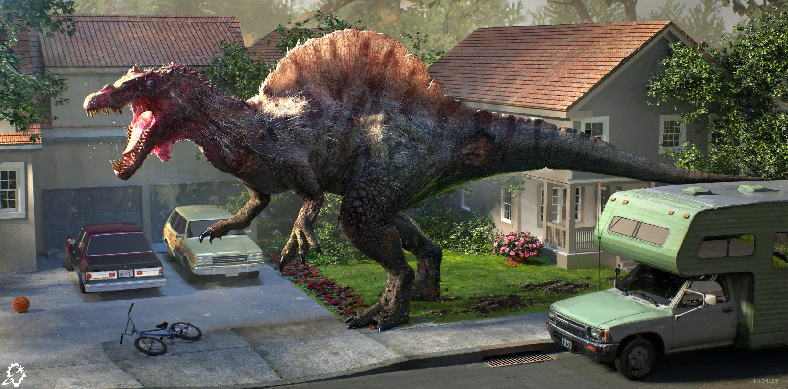
When working on the visual development phase for this project, there were a few things we had to include within the designs. It was important to have the dinosaurs presented within an environment that was fitting to the story, so in this case, we always showed the dinosaurs in context, in a 1980s suburban neighborhood. That gave the designs some real grounding and feeling for the film. Then, when designing the actual dinosaurs themselves, we tried to add an extra element of realism in terms of the overall body shapes and skin texture designs, as well as adding mud, dirt, wounds to the skin, hair, feathers, and general imperfections. These are real dinosaurs in a real setting, so they needed to look a bit rough around the edges to show they had a history before this particular setting and moment in time.
Sometimes when we see dinosaurs represented on screen they can look a bit too perfect and groomed, so it was nice this time to be able to try varying levels of grime and dirt just as you would see on any wild animal. We tried varying levels, from subtle to adding too much and then dialing it back. In the end we settled on something in the middle.
For this Spinosaurus design, I did research on real animals to look at skin qualities, and in this particular piece I wanted to show how light can pass through the fin on its back and show the way light travels through thinner areas of the skin, basically to show off sub-surface scattering. So I positioned the lighting purposefully to enhance this. I was not only thinking about the creature design, but also how to show off this dinosaur’s features through light.
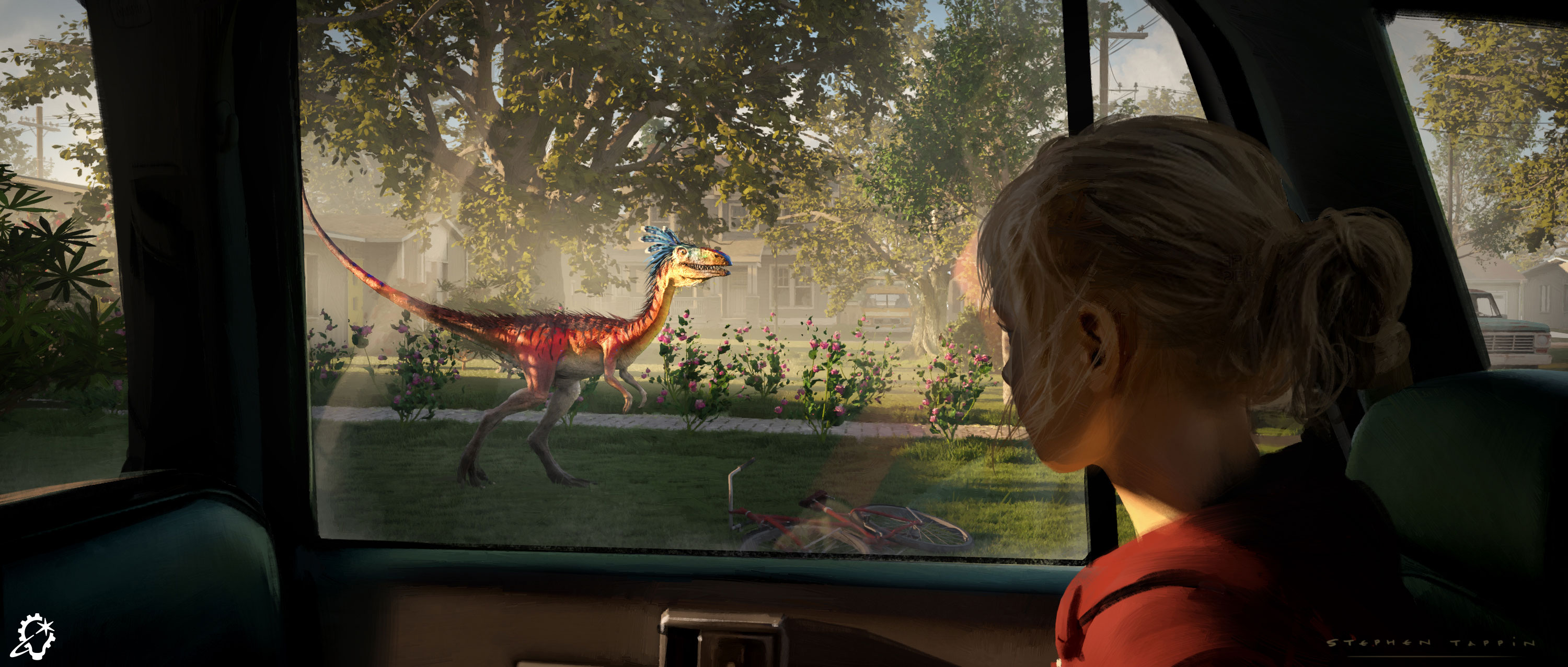
The images I produced were done very early on in the development phase. In fact I was working one-on-one with the writer and director, David Robert Mitchell. The script was still being developed but David had a clear idea of how he wanted to present things visually. He was a pleasure to work with. He liked to push things and he was highly collaborative and open to ideas.
The director provided some visual references and moodboards to set the feel and tone of both the suburban environment and also the dinosaurs. David was keen to push the use of color and feathers for certain dinosaurs, this one being a good example. Many variations were explored for this one!
David was happy to see sketches, although because of the schedule for this phase, many pieces went straight into the first pass of a finished keyframe. Sometimes we worked in black and white for quickness of turnaround.
Putting normal feathers and spine-like feathers on the very large dinosaurs like the Camarasaurus was challenging. In my opinion, I felt Sauropods probably didn’t have feathers, but David was keen to push things. My goal was mainly to try and keep it believable and make it “feel correct.”
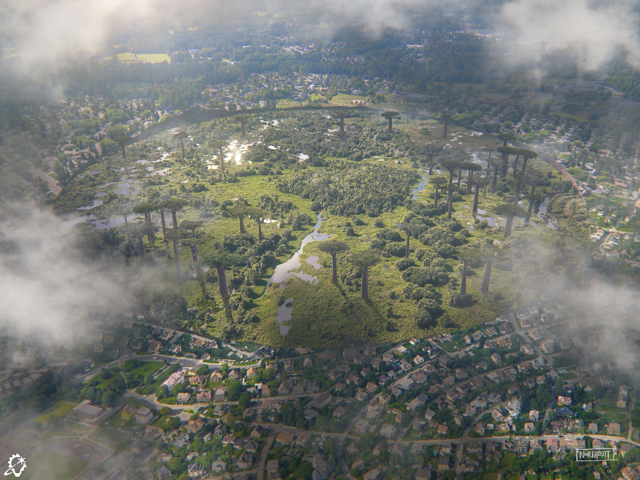
For this concept I was asked to do a wide view of a Mesozoic Era landscape nestled within the modern 1980s era of the film. Making the two distinct environments quickly read inside and outside of the circle was the goal.
I tried as hard as I could to avoid a cut-and-paste look. The two environments needed to quickly read as dramatically different, but at the same time, needed to be married together with the same believable lighting or, visually, it wouldn’t work. I spent a lot of time dialing in the atmosphere and added some subtle mist and cloud shadows that transitioned from one environment to the other. It was a good way to hold the two together. It also really helped that the terrain varied between the two environments and I could use the shadow of the uneven edge on the far side to tell the viewer where the delineation is. I highlighted some of the Mesozoic swamp water to further exaggerate how it’s different and also give the viewer somewhere to look.
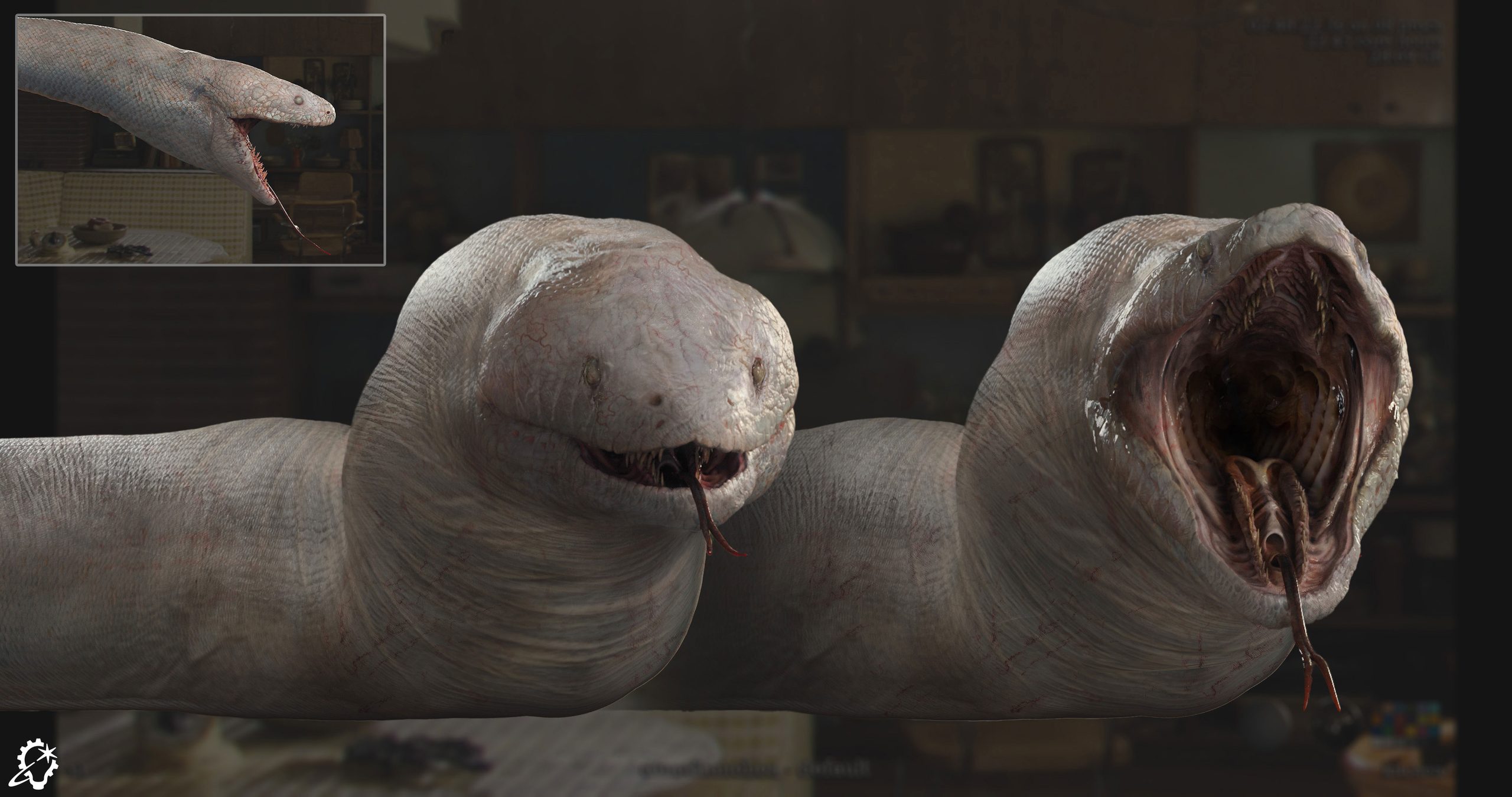
Before I came on board, Stephen Tappin and Jason Horley from the London studio’s Art Department had already explored several initial concepts. We experimented with a wide range of skin colors, patterns, eyes, and teeth. The director eventually landed on white skin with dark black eyes, which gave us the green light to start building the asset.
The final asset was created by modeler Juan de Santiago, texture artist Chris Nichols, and lookdev artist Carlos Flores Gomez. The asset team had already built a stunning model, but the director wanted to test out smoother skin with fewer scales, along with giving the snake a massively thick neck.
Using turntables provided by the asset team, I painted over the render to explore different silhouettes, levels of skin smoothness, textures, and eye and teeth designs.
Since there are no real photographs of a living Titanoboa, I gathered reference material from various snakes of all shapes and sizes. We also drew a lot of inspiration from a life-sized sculpture displayed at a museum.
My favorite detail is the texture of the snake’s skin. Unlike typical snakes covered in small scales, This design has smooth skin with fine wrinkles and visible blood vessels underneath. I think it turned out to be an interesting texture that feels almost beautiful yet eerie at the same time.
—
See the complete gallery of concept art for The End of Oak Street here on ILM.com.