ILM.com is showcasing artwork specially chosen by members of the ILM Art Department. In this installment of a continuing series, artists from the San Francisco and Sydney studios share insights about their work on the 2026 Disney production, Moana.
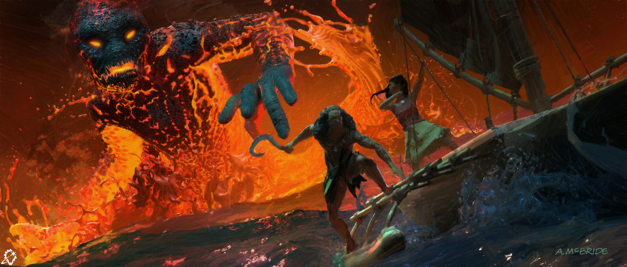
I tried to explore different looks for the character Te Kā, trying to stay faithful to the look of the character in the original animated film while also refining it to fit in a photoreal context. Initially we played with a more obscured visage for Te Kā, where the character might always be veiled in a volcanic ash cloud at first to make it feel more ominous and looming.
I looked at a lot of volcanic eruptions at night, where there is a lot of interior light from the lava within the pyroclastic clouds. The client initially wanted to explore looks that departed a bit from the animated original to fit more in the real world, but ultimately we stayed closer to the look of Te Kā in the original while adding more photorealism to its rendering.
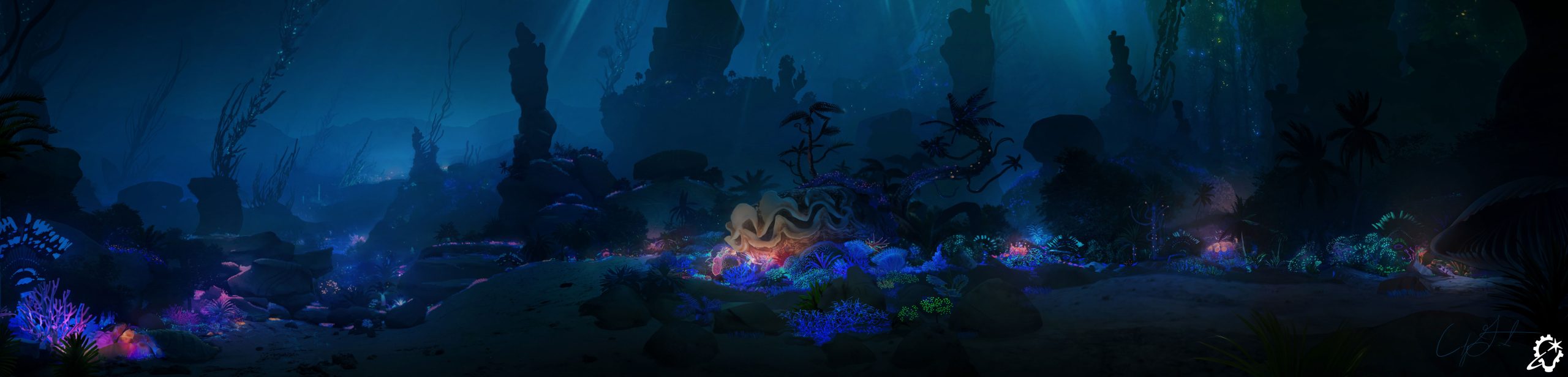
The primary goal for this piece was to define the visual aesthetic of the Lalotai forest biome situated outside Tamatoa’s cave. The key priorities included establishing a dark yet alluring color scheme that evokes a sense of stepping into a magical realm, without detracting from the vivid hues and intensity of Tamatoa’s upcoming musical sequence.
Developing this location required an additive, cross-departmental approach over multiple stages of production. The process began by identifying needs and constraints. We required an expansive subterranean vista, a dark and moody value range to build anticipation for the sequence, and essential narrative landmarks such as geysers, sea anemones, and the entrance to Tamatoa’s cave. Collaborating with key creative and technical stakeholders helped map out spatial placements in 3D, which enabled the rendering of a comprehensive panorama that captured all necessary camera information.
Scene rendering was further guided by lighting context from available live-action reference plates, where special attention was paid to maintaining a dark baseline while introducing subtle pops of value and color that support the narrative without distracting from the characters.
One of the main challenges was the panoramic composition itself. Unlike traditional single-frame compositions, capturing multiple key areas within a single panoramic shot required stepping away from conventional framing rules. A compositional hierarchy was established to balance several focal points simultaneously, trusting that tighter individual shots would naturally resolve once cameras moved into specific areas.
My favorite feature of this environment is the use of bioluminescent underlighting to reinforce depth in the scene. Taking cues from the underglow of city streetlights at night, this technique establishes scale across vast distances where ambient light is scarce, offering a clever solution that maintains an eerie, unsettling atmosphere that provides distant visibility.
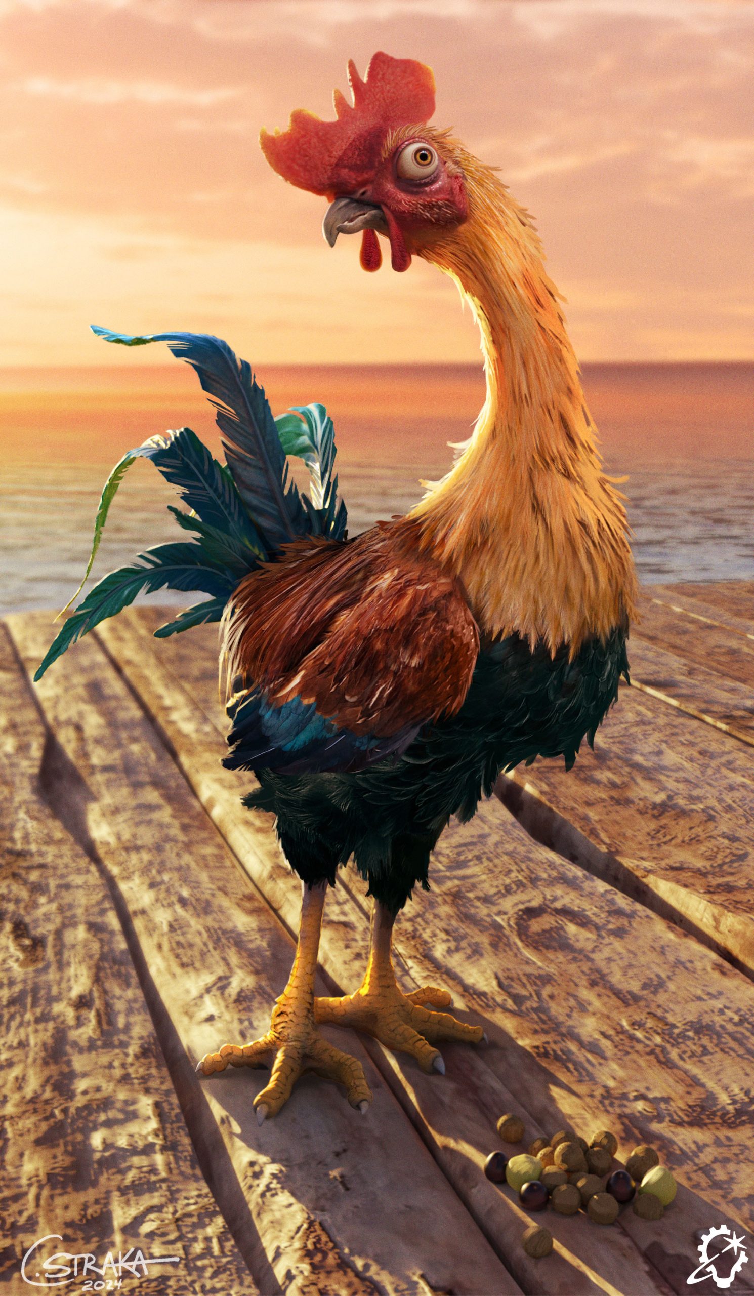
This is a photoreal Heihei! For him, it was really important to carry over the spirit of Heihei from the animated film, which for him is his gormless personality and his bugged-out eyes. The biggest challenge in translating Heihei from a stylized to “realistic” design while keeping the spirit of the character was mostly about his eyes. He’s got buggy, vacant eyes, and we quickly found that that was really alarming on a realistic chicken! So there was a lot of iteration on his eyes to find that sweet spot of stylization and realism to make him still recognizably Heihei.
As far as research, real chickens are inspiration enough; they’re very silly creatures that have a lot of variation in shape and size and color already to draw from. Heihei had to look a little pathetic, a little bedraggled. He’s not the sharpest beak in the bunch, obviously, so he walks himself into situations and needs to look worse for wear. I even gave him some messed up toes.
I always set the same goal for myself with a character; they have to be appealing, and no two characters are appealing in quite the same way. Heihei had to be appealing in the way that you feel kinda bad for him. He’s cute in a messed-up way.
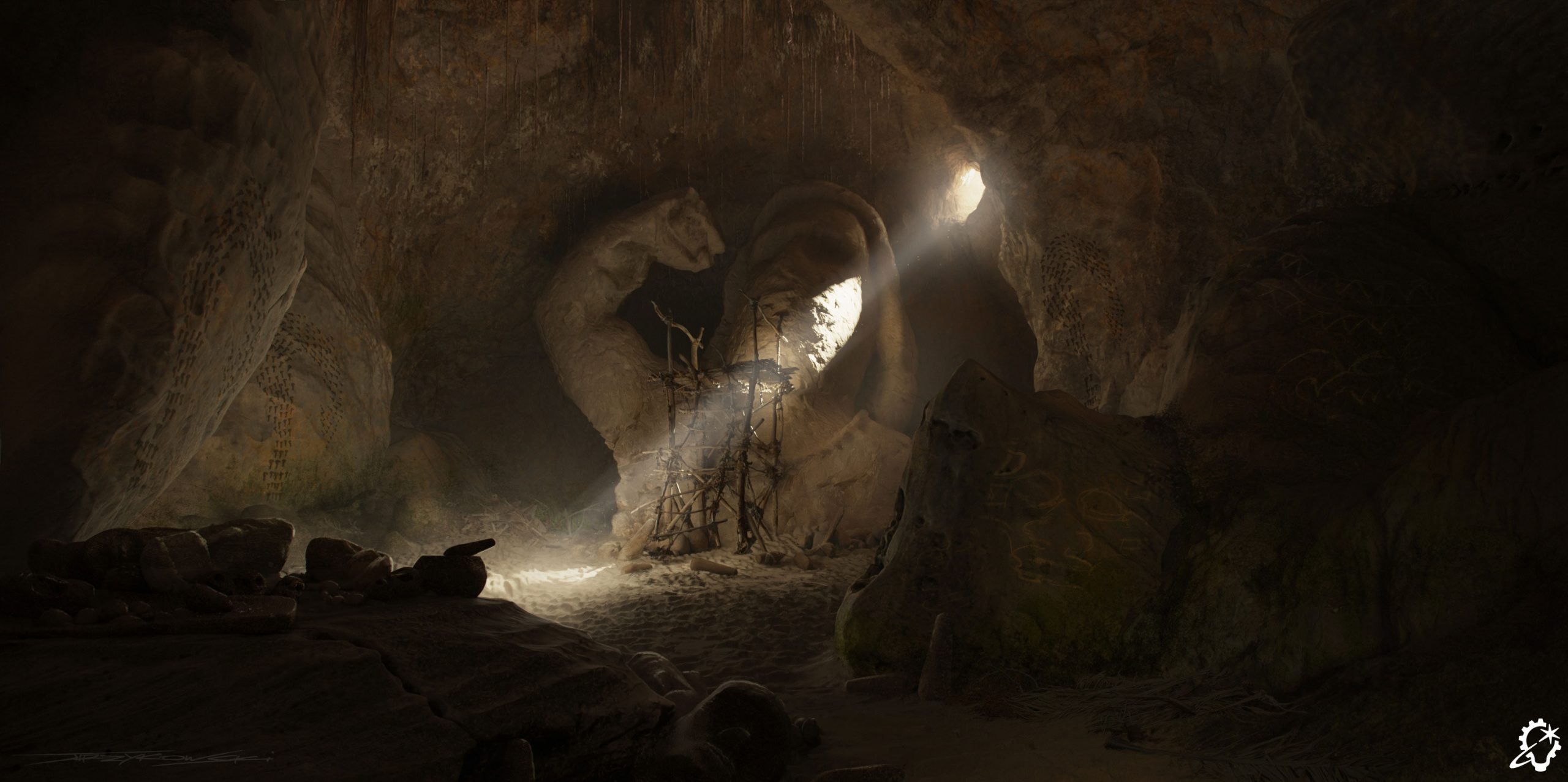
This concept design establishes the environment for Maui’s Cave, serving as both his primary residence and a workshop for his vanity projects. The brief required integrating the workshop area alongside the main focal point: a self-portrait sculpture embedded within the cave. Because the environment needed to integrate seamlessly with the live-action plate, achieving perfect lighting alignment was critical. To create a strong sense of depth and atmospheric scale, I focused on establishing a distinct foreground silhouette and clear layer separation between the scene’s elements.
The client approved the initial layout immediately but requested additional organic elements, specifically roots penetrating the cave ceiling. These revisions were efficiently integrated into the concept. While I referenced real-world cave photography for structural accuracy, the dramatic lighting was drawn from experience and other prominent, cinematic work.
My favorite aspect of the piece is the interplay between the stark foreground silhouette and the powerful background light beam, which catches the atmospheric dust to create a distinct god-ray effect.
—
See the complete gallery of concept art from Moana here on ILM.com.
Here at ILM.com, we represent thousands of artists, engineers, production staff, and support personnel working in five countries across the globe.