vfx

50 Years | 500+ Film and TV credits | 135+ Awards

SINCE 1975

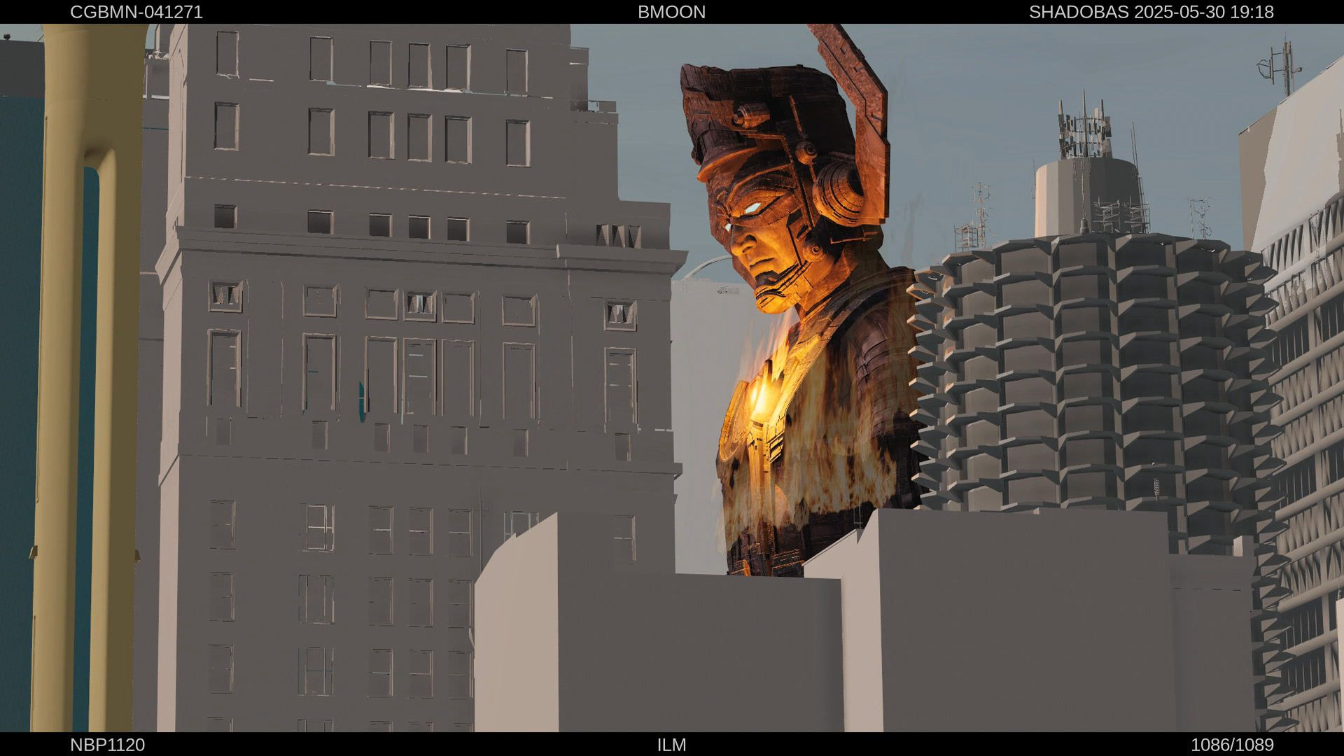
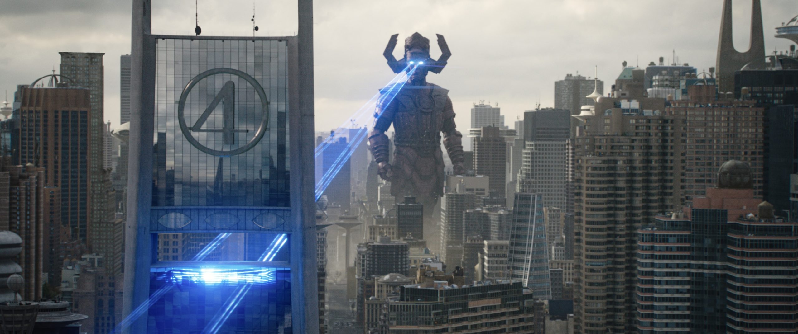
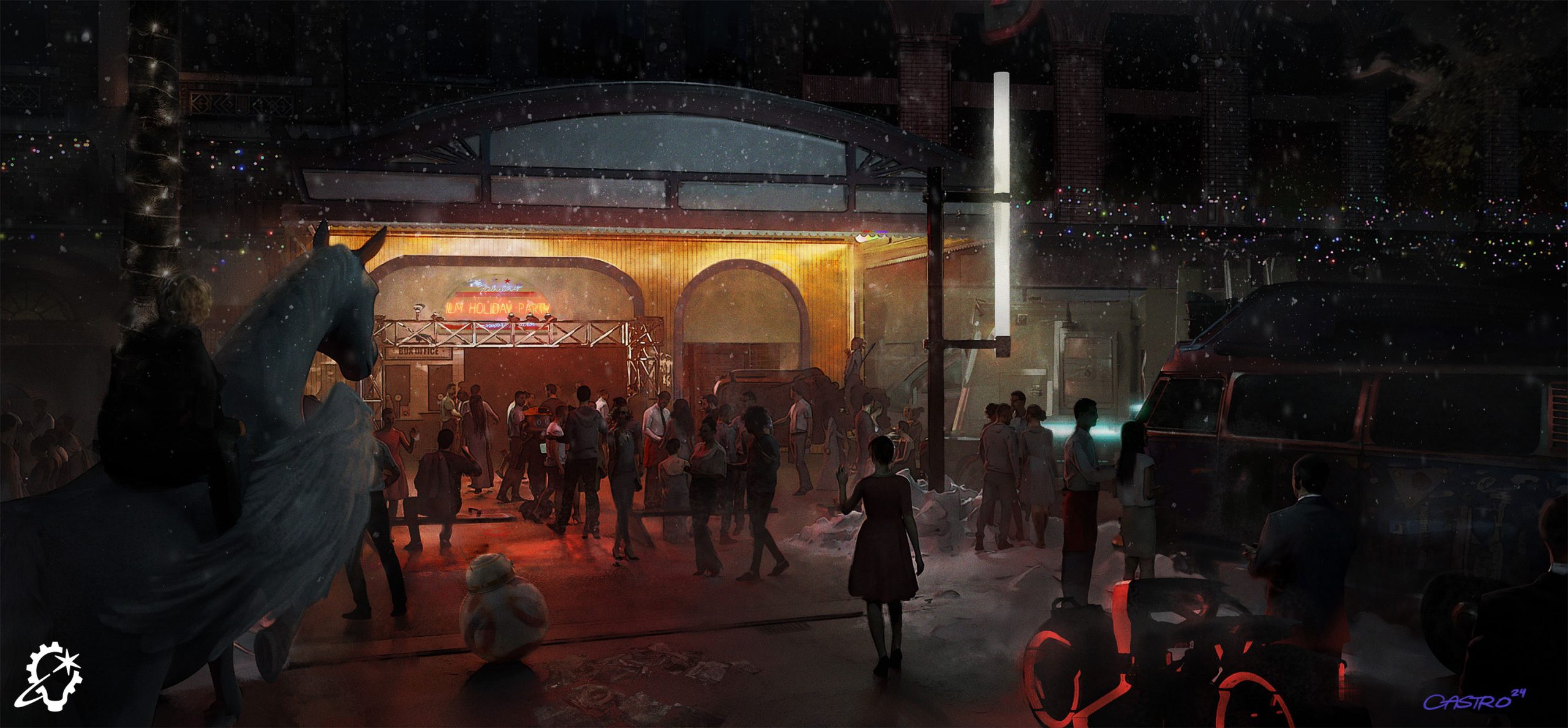
ILM creative director David Nakabayashi, along with artists from ILM’s global studios, including Aaron McBride, Cody Gramstad, Bimpe Alliu, and Chelsea Castro, reflect on the essential role concept art and storyboarding play in the filmmaking process.

By Jay Stobie

Concept art for The Avengers (2012) by Aaron McBride (Credit: Marvel & ILM).

“ILM Evolutions” is an ILM.com exclusive series exploring a range of visual effects disciplines and highlights from Industrial Light & Magic’s 50 years of innovative storytelling.

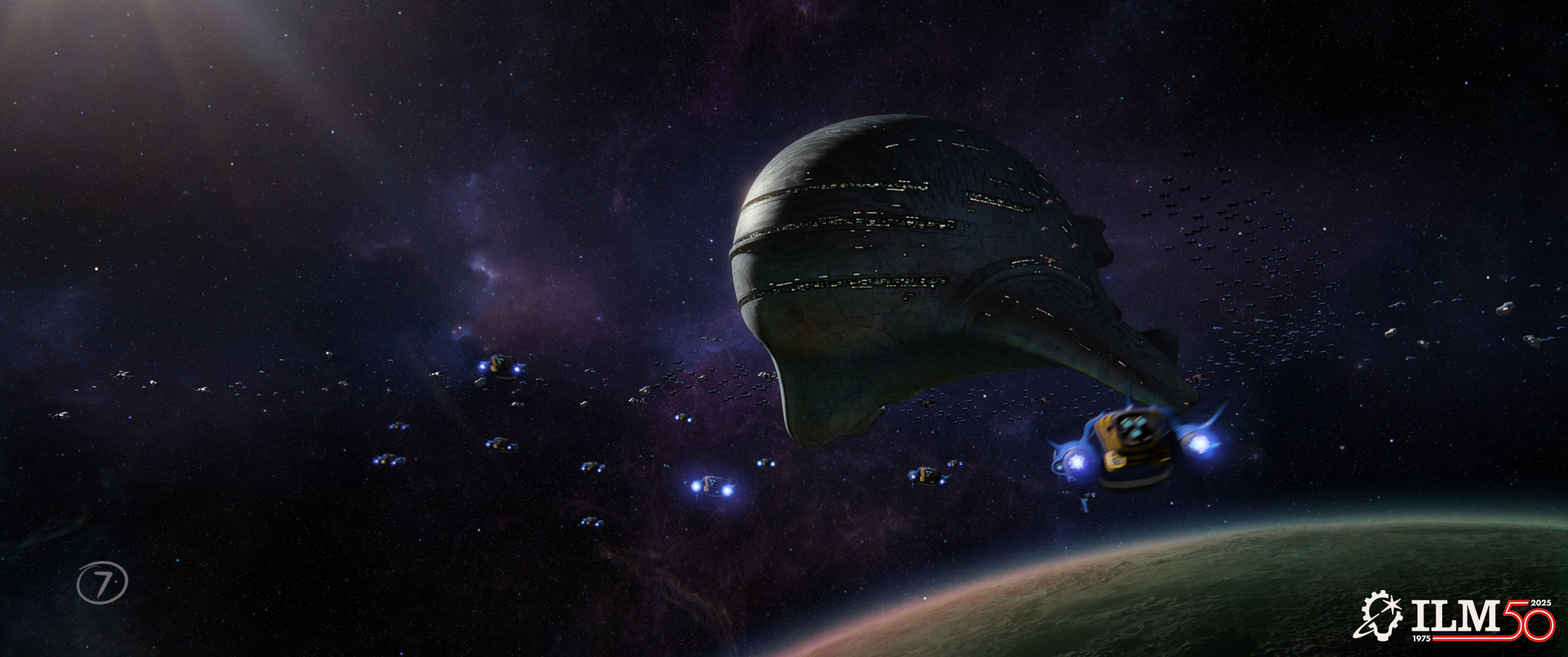
From envisioning a look for cursed pirates to plotting out space battles, Industrial Light & Magic has an unparalleled reputation for working wonders in collaboration with filmmakers to bring the stories they envision to life. Built on a 50-year legacy of talent and tenacity, ILM’s Art Department has grown into a global hub for generating and executing the ideas that immerse audiences in the worlds they see on screen. In this installment of ILM Evolutions, we’re heading back to the drawing board to focus on conceptual art and storyboarding, as this indispensable imagery fuels the creative process by visualizing a filmmaker’s ideas in the earliest stages of production.

ILM Art Department creative director David “Nak” Nakabayashi sat down with ILM.com to share his insights on the history of concept art and storyboarding, as well as his own first-hand knowledge of the craft. With an esteemed resume featuring iconic films such as The Hunt for Red October (1990), Jurassic Park (1993), Men in Black (1997), Star Wars: The Phantom Menace (1999), A.I. Artificial Intelligence (2001), Avatar (2009), Star Wars: The Force Awakens (2015), and many more, Nakabayashi now oversees art directors, illustrators, and artists across ILM’s global studios. Additionally, artists Aaron McBride (San Francisco), Bimpe Alliu (London), Cody Gramstad (Sydney), and Chelsea Castro (Vancouver) joined the conversation to highlight their careers and the latest developments in their field.

Concept art for Star Wars: The Phantom Menace (1999) by David Nakabayashi (Credit: Lucasfilm & ILM).

Ideas and Intentions

Concept art and storyboards each serve unique purposes in the production pipeline. “Concept art depicts a scene, setting, place, location, robot, spaceship, weapon – they initially come from the script along with a brief description,” outlines Nakabayashi, who emphasizes the extent to which the art helps the crew visualize the project they will be creating. “These are the key beats in the film. Concept art establishes what we’re going to be doing. We’re showing everyone that this is the movie we’re going to be making when absolutely nobody has any idea what it will look like.”

Nakabayashi cites concept artist Ralph McQuarrie’s contributions to Star Wars: A New Hope (1977) as the perfect example of such art having an inspirational impact on a film. “They based everything on his art. It fed everybody’s imagination.” Today, concept artists regularly assist filmmakers as they design and seek green lights for their films. “Sometimes, ILM will do development or spec work, where we take concept art and show the studio what the movie will be with the same intention as Ralph did. We carried that on.”

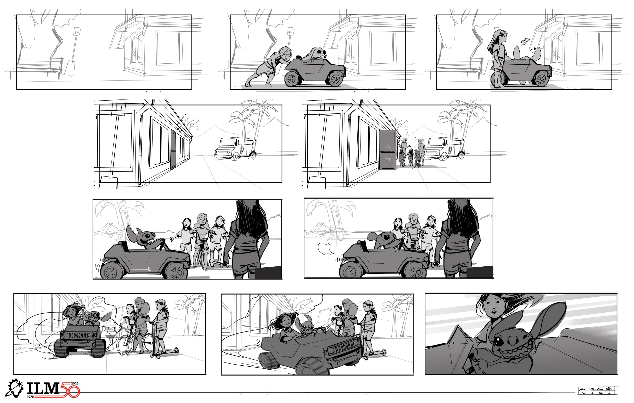
While concept art focuses on design, storyboards define the action that occurs on-screen. “Storyboards are all about the cinematic motion, the energy of a visual effects shot. That’s why ILM’s Joe Johnston was such a great foundation for this department. He would draw storyboards with arrows that would be compressed in perspective, and you really understood the depth of what he was trying to say,” Nakabayashi notes. Over time, the advent of digital animatics altered the use of storyboards. “We hardly storyboard anymore these days because animatics act as the filler, but it’s the same principle.”

From a broader perspective, Nakabayashi is quick to point to the artistic value of concept art and storyboards. “A pencil drawing, for me, is as powerful as a Ralph McQuarrie gouache painting. I get consumed by the techniques sometimes, and how a person can draw this perfect angle of a little spaceship cruising through the columns of some weird planet. To draw that sequence helps the director make decisions. It’s about visualizing and timing the film before they actually shoot anything, though it’s all changed quite a bit with the whole animatics tool set.”

Storyboards for Men in Black (1997) by David Nakabayashi (Credit: Sony & ILM).

The Importance of Art

“When you look at the scope of what ILM has done,” Nakabayashi says, “obviously Star Wars was a flashpoint for concept art and storyboards because that was the first way of getting creativity into the movie and bringing visual life into the script.”

Of course, the benefits extend far beyond what is seen on-screen. “Art is important for many other reasons,” Nakabayashi explains. “For ILM, it is also about the budgeting process. Historically, the model shop would look at storyboards and concept art and have an idea of what was coming. Production is very budget-driven. ILM would storyboard their sequences, not just for the artistic impression of it, but for logistics and production. That was how a director would communicate with the visual effects supervisor. ‘We’re going to shoot this practical and this blue screen. We can save a lot of money if we do this with miniatures.’”

Nakabayashi boils the work down to its essence, relaying, “It’s about the artists believing that the future is possible and the creation of the cliche ‘Show me something I’ve never seen before,’ which is sort of a byline we usually get from our clients. We can do that because we have the right people – people who take inspiration from the artists who came before them. That’s ILM’s culture of concept art and storyboarding. I’m not a great storyboard artist, but I can communicate and do the work. To me, that is the most important part – communicating the ideas.”

Concept art for A.I. Artificial Intelligence (2001) by David Nakabayashi (Credit: Warner Bros. & ILM).

Communicating Concepts

As an art director at ILM’s Sydney studio, Cody Gramstad (Sonic the Hedgehog 3 [2024]; Lilo & Stitch [2025]) affirms the significance of communication, stressing, “When it comes to being a concept artist, you’re not necessarily there to create artwork. You’re there to clarify and communicate ideas. My favorite part of the job is actually the conversation where I sit down with a bunch of creative people, brainstorm potential solutions to problems, and get everyone amped up as we figure out our creative direction. Painting and visuals are a part of that, but being able to talk, pitch ideas, and get people excited is one of the most important skill sets.”

Gramstad, whose parents were professional sculptors, takes the notion a step further, suggesting that prospective concept artists can bolster their abilities by balancing the dedication necessary to hone their craft with time off for real-life adventures. “Step away from your computer every now and then, have some experiences, meet people, and socialize,” declares Gramstad, placing value on the correlation between communicating ideas and relating to those around you. “It’s a lot easier to work with someone who has gotten out in the world and brings those stories into their artwork.”

Concept art for Lilo & Stitch (2025) by Cody Gramstad (Credit: Disney & ILM).

The ILM Influence

Turning to Industrial Light & Magic’s unique place in the history of concept art and storyboarding, Nakabayashi states, “ILM is special because it all sort of started here. It’s special because of the people who believed and put their foot down – Colin Cantwell, Ralph McQuarrie, and Joe Johnston. There were others on the outside, like Syd Mead and Ron Cobb, all these illustrators who were doing sci-fi stuff, but ILM was the first one to take the visual effects art department and make it something that everybody wanted to be.”

San Francisco-based senior art director Aaron McBride notes ILM’s post-Star Wars permanence as a standout achievement for the company. “Before ILM, visual effects departments would start up for the duration of a film and be temporary. When the film was over, everyone would get scattered. It was almost nomadic,” McBride mentions. “There was a demand for the work that ILM was doing, and ILM was able to advance technologies because it was kept intact.”

By the time of Star Wars: Return of the Jedi (1983), Nakabayashi explains that directors began approaching ILM for innovative films like Poltergeist (1982), The Goonies (1985), Cocoon (1985), Terminator 2: Judgment Day (1991), and many others. From crafting concept art that gave those films their “first breath of life” to “feeding production with ideas,” Nakabayashi views the ILM Art Department’s past with distinction. “Historically, we’ve had some of the best concept artists ever – Doug Chiang, Harley Jessup, John Bell, Terryl Whitlach, Christian Alzmann, and James Clyne. A lot of the artwork that they created determined whether or not a movie was made. That kind of talent, to me, is the greatness of the department.”

As the visual effects art director on The Phantom Menace, Nakabayashi saw connections between his work and that of his predecessors. “We had all this concept art, and part of my job was to bring it into the real world. That’s what the ILM Art Department has always been at the forefront of back to the days of Joe Johnston because he wasn’t even a storyboard artist when he started. He also got into the model shop and built models. He loved making miniatures and setting up the stage. It was kind of the birth of the visual effects art director. We followed along that path. It’s not just doing the drawing or coming up with an idea, it’s implementing it, as well.”


Executing the Ideas

Nakabayashi recalls his experience collaborating with director Barry Sonnenfeld on Men in Black II (2002). “I was tasked to take a trash can and turn it into a killer robot. I liked the idea that it opens up like a flower, and it comes with multiple gun turrets that are not necessarily normally situated in a standard military platform. Maybe it’s more like an orchid. With a few changes, the design went to computer graphics, and I helped develop it in dailies with the modelers, painters, and animators.”

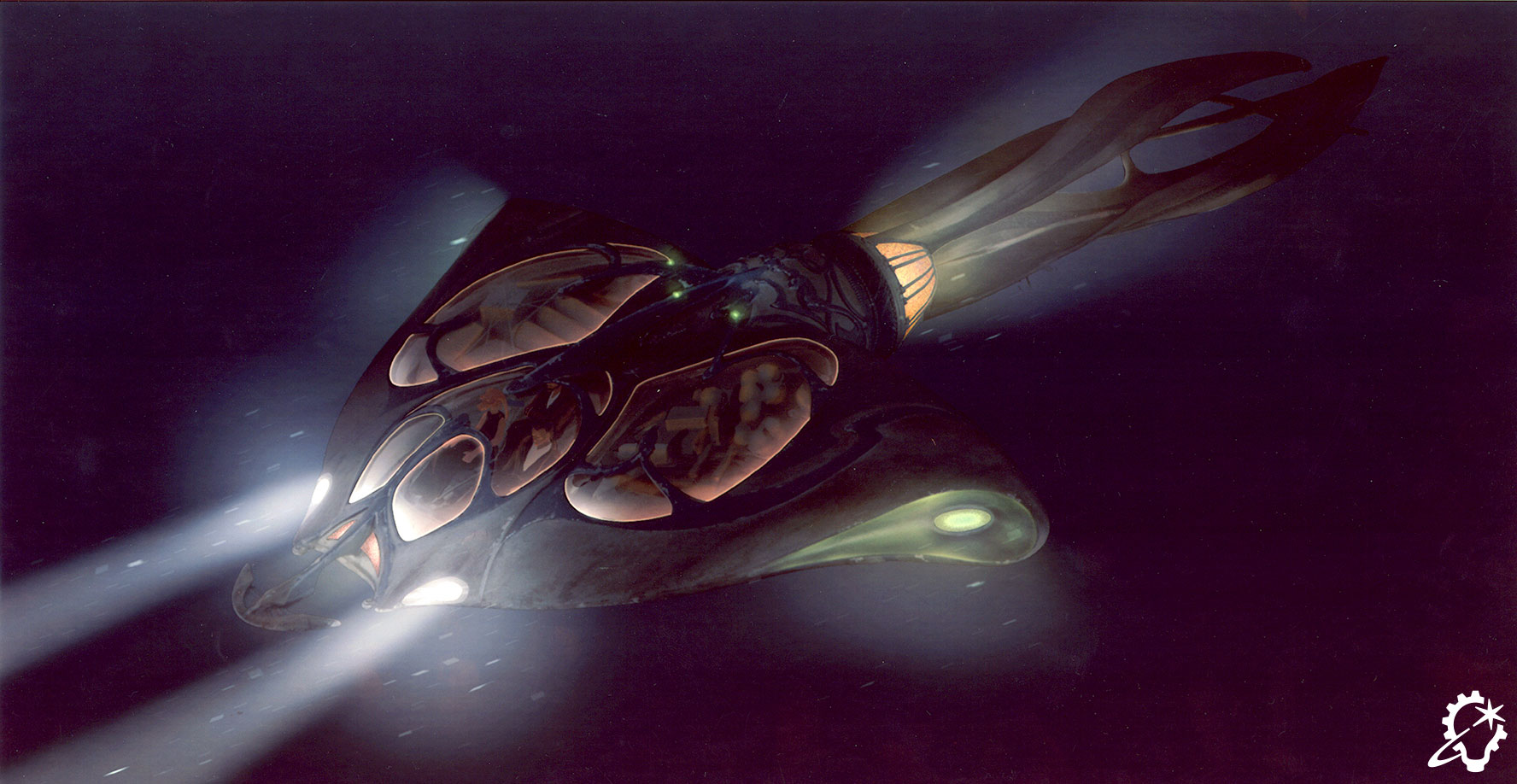
Turning to his time on A.I. Artificial Intelligence, Nakabayashi posits, “Those worlds – Coney Island, the Rouge City, an underwater theme park – were all absorbed through storyboards that Chris Baker did with Stanley Kubrick for a couple years. We started with that as our inspiration, and then we started doing colored artwork – paintings, drawings, some storyboards for shot ideas – and pitched those to [visual effects supervisor] Dennis Muren and numerous other people. It became this whole world of miniatures, and it was also on the brink of the digital component coming into the workflow. There’s a real marriage of practical effects, which I will still say is the most fun to work on, with the digital component.”

Envisioning new worlds still requires references that ground them in reality. For The Phantom Menace, Nakabayashi saw a dry South Dakota riverbed as a perfect reference for the bottom of Naboo’s oceans, proposing a fresh take on how to approach the Gungan city to Dennis Muren. “I go, ‘What about a booming shot? You track over and dip down to see the top of the city as opposed to always looking up. We’re going underwater, right?’” Such insight and inspiration impressed director George Lucas. Nakabayashi touches on the Gungan shield that comes down on the battlefield, continuing, “I had this idea – it was a parasol and an umbrella, kind of like a sprinkler. George loved it.”

Concept art for Men in Black II (2002) by David Nakabayashi (Credit: Sony & ILM).

Turning the Tide

As is often the case with the work ILM tackles, changes manifested for the art department over the years. Nakabayashi indicates Adobe Photoshop – the editing software co-created by John Knoll, ILM’s current executive creative director and senior visual effects supervisor – as technology that revolutionized his field. ILM even dabbled with Photoshop during its earliest days. “With Death Becomes Her (1992), Doug Chiang took plates and drew the effect of Madeline Ashton [Meryl Streep] having a broken neck. He took pictures of people and we altered them into these effects-type things.”

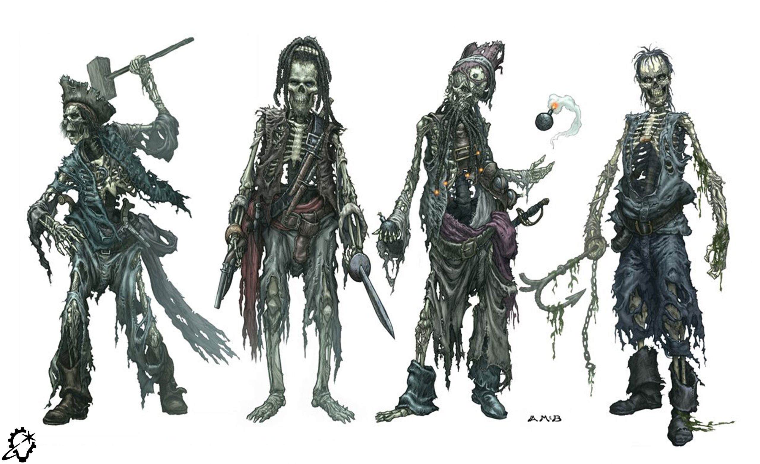
Along with Photoshop’s availability, concept artists continued drawing with traditional tools like pencils, markers, and paper until ILM received the call for Pirates of the Caribbean: The Curse of the Black Pearl (2003). “The director, Gore Verbinski, was like, ‘These are great drawings, but I want to see what it looks like in my film. Don’t give me a pencil sketch,’” Nakabayashi says. The filmmakers wanted a desiccated – but not bloody or gory – aesthetic for the cursed pirates, so Aaron McBride test-photographed beef, turkey, and salmon jerky.

“The turkey jerky felt the best because it scattered a slightly lighter color and was the closest to the right muscle striation texture,” muses McBride, who credits his shyness at speaking up in dailies for the process, laughing, “I pushed to do the concept art as photo-realistically as possible mostly because I wanted to be able to point to the art and not have to say anything.” As Nakabayashi explains, “Aaron took a plastic skull, a bunch of costumes, and turkey jerky, scanned it, and put all these textures on the face. This gave Gore a direction for his movie, and it was a huge moment. Everybody was trying to copy Aaron after that. We still drew and did other traditional methods, but all of a sudden, everything had to be photoreal.”

Concept art for Pirates of the Caribbean: Curse of the Black Pearl (2003) by Aaron McBride (Credit: Disney & ILM).

Another Dimension

“Getting photoreal is a lot easier now with three-dimensional tools,” Nakabayashi adds. “A quick sketch might happen, but a lot of our artists are excellent at building and designing 3D packages. It’s a great transition point from concept art to visual effects work, because of the digital assets.” 

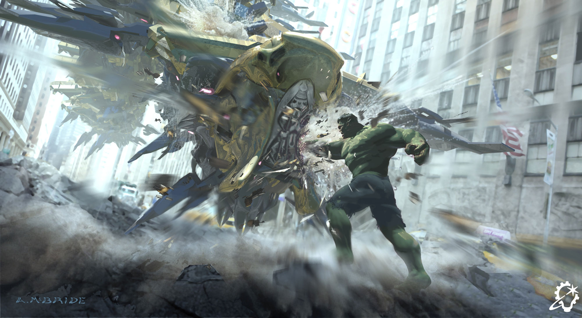
As an intern, one of McBride’s first jobs actually involved developing photos taken for The Mummy (1999) and scanning them into a computer to be painted. He later experimented with 3D on Star Wars: Revenge of the Sith (2005), and then leaned into it while working on the suit-up machine in Iron Man (2008). “I didn’t have the skill set to do mechanical drawings, so I blocked it out in 3D to figure out how some of the panels and other mechanical things moved,” chronicles McBride. For The Avengers (2012), McBride designed a snake-like creature that dropped soldiers into the Battle of New York. Inspired by the Greco-Roman aesthetic crafted by the Marvel art department, McBride envisioned the troop transport “as a Roman galleon, almost like a biomechanical being, which had fins that were like oars.”

“We have a couple artists in the department who are sort of hybrid artists,” remarks Nakabayashi. “They do 3D, 3D animation, compositing, and things like motion graphics. Sometimes, we want to bring a flat, still drawing to life, and you’ll do a quick projection. Making something move is a huge component for success in your pitch meetings. The animatics these days are so good and so accurate that you can’t deny the distinction. They’re more productive than storyboards.”

Concept art for Indiana Jones and the Kingdom of the Crystal Skull (2008) by David Nakabayashi (Credit: Lucasfilm & ILM).

A Generational Shift

Having contributed to a variety of ILM projects as an art assistant, Chelsea Castro is now making her mark on the next wave of ILM shows as a junior concept artist at the Vancouver studio. Castro, who finds inspiration for her art in everything from books to video game soundtracks, strikes a balance between traditional methods and cutting-edge techniques. “Coming from a 2D background, I tend to sketch as much as I can, and then move on to photobashing [combining photographic and CG elements together into a new piece of art] and texturing,” Castro shares. “Afterwards, I fully build out as much as I can in the 3D software that I’m using. Then I go back into 2D to tweak everything and finalize them.”

Castro sees a fundamental evolution when it comes to storyboarding, explaining, “I feel it has gotten a lot more immersive. We still do the classic line art, but now that you can build whole 3D worlds, I’ve seen storyboards done completely in 3D. Sometimes the artists take their scenes and show it to the client with different cameras set up, like it’s their own film set. The game has changed, but the spirit of it is very much the same,” Castro concludes. “Brainstorming and getting ideas out is great with the new technologies. The refinement is where you fall back on your foundations, techniques, and the skills that you’ve built up.”

Cody Gramstad adds, “3D gets you closer to real-world accuracy. Inherently, as we’re hand-painting things, we have a tendency to make artistic cheats. It’s not necessarily a bad thing in illustration, as we can push that to enhance emotion. But, especially in a live-action context, reality is what makes the world believable – 3D is very useful for that because it takes calculations from the real world. For example, how lighting actually bounces off of different surfaces.”

Bimpe Alliu from ILM’s London studio observes that increased accessibility to 3D software among young people is as vital as the technology itself. “I’ve mentored teenage students who are learning 3D, picking up software like Blender, and learning to model and sculpt,” Alliu details. “Regardless of the gradual transition from hand-drawn paper storyboards to digital storyboards, as well as individual artists’ preferences for 2D or 3D drawing, a combination of those skills are always used to do the work to the best of your abilities,” Alliu asserts. “More people are using different techniques in order to bring together their storyboards. It’s harmonious.”

Concept art for a company holiday card by Chelsea Castro (Credit: ILM).

A Global Approach

As the ILM Art Department’s creative director, Nakabayashi embraces the modern tools bringing our world closer together as he oversees and collaborates with artists at ILM’s international studios. “I’m very much hands off, and I let the artists do their job,” opines Nakabayashi, who jokes, “When something goes wrong, I get called upon.”

For Cody Gramstad, being an art director in ILM’s Sydney studio means handling multiple shows simultaneously. “I meet with visual effects supes and give guidance for the shot sequences and how they’re progressing, and at the same time, provide feedback to the Sydney art department team to guarantee they are targeting the supervisors’ and directors’ goals.” Gramstad points out that the process is often a worldwide effort, regularly involving colleagues at ILM’s other global studios. “We support each other and make sure that we’re getting the work done at the level we need to. Nak and [director of art and development] Jennifer Coronado make certain that standards are equal across the different studios.”

However, informal conversations are just as productive. “There are a lot of art posts and chats. Keeping people inspired becomes really important, and it’s great to have artists around you that can contribute to that. Sometimes, we do design competitions, too,” Gramstad proclaims. “The art directors also sit with the artists every couple months. We break down where we can improve and how to adapt our approach as we move forward on future tasks. There are so many different shows across the world, so they’re all learning different lessons. It takes direct communication to make sure those lessons get spread to all of our studios.”

Concept art for Lilo & Stitch (2025) by Cody Gramstad (Credit: Disney & ILM).

Timelines and Tasks

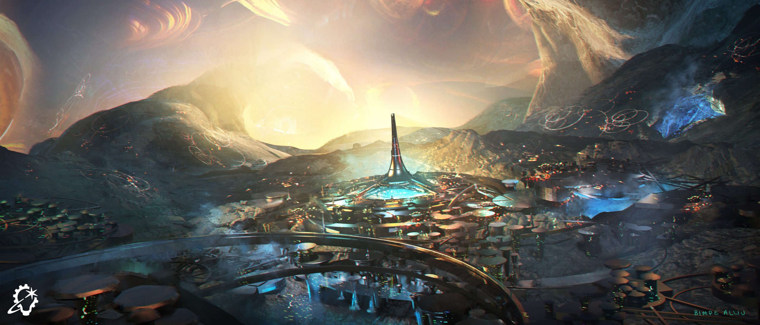
With video calls continuing to bring our world closer together, ILM’s concept artists are able to communicate with clients and take on projects across multiple continents while working from their respective spaces at ILM’s global studios. This ability allows artists to be flexible in terms of their involvement on any given series or film. “Sometimes, we can be on a show for a day,” says Bimpe Alliu, who estimates that the longest time she spent on a project was her two-year tenure on The Marvels (2023).

Similarly, the timeline is naturally impacted by the stage at which the artists are brought on. A fan of anime who started out by drawing her friends as Dragonball Z characters in her youth, Alliu elaborates on the depth of her tasks, advising, “It can be pre- or post-production. We can be working on plates or creating assets for ourselves. With a recent character design, I was given the previs model and a scan of the actor, so I took those, mishmashed them together, and then detailed the clothes on top of that.”

Watching Iron Man inspired Alliu to pursue her current career, so working on WandaVision (2021) was a full-circle moment for the self-described “massive nerd.” “For the sequence where The Vision is disintegrating, I was designing what the disintegration effects would look like. Not just the space, but also The Vision himself,” Alliu recounts. On ABBA Voyage (2022), Alliu was brought on so early that she “was designing what the room where ABBA themselves would be recording and filming all their motion capture stuff would look like. I even designed baby dragons for a TV show called Lovely Little Farm (2022). They made them into little maquettes, so that was the first time that anything I designed got made physically.”

Concept art for Ant-Man and the Wasp: Quantumania (2023) by Bimpe Alliu (Credit: Marvel & ILM).

A Legacy Earned from Lessons Learned

Despite all the changes that have transpired with concept art and storyboarding over the last half-century, ILM’s history and prestige set it apart as it moved into the present and looks to the future. “ILM has a support structure and legacy that a lot of other studios don’t have. ILM can nudge newer people in the right direction as they learn the lessons that their predecessors have discovered in the past,” Gramstad reveals. “There’s also the sheer amount of variety at a place like ILM. Since so many film studios come to ILM as a source of visual effects experience, we get a huge range of projects. So, more so than any other studio in the world, I think that ILM allows people to be super versatile. One morning, we’ll be working on animated silliness with Sonic the Hedgehog, and two hours later, we’re doing a grounded oil rig on an ocean that has to be absolutely photorealistic.”

ILM’s academic aura benefits its up-and-coming and veteran personnel equally, as Bimpe Alliu resolves, “You don’t have to be the finished article. You’re going to constantly grow, and ILM is always looking for potential. It helps when you’re around people that you can learn from.” Chelsea Castro beams, “At ILM, you feel so included, and everyone shares their time with you. It’s amazing to have access to all these people around the world.” Aaron McBride, who has been with ILM for 27 years, praises ILM’s multi-generational nature for making him a more well-rounded artist, concluding, “New techniques can inform older ones, and older techniques can inform new ones. I’m inspired by what younger artists are doing, and I think it’s important not to dismiss any aesthetic because it’s new to you.”

Concept art for The Sandman (2022-25) by Bimpe Aliu (Credit: Netflix & ILM).

Jay Stobie (he/him) is a writer, author, and consultant who has contributed articles to ILM.com, Skysound.com, Star Wars Insider, StarWars.com, Star Trek Explorer, Star Trek Magazine, and StarTrek.com. Jay loves sci-fi, fantasy, and film, and you can learn more about him by visiting JayStobie.com or finding him on Twitter, Instagram, and other social media platforms at @StobiesGalaxy.

The ILM creative director and Jurassic‘s production visual effects supervisor talks dinosaurs and collaborating with Gareth Edwards.

By Mark Newbold

(Credit: ILM & Universal).

Jurassic World Rebirth (2025) has grabbed global audiences by the hand and pulled them back into the savage world of the Jurassic film series, three years after Jurassic World: Dominion (2022) completed the second Jurassic trilogy. Rebirth has also changed the direction of the franchise, focusing on the genetic heritage of the incredible dinosaur creations.

Taking place on the fictional island of Île Saint-Hubert in the Atlantic Ocean, Rebirth shows the terrifying cost of unchecked genetic manipulation as we meet familiar creatures, including the armored Ankylosaurus, the chicken-sized Compsognathus, the crested, acid-spitting Dilophosaurus, the aquatic Mosasaurus, the F-16-sized Quetzalcoatlus, and, of course, Tyrannosaurus rex (albeit a much beefier one than the classic Rexy).

Along with these classic creatures are new franchise stars Scarlett Johansson as Zora Bennett, Mahershala Ali as Duncan Kincaid, Jonathan Bailey as Dr. Henry Loomis, and Rupert Friend as Martin Krebs. Together, they encounter distinctly unfamiliar dinosaurs, including the enormous Distortus rex, the towering Titanosaurus, and the horrifying Mutadon. It’s a one-way trip for anyone visiting the island – but in the capable hands of director Gareth Edwards (Rogue One: A Star Wars Story [2016] and The Creator [2023]) and visual effects supervisor David Vickery (Jurassic World: Fallen Kingdom [2018], Jurassic World: Dominion, and Mission: Impossible – Rogue Nation [2015]), it’s exactly what was needed for a pulse-pounding adventure in the grand Jurassic style.

Director Gareth Edwards, a frequent ILM collaborator (Credit: Universal).

ILM.com had the chance to sit down with David Vickery to discuss the visual effects of Jurassic World Rebirth. We started by looking at how the visual effects field is viewed today compared to a decade ago, when Jurassic World (2015) broke box office records and made the world stare in awe at dinosaurs all over again.

“The visual effects industry has grown in many ways,” says Vickery. “There’s a lot more trust placed in us than there used to be, even 10 years ago. Back then, visual effects were seen as something of a necessary evil – but now we find ourselves much more readily accepted as a department on set. Nowadays, other departments – whether it’s hair, makeup, costumes, special effects, stunts – rely on visual effects to guide how to film something because they know how vital it is that the visual effects work properly at the end of the process. They want to make sure what they’re doing is conducive to how we’re going to work, and it always used to be the other way around, so that’s been a refreshing change.”

On the surface, the art of visual effects may appear to be made up of equal parts skill, ingenuity, knowledge, and creativity, but the field also requires a healthy dose of collaboration, as Vickery explains.

“Over the years, I’ve found myself not trying to figure out how to do visual effects but rather figure out how not to do visual effects, and, as best I can, enable people on set to get what they need. You rely on the expertise of the crew. The camera operators and special effects technicians might have been in the industry for 30 years, and at ILM, we’ve got a bunch of talented artists that are generalists by nature, so that level of trust in visual effects has definitely grown.

“There’s a narrative in the press about how everything is done in-camera,” Vickery adds. “Well, yeah, everything is shot in camera because you can’t ‘shoot’ visual effects. What you’re trying to capture is as many practical things on set as you can because you can’t go back and get it in post-production.”

(Credit: ILM & Universal).

A veteran of three Jurassic adventures (three and a half if you include the 2019 short, Battle at Big Rock, directed by Colin Trevorrow), Vickery has worked with three directors (Trevorrow, J.A. Bayona on Fallen Kingdom, and Edwards), and that means differing styles and methods in bringing the dinosaurs to life.

“I find it interesting, the experiences I have with crews, directors, and producers who want to make their films in different ways,” he explains. “Colin relied heavily on animatronics for his films [Jurassic World and Jurassic World Dominion]. Gareth is much more comfortable with visual effects and wanted a consistency in his aesthetic by relying on effects for all the creatures and dinosaurs. On top of that, there’s a layer of what’s fashionable in movies at the moment. For a while, it was very ‘in’ to be shooting on green screen, or it was fashionable to use animatronics, and that’s what the public wanted to see. Now there’s a desire to see things filmed on location, and there’s an acceptance of visual effects, so filmmakers respond to that in the way they make their films. It’s interesting to see the evolution in how things are done.”

The style and flair shown by Gareth Edwards in his previous films – and his obvious affection for giants, as evidenced by Godzilla (2014) and Monsters (2010) – led producer Frank Marshall and executive producer Steven Spielberg to offer him Rebirth’s directorial seat in early 2024. And with that came a rare skill set for a major franchise film: a vast working knowledge and understanding of visual effects.

“Gareth’s a very distinctive filmmaker,” explains Vickery. “He comes from a visual effects background, so he truly understands how things work. He’s the type of filmmaker that creatively evolves his thought process as a project develops, so he’s totally happy to change his approach and defer some decision-making to later down the line. Visual effects is a great opportunity for him to do that, but he also likes reacting to natural things that happen on the day.”

(Credit: ILM & Universal).

Along with his knowledge of effects, Edwards is also known for his guerilla filmmaking style, something Vickery would learn more about from an Oscar-winning special effects supervisor.

“We worked with Neil Corbould [special effects supervisor for 2000’s Gladiator and Edwards’s The Creator, among others] on Rebirth,” Vickery says, “and I spoke to Neil beforehand because I was trying to find out what Gareth is like, and he said Gareth shoots really long takes. I’d heard of 20-minute or 30-minute takes on Rogue One, but how do you plan for that? How do you rig special effects knowing that Gareth’s going to roll for 20 minutes? Neil said they put a load of stuff out there – loads of mortars, loads of pots, loads of bangs, loads of fires and squibs, and they fired them off. They gave him something to work with, and Gareth reacted to that. Gareth wants to be in the real world, to react to what’s in front of him, and then capture the best version of that.”

That drive to find the best moments, to allow the actors to add their own essence to their characters, and to rarely say “cut,” extends to the visual effects realm as well, where Vickery found Edwards was every bit as open to allowing ILM to find those moments.

“He’s very open with his creative briefs and gives ILM a lot of creative flexibility in how to work,” says Vickery. “He doesn’t look at something and say, ‘What’s wrong with this?’ At ILM, we look at something and try to understand how we can make it better, and I think that’s why we stand out in the visual effects field. We’re trying to figure out how things can be made better, and Gareth does the same. He looks at something and in his head it’s a 7 out of 10, but what do we have to do to make it a 10 out of 10? What do we have to do to make it an 11 out of 10? He’s always going to wonder what would happen if we pushed it a little bit more. Does it break, or is it better? He doesn’t want to leave any creative opportunities on the table.”

Edwards’s naturalistic style formed the bedrock of the film, giving Vickery and the ILM team an opportunity to do things differently, opting for realistic substance over easier, stylistic options.

“Gareth said early on that he never wanted to get into a situation where the dinosaur walks into shot, strikes a pose, and roars. That feels staged,” Vickery says. “When you photograph animals in nature, they do whatever they want, so there were a few golden rules that he gave us. We should never animate a dinosaur unless we had reference of a real animal to use. It didn’t have to be doing exactly what the dinosaur was doing in that moment because you can’t find real dinosaur animation reference, but it could be something like a large animal looking scared or startled. Gareth said if we do that, he wouldn’t question whether the animation or the intent of the performance was correct, so he was very good at not micromanaging.”

(Credit: ILM & Universal).

Another advantage of Edwards’s understanding of the effects tool kit was that it gave Vickery and his team a framework to build the film around before the work began.

“He would construct an edit for us, but because he understands visual effects, he also understands the possibilities of what the shots can be,” notes Vickery. “We often found that the first time you watched them, it was difficult to understand how he wanted the performances of the creatures to play out, but you started to work on it and put it together, and suddenly we were like, ‘Oh yeah, that really works, the timing here’s really good.’ That’s how his visual effects background plays to his strengths because he can see the finish line much more clearly in his head than most other creatives.”

With all the advantages of a director understanding one of the key elements of the production, the process of building the film forged on.

“The first process we go through is laying the shots out and blocking in very basic key frame animation,” says Vickery. “That process takes a long time because it’s all about getting the composition of the image correct. In post-production, 60% or 70% of our time was spent on layout and animation, and then the rest – composites and lighting – was relatively quick. Gareth’s a great cinematographer in his own right, so he’s able to see when the composition of an image works well, and then ILM takes it from there.”

The presence of a T. rex is a Jurassic tradition, dating right back to the 1993 original and through every iteration since. While the Tyrannosaur isn’t always the “star” of the film – as in Joe Johnston’s Jurassic Park III [2001], which introduced Rebirth star, the Spinosaurus, or Jurassic World’s Indominus rex, Fallen Kingdom’s Indoraptor, and Dominion’s Giganotosaurus – the queen of the lizards remains ever-present. With Rexy, the original T .rex from the first six films not present in Rebirth, her starring role went to a new, even more terrifying Tyrannosaur. The new star appears in a sequence inspired by a scene in Michael Crichton’s original 1990 Jurassic Park novel where Alan Grant and John Hammond’s grandchildren, Tim and Lex Murphy, raft their way back to the main complex on Isla Nublar. It presented more than a few challenges.

(Credit: ILM & Universal).

“The T. rex boat inflation scene was an idea Gareth had really early on,” Vickery says. “We looked at it thinking, ‘How do you inflate a raft, have it pop up, and then like a magic trick, make the T. rex vanish?’ On the day, we had a special effects raft that inflated, but it didn’t fit into the bag, so it was laid out and they popped it up, and it inflated and fell into the water, but it didn’t stand up on its end. It took much longer to inflate, so that was always designed to be a reference for us, and then our effects artists worked on that and created this wonderful piece of dynamic simulation that had to be choreographed as a piece of animation to feel naturalistic, slowly dropping into the water. We spent a long time on the simulation of the raft. As a supervisor, that was a thing of absolute awe-inspiring wonder for me. The artist that worked on that simulation did such an amazing job because it’s an incredibly complex piece of dynamics and timing. We ended up with a subtle piece of animation where, just as the raft is inflating, you start to see the T. rex moving and start to get up.”

Bringing this adaptation of a classic Jurassic scene from the pages of the novel to the big screen required some ingenious thinking, especially given the presence of a sleeping T. rex and a noisy inflating raft.

“We played around with the T. rex a number of times because we had to walk a very thin line,” notes Vickery. “If you thought the T. rex was awake, you’d wonder why it didn’t see the girl and eat her, so it had to look like it was asleep, but not so fast asleep that it wouldn’t have the ability to wake up and move off.” Timing was everything. This newer version of the T. rex wasn’t as simple as reskinning the existing T. rex asset; this required a completely new “build” taking into account the larger frame and bulk of this Tyrannosaur (to say nothing of its ability to swim). Vickery has nothing but praise for the team that worked on the project.

“The creature department has a brilliant understanding of anatomy; they could be biologists. We had a modeler on Jurassic World: Dominion who trained as a palaeontologist at university, but it’s more than just figuring out how its muscles should jiggle and how its skin should wrinkle. That gets you to the equivalent of a shop mannequin version of a dinosaur. The challenge is to imbue character into the creature, so it feels unique amongst its own species.” 

“Gareth would say, ‘I want to see 100 T. rex’s perform and choose the best one,’” Vickery continues. “He wanted the Robert De Niro version, not the shop mannequin, so how do we imbue that kind of character into it? Part of it was to go back to the animation reference, so you really understood the creature’s intent, and part of it was making sure it’s performing in a naturalistic way.

“Gareth explained how, if you block a sequence with an actor and the brief is you come in the door and you sit down at the desk and you pick up the pen, then the person who’s the stand-in for the day will walk in the door and sit at the desk and pick up the pen,” Vickery adds. “But when the actor comes in, they’ll walk in the door and they’ll give him a mean look and they give it the De Niro treatment and you get a real performance. We always look for that level of performance, and that goes all the way back down to the anatomy of the creature. Do you know where its muscles are firing to give tension in the neck or in the legs? Gareth was interested in things that a creature would have that weren’t preserved in the fossil record, so that gave us creative licence to add extra fat layers or muscles, or waddle under the neck or flaps of skin in different places that would help give it character, which the shop mannequin version wouldn’t have had.”

(Credit: ILM & Universal).

In Jurassic World Rebirth, there’s an extra layer to the story of the dinosaurs; alongside the “classics,” there are genetic mutations, creatures created while striving to find the perfect mix of DNA – both biologically ancient and contemporary – to create the attractions demanded in the parks. As Vickery explains, these creatures were never intended to be seen by the public.

“It’s not like Jurassic World, where they were trying to create attractions for the park. These are failed experiments to create truer genetic dinosaurs. Before they figured out the exact strands needed to get a Velociraptor, they didn’t get the combination right, so that’s how we got the Mutadon. You’re supposed to feel a bit sorry for these creatures. It’s like Sloth in The Goonies [1985], initially terrifying, but then you feel really sad for him by the end of the film, and he becomes a hero.” 

Vickery adds with a smile, “I’m not sure you feel that sad for the D. rex, but you do understand that it’s biologically limited. It’s got this huge encumbrance on its head. It’s heavy and weighty, and that means it can’t run really fast.”

In addition to the raft and the T. rex, there are plenty of other visual effects in the river sequence. “When visual effects are successful, people don’t notice them,” says Vickery. “The raft, the grass, the tree, and the land mass that the T. rex was on were entirely digital; it wasn’t shot on location. The thing is, no one’s going to look at it and go, ‘That was a visual effect,’ so it doesn’t get the credit it deserves, and that’s something I think about a lot. When you’re so close to a film and you’re working on every single component of it, you inherently know what’s a visual effect and what’s not. You hope to get to a place where people don’t realize what a visual effect is, but you’ll never fool them with a T. rex, right? It’s hard to know where to place your emphasis when you’re discussing or promoting work, and it’s hard to know where to draw people’s attention because I don’t know what you or the person sitting next to you understand to be visual effects or not.”

Another unseen visual effect is water, of which there is plenty in Jurassic World Rebirth. From the Mosasaurus attacking Duncan Kincaid’s boat to the T. rex attack on the Delgado family (Manuel Garcia-Rulfo as Reuben, Luna Blaise as Teresa, Audrina Miranda as Isabella, and David Iacono as Luna’s boyfriend, Xavier Dobbs), water is a constant presence in the film. And the marriage between the real-world filming locations and the pixels of ILM required some heavy-duty work to succeed, as Vickery explains.

(Credit: ILM & Universal).

“We spent six weeks in Malta shooting the boat sequence, and the cast were on the water for two days of those six weeks. I took a drone out with the second unit and did aerial photography for another three or four days, so probably 85% of the 300 shots in that sequence were shot on dry land. There are very few shots which don’t have some element of digital water in them, even the shots that were filmed at sea. Perhaps it’s a little more obvious when there’s a huge dinosaur thrashing around in it. But the fact that only 10% to 15% of those shots have real water in them is another thing that audiences may take for granted when they’re watching the film.

“Our effects department, led by CG supervisor Miguel Perez Senent, started development work on the water simulations when we were still in pre-production,” Vickery continues, “so we had a good six months run up to it because there are 50 pages of script that take place on the ocean. So we always expected that to be the biggest technical challenge we had on the entire film.” 

That massive undertaking required new solutions to work. “We built new water solvers in Houdini [3D visual effects software] to help with the white water, the spray, and the secondary and tertiary splashes as the creatures break out of the water, but it was a massive data management issue because the simulations were throwing huge amounts of data around. One of the sims had over 5 billion points of white water spray and splash, so Miguel developed some really clever techniques and tools to help us identify and break those simulations up into regions to make the caches and the sims more manageable.”

The technical aspects of the process are groundbreaking, exactly what audiences and followers of ILM have come to expect over half a century of innovation, but the glue that seals the effects to the physical action requires an artist’s touch.

“Beyond the technical side of it, there’s the visual artistry of being able to blend and match the look of water in Thailand, where it’s slightly greenish-tinted water where you can see through to the rocks and the coral beneath the surface, or the slightly deeper, bluer waters of Malta,” explains Vickery. “And then being able to make sure we’re matching all the different lighting conditions that we had throughout the time we were shooting in Thailand and Malta, on the tank, and on the stage, and all the while trying to live up to Gareth’s standards of cinematography and lighting.

“We had John Mathieson on the show, arguably one of the finest cinematographers alive today,” Vickery adds, “so we’re trying to match our work to the best in the world, whether it’s cinematography or special effects. The artists at ILM stand toe-to-toe with all of those departments.”

(Credit: ILM & Universal).

To evoke the look and feel of the 1993 original, Gareth Edwards chose to film Jurassic World Rebirth on 35mm film using Panaflex Millennium XL2 cameras and vintage C and E Series anamorphic lenses from Panavision, closely following the equipment used by Steven Spielberg over 30 years ago. In days past, such a decision could have caused issues, but decades into the digital age, Edwards’s choice was purely aesthetic.

“I’ve gone back and forth between digital and film with the projects that I’ve worked on at ILM and elsewhere,” says Vickery. “Jurassic World: Fallen Kingdom was fully digital, Avatar: The Way of Water [2022] was digital, Mission Impossible – Rogue Nation [2015] was shot on film, and this Jurassic was shot on film, so I don’t really have any skin in the game as to which one I prefer because it’s the difference between painting on a wall or painting on a canvas. There’s a texture that’s unique to film, which I really enjoy. There’s the grain, the emulsion, the chromatic aberration, the distortion, the shallow depth of field. It helps you bed the visual effects into something that feels real. Gareth wanted the aesthetic of the original Jurassic Park, not the narrative or the characters, just the aesthetic. He wanted it to be as if Universal had gone into their film archives and found something they shot 30 years ago. It felt quite nostalgic at times.”

With a career spanning well over two decades and a role as creative director of ILM’s Mumbai studio, one could be forgiven for thinking David Vickery knows all there is to know in his field. But in an arena built on innovation and creativity, he continues to learn from others and add that knowledge to his own, including from Rebirth’s director.“Gareth would say, ‘Don’t be afraid to try new things,’” the visual effects artist concludes. “When we started designing these creatures, his remit was to do little pencil sketches, so if you give him 13 ideas for a dinosaur, he’d be upset if seven of them weren’t so entirely stupid that we couldn’t use them because we hadn’t pushed the envelope far enough. He didn’t want 13 really safe ideas because we would look back and think, ‘What if we’d pushed it a bit harder?’ It’s much easier to dial back something crazy and make it truly excellent than it is to force something average to be ‘good enough.’ The flip side of that is oftentimes on a film you’ll come up with an idea and you push it harder and harder, and you try and try, but it doesn’t work, so it’s also about knowing when you should tear it up and start again. I feel like I learned a lot from Gareth.”

Vickery pauses for a moment. “He did an amazing job on Rogue One, so if he ever does another Star Wars, I’m in.”

(Credit: ILM & Universal).

Jurassic World Rebirth is available to stream on Peacock beginning October 30, 2025.

Mark Newbold has contributed to Star Wars Insider magazine since 2006, is a 4-time Star Wars Celebration stage host, avid podcaster, and the Editor-in-Chief of FanthaTracks.com. Online since 1996. You can find this Hoopy frood online @Prefect_Timing.

In a special video, the senior compositor examines moments from a number of iconic films.

Industrial Light & Magic senior compositor Todd Vaziri recently joined Vanity Fair to break down classic visual effects shots from productions including Rogue One: A Star Wars Story (2016), Dungeons and Dragons: Honor Among Thieves (2023), Star Wars: Skeleton Crew (2024), Star Trek Into Darkness (2013), Transformers (2007), and Star Wars: The Force Awakens (2015).

“There’s a perception out there that digital effects are a black box, that it just gets shipped off and the directors are just handed this work,” Vaziri comments at one point in the video. “[That] couldn’t be further from the truth. We work directly with filmmakers to achieve their vision.”

Watch the full video at this link or above. And hear more from Todd Vaziri on Lighter Darker: The ILM Podcast.

Read more about Beyond Victory on StarWars.com.

ILM.com is showcasing artwork specially chosen by members of the ILM Art Department. In this installment of a continuing series, eight artists from the San Francisco, Vancouver, London, and Sydney studios share insights about their work on the 2025 Disney production, Lilo & Stitch.

Art Director Cody Gramstad

Gramstad: This concept was tackling two key problems for this scene. What should our balance be between Chris Sanders’s soriginal visual style and the limitations of live action expectations?  At the same time, we could use this image to give practical design guidance for the environment team on how to stage the podium space so that the window both frames and provides value contrast to the Grand Councilwoman’s head for our primary focal point.

The iteration process for this concept was an evolution of a pre-existing previs set. From the original film we knew key staging, camera placement, and expected lighting direction. The iterations came in adjusting the environmental elements around the figures, exploring different shape languages and materials, and experiments in color and saturation to find a balance that maintains the personality of the original animated film but could exist in the lighting and material context of a more dimensional rendering approach.

My favorite part of this piece is the simplified value shape language. When this composition is refined down to its most basic fundamental art skills, it creates a graphic shape language that feels in character to the original film, while at the same time allows for a clear read of the primary focal point.

Senior Visual Effects Art Director Alex Jaeger

Jaeger: The main brief for Lilo & Stitch was to try out some ideas to pull it away from looking like an animated feature and make it feel more realistic while keeping all the main structures from the original film the same. 

The work on this piece was done as part of a push to complete a set of shots early for the trailer. As part of the process it was also done in an effort to gain a bit more realism in this sequence and offer up some new suggestions and options for detail and lighting. So, after looking at the existing sequence, I found that the textures overall were soft and that a few indications of hard reflections might help.

One of the challenges was to not alter any of the models, but rather keep my alterations to lighting and texture. So I added more fall-off and texture to the spot lights, added a metallic line element to the platform railing and floor. I also added a more metallic glint to the threads in the banners. The hardest part was finding spots to add metallic elements that would be most effective for the added realism that the client requested, without altering major elements.

Concept Artist Mathilde Marion

Marion: After his trial, Stitch is sent to a lab room where he is being tested upon, and from where he escapes. We needed to start from the client’s design of the room, and in the same spirit, expand a workstation into a DNA reading machine. We came up with a few variations of designs and how it would work, based on the client’s storyboards. This one is, in my opinion, the most successful.

This is a frame of the overall design, but it was actually designed and sent to the client as a series of close-up shots where we can see Stitch’s hair being processed and tested by the machine. There were primarily two challenges: designing a machine in the spirit of the original animated feature, all the while showing a sequence of mechanical events that are somewhat logical. Because the movie isn’t meant to be realistic, we had a bit of leeway, but it still needed to work within the chosen design and make sense story-wise.

I took inspiration from Chris Sanders’s original designs, and the original movie’s assets and weapons. I made a goal to try and match another artist’s style, which is not the easiest thing to do. My style is usually not as cartoony, and it was important for the story that everything was sitting in the right visual universe. A stylized-type of drawing is really tough, as it requires a perfect understanding of the basic shapes, values, and color relationship. You can’t hide behind details or processing in your image. I found that very interesting and had to challenge myself.

Senior Concept Artist Brett Northcutt

Northcutt: I worked on this piece late in the schedule trying to help with lighting and reality cues to improve the look of the shot.

This shot was originally front lit against space and I thought it looked a bit flat. I reversed the lighting to make it back lit, which really helped the mother ship look more imposing. With the ship now pretty dark, adding a nebulous background really helped to make it pop and also added visual interest. Finally, adding a planet to the lower right justified adding some unusual light reflection to the dark side.

Supervising Art Director Fred Palacio

Palacio: The task was to make the character more appealing to a broader audience, while avoiding a design that may appear too frightening for some. The main challenge was the time constraint, as the character had already been modeled, textured, animated, and rendered, so any changes had to be made on the spot.

In situations like this, my approach is to assess where we are and iterate step by step through paintovers, gradually exploring the visual possibilities. For example, we might ask: what if we changed the shape of the pupil? Its size? Its color? What if the skin appeared softer, the color more uniform, or the hair density had more contrast? 

Each adjustment was aimed at subtly shifting the character toward a more stylized, graphical direction, while still preserving the realistic quality the team had already achieved. It felt almost like sending Jumba to our makeup and hairstyling department. We also explored enhancing the clothing by injecting more saturation and slightly shifting the hues to evoke the distinctive palette of the 2002 film.

Art Director Amy Beth Christenson Smith

I worked closely with senior animation supervisor Hal Hickel under a fast deadline to get final boards ready for these sequences. The location had been scouted, so I had to make sure to match the scale and layout of it all.  The most challenging part was also the best part: making sure Stitch had a lot of over-the-top personality and that the comedy would shine through.

The client shared reference for the scouted location, as well as some rough sketches for a few frames. The biggest inspiration came from the characters in the original animated movie, trying to match their body language and personality. I also took inspiration from my pet rabbit – having Stitch turn only his ears in the direction of the sound when the shop doors are opening came from how my rabbit’s ears twitch and turn when she hears any sound.

Art Director Igor Staritsin

This was an art direction shot paintover that was meant to help the visual effects team establish the look of the final shot. The main challenge for this sort of task is to make the concept as close as possible to the final quality of the shot, as if it was seen in the movie. It usually requires quite a bit of research on the subject matter, as we want to make sure that the decisions made are based on reality. For example, a good design is usually achieved not only by establishing a pleasing aesthetic look, but also a logical function. The same goes for shot paintovers. We want to play up the most important elements in the frame that help to tell the story and play down the rest.

For this shot I knew what I was going to do after gathering enough information from my prior research on the task. However, there are certainly moments when one might experience a bit of struggle when trying to find a solution. I think it is best to assess your design in the simplest way possible, meaning one shouldn’t try to go into details too soon and get lost there. It is important to make sure that big shapes read well. Proportions and distribution of shapes make for a pleasing arrangement. When the basics are in place then mindful distribution of details on top will bring the design home.

I really enjoyed adding small details, a variety of materials, and break-ups that made it all look more realistic in the end. Tiny things like halation, bloom, vignetting, and suppressing details in secondary areas, as well as increasing the attention around the focal point really helps to bring it all to life while telling the story in the shot.

Concept Artist Evan Whitefield

The squid-piloted robot was designed as a supporting but visually memorable background character in the Grand Council chamber. While not a primary character, it helped reinforce the sci-fi tone, scale, and advanced tech of the Galactic Federation. The design retained the creature-in-a-tank-helmet concept, evolving through multiple iterations to balance the charm of the original animated version with a more grounded, high-tech look for the live-action world.

When I first started exploring the design, my goal was to go all out with the initial concepts to really push the creativity and explore extreme ideas without limits. This helped uncover unique shapes and personalities for the squid-piloted robot. Once I had a strong range of options, I focused on pulling things back to create a more grounded, believable design that would fit seamlessly into the live-action world. That balance between bold exploration and practical refinement was key.

One of my favorite details is how the tank-like helmet functions as both a life-support system and a clear window into the squid’s personality, letting its expressiveness come alive. I also love the contrast between the squid’s relatively small size and its massive, bear-like robotic frame. The functional, mechanical design of the robot pairs beautifully with the organic shape of the squid, creating a compelling balance between technology and creature.

See the complete gallery of concept art from Lilo & Stitch here on ILM.com.

Learn more about the ILM Art Department.

Watch Lilo & Stitch on Disney+.

Discover Industrial Light & Magic’s role in helping inspire one of the world’s most iconic pieces of imaging software.

ILM executive creative director John Knoll and his brother Thomas recently joined Adobe’s Russell Preston Brown for a live recording of The Photoshop Archives at Lucasfilm’s San Francisco headquarters. Together, they discussed the origins of Adobe Photoshop, first created by the Knoll brothers in 1987 and acquired by Adobe the following year.

John Knoll had been hired at ILM in 1986 and soon began working the night shift as a motion-control camera operator. He also pursued an interest in computer graphics, then a rapidly expanding field quickly gaining traction in the realms of filmmaking and visual effects. Not long after he started at ILM, Knoll toured the ILM CG Department. The team had only recently been formed after the spin-off of the Lucasfilm Computer Division’s graphics group as “Pixar, Inc.” had left a vacuum for active work in the field within the company. The ILM team retained a fabled Pixar Image Computer, a groundbreaking image processor that had already been used to create a memorable stained glass knight in the ILM production, Young Sherlock Holmes (1985)

Knoll’s exposure to the Pixar machine yielded a glimpse of the future for visual effects, as he explains in The Photoshop Archives, and he quickly set about finding the means to create similar tools that could be adapted on more accessible computers available to the average consumer. He soon recruited his brother, Thomas, already an experienced computer programmer and scientist, to partner with him in the venture. Working on their own time while John continued in his role at ILM, the roots of Photoshop had been planted.

Soon after its debut, Photoshop was employed by ILM artists on James Cameron’s The Abyss (1989), which featured the all-computer graphics pseudopod creature. The software would continue to play an important role in helping the ILM team to innovate CG characters and worlds for many years to come.

Don’t miss the full episode featuring the discussion with John and Thomas Knoll on The Photoshop Archives.

And watch the ILM.com Newsroom for all the latest news and features.

Industrial Light & Magic has unveiled a new trailer and key art for the podracing adventure that’s coming this fall.

Industrial Light & Magic and Lucasfilm announced today that Star Wars: Beyond Victory – A Mixed Reality Playset, the next groundbreaking entry in interactive Star Wars storytelling, will launch on October 7, 2025, exclusively for Meta Quest 3 & 3S headsets.

“This experience is designed to celebrate storytelling, action, imagination and everything we love about Star Wars,” said director Jose Perez III. “We wanted to give players a new way to step inside the galaxy and make it their own.”

Watch the new trailer below:

Visit StarWars.com to learn more about the exciting new voice cast and distinct gameplay modes for Star Wars: Beyond Victory.

Don’t miss all of the latest updates from Industrial Light & Magic on the ILM.com Newsroom.

ILM’s Mohen Leo and Scott Pritchard and Lucasfilm’s TJ Falls are among the winners for “Outstanding Special Visual Effects in a Season or a Movie.”

The team from Andor pose in the press room with the award for outstanding special visual effects in a season or a movie during night one of the Creative Arts Emmy Awards on Saturday, Sept. 6, 2025, in Los Angeles. (Credit: Richard Shotwell/Invision/AP)

The 2025 Creative Arts Emmy Awards took place on September 6, and Lucasfilm’s Andor series took home four wins, including “Outstanding Special Visual Effects in a Season or a Movie.” Industrial Light & Magic’s Mohen Leo – who served as Andor‘s production visual effects supervisor – took home the award along with ILM visual effects supervisor Scott Pritchard and Lucasfilm’s visual effects producer TJ Falls.

The other Emmy recipients for “Outstanding Special Visual Effects in a Season or a Movie” include special effects supervisor Luke Murphy, special creature effects lead Neal Scanlan, Hybride visual effects supervisor Joseph Kasparian, Scanline visual effects supervisor Sue Rowe, In-House visual effects supervisor Paolo D’Arco, and digital colorist Jean-Clément Soret.

Congratulations to all of our Andor winners! Visit StarWars.com to see the full list of recipients.

Learn more about ILM’s work on Andor here on ILM.com:

“Like Eating an Elephant One Bite at a Time”: TJ Falls and Mohen Leo on the Visual Effects of ‘Andor’ Season 2

“Let the Experts Be the Experts”: TJ Falls and Mohen Leo on the Visual Effects of ‘Andor’ Season 2

Assembling a Starfighter: Exploring ILM’s Role in Creating the TIE Avenger from ‘Andor’

ILM’s Mohen Leo, production visual effects supervisor of Andor, attends the Governors Gala at the 2025 Creative Arts Emmy Awards (Credit: Invision/AP).

The ILM visual effects supervisor speaks on ILM’s contributions to the blockbuster film that brought Marvel’s First Family into the Marvel Cinematic Universe.

By Jay Stobie

(Credit: ILM & Marvel).

Marvel Studios’ The Fantastic Four: First Steps (2025) transports audiences to the Marvel Cinematic Universe’s Earth-828, where Reed Richards (Pedro Pascal), Sue Storm (Vanessa Kirby), Johnny Storm (Joseph Quinn), and Ben Grimm (Ebon Moss-Bachrach) must prevent Galactus (Ralph Ineson) and his herald Shalla-Bal (Julia Garner) from destroying their entire planet. Directed by Matt Shakman, whose acclaimed credits include helming episodes of the long-running comedy series It’s Always Sunny in Philadelphia (2005-Present) and the mystical Disney+ hit WandaVision (2021), The Fantastic Four leans into a retro-futuristic aesthetic that blends 1960s-inspired designs with out-of-this-world technologies.

With this innovative endeavor in mind, the filmmakers called upon Industrial Light & Magic and its accompanying half-century of visual effects expertise to help execute Shakman’s vision, with a particular focus on The Thing, Galactus, the climactic third act battle in New York City, and more. Daniele Bigi (Ready Player One [2018], Star Wars: The Rise of Skywalker [2019], Eternals [2021]), who served as the ILM visual effects supervisor on The Fantastic Four, sat down with ILM.com to discuss the company’s numerous contributions to the project, from devising a fresh approach for portraying The Thing’s rocky features to constructing Earth-828’s distinctive New York City skyline.

An ILM Overview

As the ILM visual effects supervisor on The Fantastic Four, Bigi spearheaded ILM’s involvement on the project from the company’s London studio, working closely with invaluable colleagues like ILM animation supervisor Kiel Figgins and ILM senior visual effects producer Claudia Lecaros. “In this case, ILM didn’t split the work between multiple ILM facilities, so my team ended up keeping all the asset and shot work in London. We were assigned the major task of handling the third act of the movie, which centered on the final battle between the Fantastic Four and Galactus,” Bigi tells ILM.com. “Although it’s divided into multiple sequences, the third act is a continuous narrative from Galactus’s arrival on Earth through the end of the film. It was a fascinating and important piece of work to deal with.”

ILM’s assignment included devising an innovative look for Ben Grimm’s iconic alter ego, The Thing. “We did all of the initial development with [production visual effects supervisor] Scott Stokdyk and [visual effects producer] Lisa Marra from Marvel, in collaboration with [head of visual development] Ryan Meinerding. Ryan provided us with the concept for The Thing, which is what we based our work on,” Bigi relays. As the leading vendor for The Thing, ILM developed the entire character and then distributed the asset to the film’s other visual effects vendors for their own sequences.

(Credit: ILM & Marvel).

“After the initial development of The Thing, we were assigned another prominent character to build. Since ILM had several shots in which Mister Fantastic stretched his body and used his ability in an extreme way during the final battle, ILM ended up leading the look development of Reed Richards, too,” Bigi explains. In January 2025, ILM’s success with these character creations prompted Matt Shakman to task Bigi’s team with crafting the Fantastic Four’s immense nemesis, Galactus.

“Another big component to ILM’s work was the development of New York City, which was an imaginary version of it based on Marvel concept art,” Bigi continues. “Roughly 90% of the New York City shots were done in computer graphics by ILM. It’s a 1960s futuristic New York, and while certain aspects appear exactly like our New York, there are many buildings and stylistic elements that reflect both 1960s and futuristic designs. A large section of the city, including Times Square, was ingested from Sony Pictures Imageworks, whom ILM collaborated closely to combine different city blocks into a unified layout with a matching style, color palette, and overall look.” Most of the city set-up was handled by environment supervisor Stacie Hawdon and CG supervisor Tobias Keip at ILM’s London studio. In total, Bigi estimates that ILM contributed between 350 and 380 shots to The Fantastic Four.

Thinking the Thing Through

“At ILM, we aimed to deliver on Matt Shakman’s vision by dramatically changing what had been done with The Thing in the past. We sought to create the most believable, realistic performance that would respect Jack Kirby’s original design, from the size of the rocks to the very specific rock formation of The Thing’s brow,” Bigi shares. Animating facial expressions for a character whose face is composed of rock proved to be a considerable challenge. “We explored different options, but I always wanted to keep the rocks as rigid as possible. If we started to squash and stretch them, The Thing would resemble what was done in the past with plastic material and foam prosthetics.”

(Credit: ILM & Marvel).

Leaning into The Thing’s bouldery frame, Bigi’s team created small, undefined gaps between the rocks. “Depending on the expression, we could move the rocks in these minuscule spaces. Additionally, we allowed the rocks to gently stretch in areas that were invisible to the camera, giving us larger gaps that let us keep the rest of the rocks completely rigid.” ILM employed another sophisticated technique for The Thing’s face and body, running an effects simulation on the rocks rather than dealing with geometric skinning. Bigi praises FX and creature technical director Maybrit Bulla, who used Houdini to create a custom setup to control the collision between the rocks. “We used our blend shape technology to move the underlying surface, but there are rocks on top of it that are actually colliding. They push each other and land in a natural position. In some shots, we had to guide the simulation in an artistic manner to avoid having rocks go into unwanted territory and seem weird or strange. The process is something new that we developed for this movie.”

Ebon Moss-Bachrach as The Thing (Credit: ILM & Marvel).

When it came to actor Ebon Moss-Bachrach’s performance capture for The Thing, ILM referenced the work-in-progress geometry data from Digital Domain (another effects vendor on the film). “The data was useful for the initial stages and the blocking animation, but when we started to go into the minutiae with Scott Stokdyk and Matt Shakman, we ultimately worked on our own system and reanimated the character for our final animation,” Bigi details, crediting CG supervisor Marco Carboni for developing a workflow to quickly ingest data from Digital Domain and transfer it to ILM’s proprietary facial rig.

Rules for Reed Richards

Alongside Shakman, ILM outlined clear guidelines for Reed Richards’s capabilities as Mister Fantastic. “Matt was keen to avoid creating what we called a ‘noodles’ or ‘spaghetti’ feeling. How we controlled the stretch was unique and based on Matt’s vision,” Bigi recalls. “Instead of developing the character for months and then realizing that it didn’t behave in the right way, I proposed exploring various 3D action poses with extreme body stretch from several angles. Matt was incredibly receptive to the notion of rendering these static frames before having a functional rig or muscle simulation for the animator to use.”

Setting rules for Mister Fantastic became essential to ILM’s process. “What can Reed do? Do we want to stretch the neck, or don’t we? We decided not to, so there’s not a single shot where you see the neck stretching a lot,” Bigi notes. “We established a rule that only Reed’s limbs would stretch, meaning his upper torso and shoulders would remain the same width as the actor’s. Another rule dealt with his bone structure. While stretching, his elbows and knees would be more defined, the idea being that the skin was getting thin and wrapping around the bone. This was all discussed with Matt and Scott and developed in the initial stage where we did our 3D maquette action poses.”

(Credit: ILM & Marvel).

Bigi took inspiration directly from Marvel’s comic books, as well. “Many comic book artists before us, in particular Alex Ross, maintained a very strong V-shape when portraying Reed’s upper body. So, in the ILM shots where Reed is stretching, we kept the lat muscles on his body fairly large, like an athlete or swimmer,” Bigi declares. “We also decided Reed would snap his limbs back to a natural pose relatively quickly. The thought was that it wasn’t easy for Reed to stretch, so he would only do so on important occasions. He doesn’t do it for fun, at least in this movie.”

While Reed’s arms and legs stretch extensively, Bigi points to another key decision ILM made when generating the look and feel of Mister Fantastic. “The stretch of his fingers is minimal, and the gloves you see are usually the normal size as established by the practical costume designer. The concept being that, unlike the fabric close to his body, the actual fabric of the gloves didn’t need to stretch at all.”

Seeing Sue Storm

As was the case with The Thing, ILM pursued a unique path to conveying Sue Storm’s abilities in the final battle. “Rather than relying on particle simulation, all of ILM’s Sue effects were based on optical elements,” Bigi reflects. “The Sue effects were meant to be analog, in a way. There are no effects simulations of any kind. Most of those shots were crafted by ourcompositing team, so it’s a 2D-based approach using references of how lenses naturally create refraction and color variation. You see that we enhanced and exaggerated the prismatic fringes that occur with specific types of lenses.

(Credit: ILM & Marvel).

“Although this route was simple in a technological sense, it was nevertheless quite effective visually, and blended well with the atmosphere of the movie,” Bigi concludes. “Going with the latest, state-of-the-art technology is not always the answer. In this case, it was the opposite. We wanted it to feel simple and analog, so we stayed with the real optical effects. It’s all about what the director wants and the feeling you wish to convey.”

Grappling with Galactus

Unlike the challenges that ILM tackled with The Thing’s rocky features, the surface of Galactus’s face resembled the actor to a much greater extent. “We were able to use Ralph Ineson’s performance through a normal blend shape technique for Galactus’s face. Matt wanted to infuse Galactus with a god-like aspect, so he had us downplay the realistic human aspect and micromovements of the actor’s face. We reduced the range of motion and kept the face a bit firmer,” Bigi states. “For the body, we received a scan of the beautifully-constructed costume, but at the end of the day, ILM replaced it with CG in all of our shots because of its need to appear metallic.”

(Credit: ILM & Marvel).

Representing Galactus’s true scale also came into play. “We determined a specific height for Galactus, so the camera had to conform to that size. There are several shots with plate photography, but the majority was done digitally, especially due to the interaction between Galactus and the city,” Bigi reports. “Galactus’s body had to be covered with thousands of tiny lights, which couldn’t be done realistically with prosthetics, and he’s so large that the amount of detail necessary to set the scale was tremendous. We scattered literally millions of tiny pipes, greeblies, and geometric objects to increase the sense of scale. At a distance, our Galactus was the same as the costume, yet it was much more elaborate in the extreme close-ups.”

(Credit: ILM & Marvel).

ILM held conversations with Matt Shakman and Scott Stokdyk about the bridge devices that serve as a centerpiece for the climactic conflict with Galactus. “We developed an effect that we called ‘bridge effects,’” Bigi notes. “The bridge is an amazing device that – spoiler alert – Reed conceived to transport Galactus to another location in space. Because of the 1960s style of the movie, we avoided a digital quality for the portal. We found references and simulated optical effects rather than calling upon inspiration from the digital world. It was a real brainstorm with Matt and Scott. All sorts of ideas, such as having Galactus’s body stream with particles inside the bridge effects, came up in our conversations with Matt.”

A “New” New York

In preparation for depicting Earth-828’s New York City, Bigi traveled to New York for a 10-day shoot with The Fantastic Four’s second unit. “It was an amazing experience,” Bigi beams. “Based on the previs, there were certain shots we knew would be CG, but we tried to film as much as possible. Before going to New York, I used a combination of Google Earth and other digital resources to virtually scout Manhattan and propose methods to capture it from specific locations in a thorough fashion. I spent days capturing 360 HDRI panoramic views, mostly along 42nd Street, that construct a library of texture and material references. At the same time, a small team from Clear Angle Studios scanned the entire road using a LiDAR [Light Detection and Ranging] scan.”

The work continued upon Bigi’s return to London. “Initially, we took the images of New York and removed all the buildings constructed after the 1960s. It was essentially a filter that permitted us to show this version of the city to Matt and Scott,” Bigi remembers. “Then, in collaboration with [production designer] Kasra Farahani and Scott, we drew inspiration from futuristic-looking buildings elsewhere in America, such as Chicago. We selected preexisting real-world buildings that had rounded shapes and concrete bases. Another selection was done by concept artists at Marvel who had come up with original designs.

(Credit: ILM & Marvel).

“My team at ILM modeled those buildings, and we set their number and location along the street. We built several layouts and versions, gradually shaping the features of the street. That aesthetic relied on the props, as well,” Bigi asserts. “The cars and billboards resemble those from the 1960s, and we scattered spherical water tanks around the city. The phone booths aren’t based on their 1960s counterparts, as they were designed specifically for the movie. From the skyscrapers down to minute details like the color of the phone booths, everything is either a combination of real 1960s references or the artistically-driven futuristic elements that are now synonymous with the film.

”The time and talent that ILM invested in The Fantastic Four has paid off for both the artists involved in the project and audiences around the globe. Upon seeing the final cut, Bigi gravitated towards one of ILM’s shots when ranking his top stand-out moments from the project, declaring, “There are several moments that I love, but for me, Galactus emerging from the water and entering Battery Park from the river is my favorite. The water simulation and the composition combine to create a wonderful shot to begin that sequence.” Applauding the work of compositing supervisor Juan Espigares Enríquez and his compositing team, Bigi concludes, “I think it’s one of The Fantastic Four’s most exciting and spectacular moments.”

(Credit: ILM & Marvel).

Jay Stobie (he/him) is a writer, author, and consultant who has contributed articles to ILM.com, Skysound.com, Star Wars Insider, StarWars.com, Star Trek Explorer, Star Trek Magazine, and StarTrek.com. Jay loves sci-fi, fantasy, and film, and you can learn more about him by visiting JayStobie.com or finding him on Twitter, Instagram, and other social media platforms at @StobiesGalaxy.