San Francisco News

50 Years | 500+ Film and TV credits | 135+ Awards

SINCE 1975

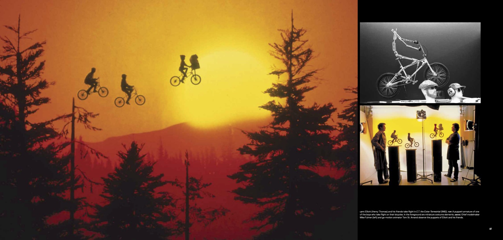
Artists from ILM’s Sydney studio take us into the Grid to discuss their part in the cult classic’s latest chapter.

By Jay Stobie

(Credit: ILM & Disney).

Directed by Joachim Rønning, Disney’s Tron: Ares (2025) breaks the barrier between the physical and digital realms, as the Master Control Program known as Ares (Jared Leto) rebels against his creator, Julian Dillinger (Evan Peters), and seeks the Permanence Code that would allow him to achieve a lasting existence in the real world. Ares finds an ally in Dillinger’s corporate rival, Encom executive Eve Kim (Greta Lee), whose empathetic nature is a stark contrast to the ruthless disposition of the Dillinger Systems leader. From the Grid’s luminous avenues to their concrete counterparts in our physical reality, Tron: Ares brims with astonishing visual effects that support its characters on their tumultuous journeys.

With Industrial Light & Magic’s own David Seager serving as the production’s overall visual effects supervisor, ILM proved uniquely suited to spread the visual effects work across its global studio sites in Sydney and Vancouver. Operating from the Sydney studio, ILM visual effects supervisor Jeff Capogreco (Jurassic World [2015]; Avengers: Infinity War [2018]; The Mandalorian [2019-23] and ILM animation supervisor Jhon Alvarado (Dungeons & Dragons: Honor Among Thieves [2023]; Alien: Romulus [2024]; Star Wars: Skeleton Crew [2024-25]) sat down with ILM.com to discuss their behind-the-scenes insights into all things Tron: Ares.

Tron’s Legacy

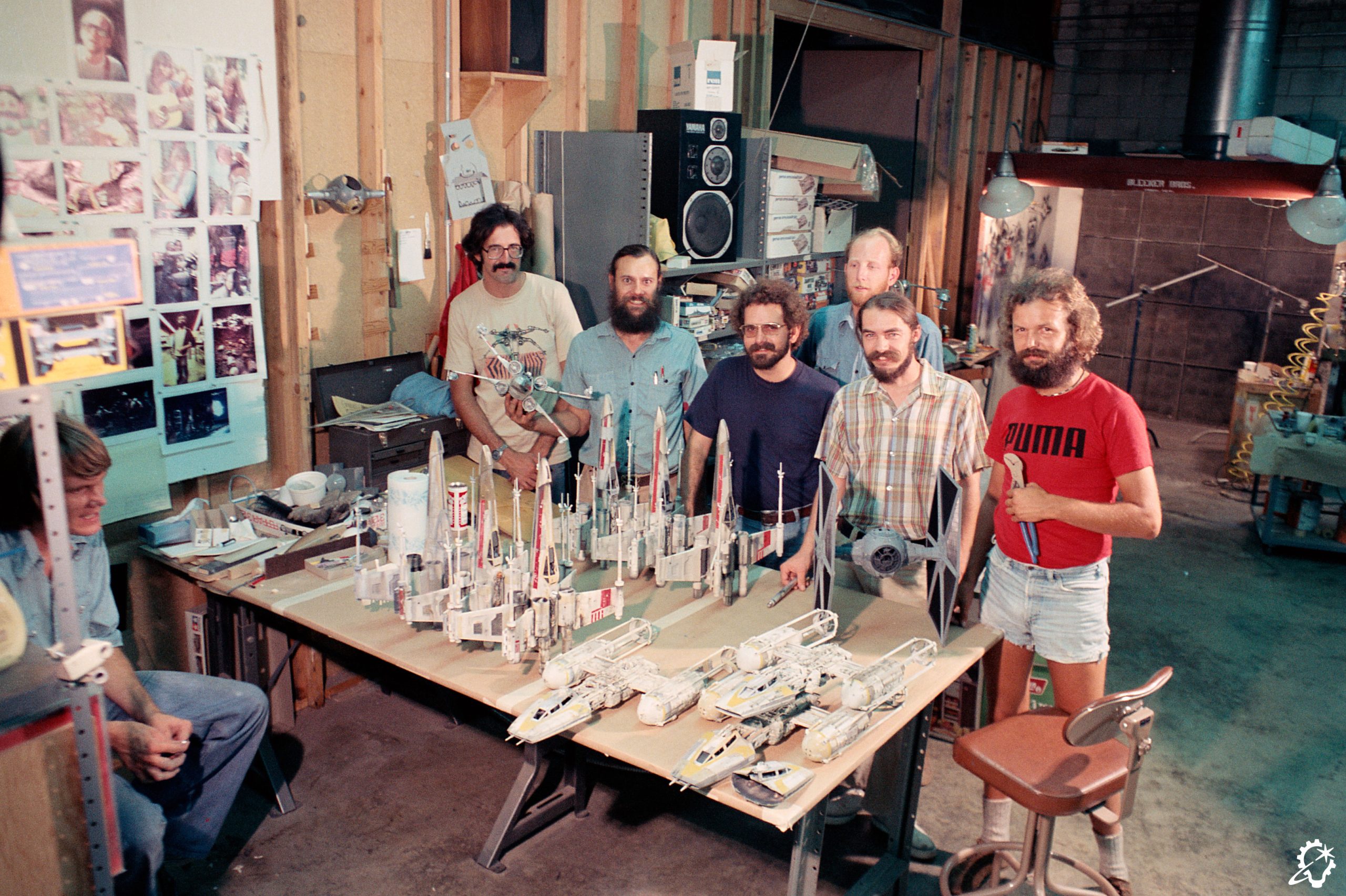
“On TRON: Ares, I was the visual effects supervisor for ILM’s Sydney studio, and my partner in crime was ILM associate visual effects supervisor, Alex Popescu,” Jeff Capogreco shares with ILM.com. “Early on, we made a conscious decision to have two technical camps going at one time, and each of us took on different roles and responsibilities. As the ‘grandpa’ supervisor, or ‘Papa Jeff,’ I worked with Alex to make sure things ran smoothly. The Sydney studio did just over 800 shots, which I believe was the biggest show to date that our studio had delivered, so it was a proud milestone.”

Capogreco’s love for the Tron franchise stretches back to its initial cinematic installment. “I’m old enough to say that Tron (1982) was one of the first movies I ever watched on VHS. My father was really into technology, and having a VHS player was a status symbol in Canada in the 1980s,” Capogreco beams. “I was probably six or seven and didn’t fully understand what was happening in the movie, but it was spellbinding. I was fascinated by Tron, and that led me to want to do visual effects. What Tron did to me, I hope Tron: Ares does to other people.”

ILM animation supervisor Jhon Alvarado’s own affinity for Tron took off with the release of its sequel, Tron: Legacy (2010). “For me, Tron hit home when Legacy came out, primarily because of the visuals and the soundtrack,” Alvarado remarks. “I loved the marriage of the two elements and how well they came together. When Tron: Ares came up for ILM, I knew I had to be on it. We’re here for movies that take us into these awesome worlds, and Legacy delivered with its sound, music, and visuals. When Tron comes in, you know it’s Tron. It has an aesthetic that you can’t get in any other film.”

(Credit: ILM & Disney).

An Animation Approach

Turning to his tenure on Tron: Ares, Alvarado supplies an overview of what his duties entailed. “As the ILM animation supervisor, my work on the show covered quite a bit. I was involved in shot design and creating shots for the film. We’d receive sequences with a rough previs of what the idea would be, but once the previs was put into the cut, I’d occasionally get blank frames with descriptions of what was supposed to happen. My job became interpreting them, taking the shots that the director had in mind, and Tron-ifying them while making it all feel believable and realistic. I had to think like a cinematographer so that, even when the shots were full CG, they appeared as if they were filmed for real.

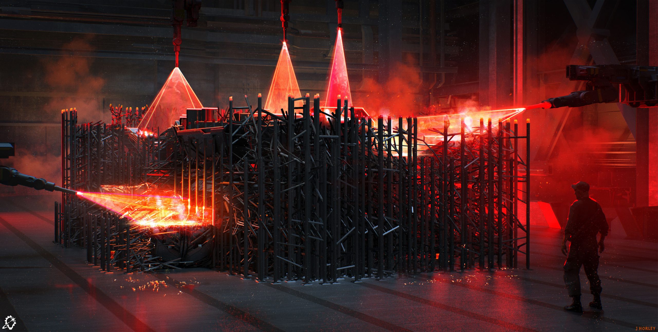
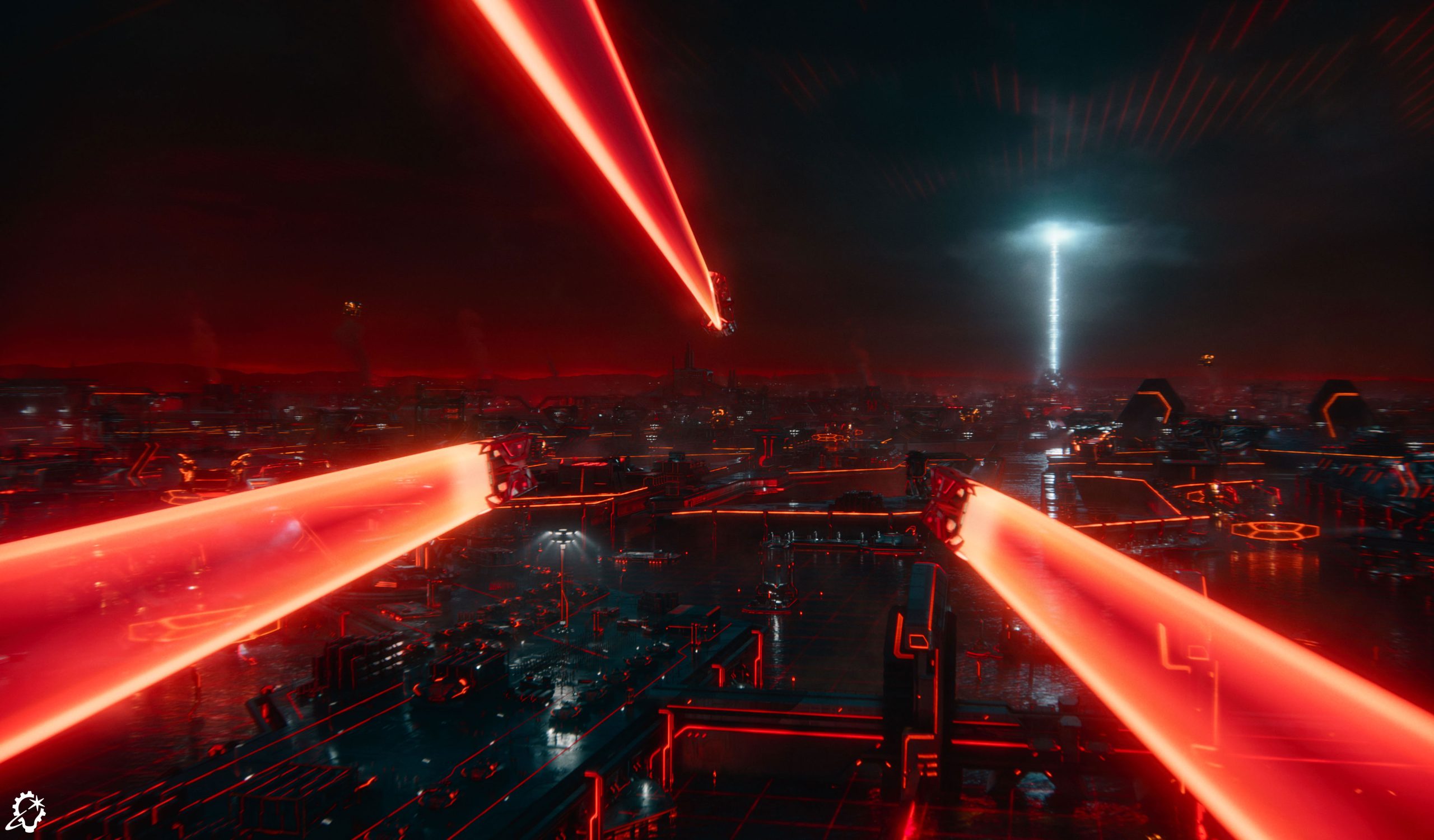
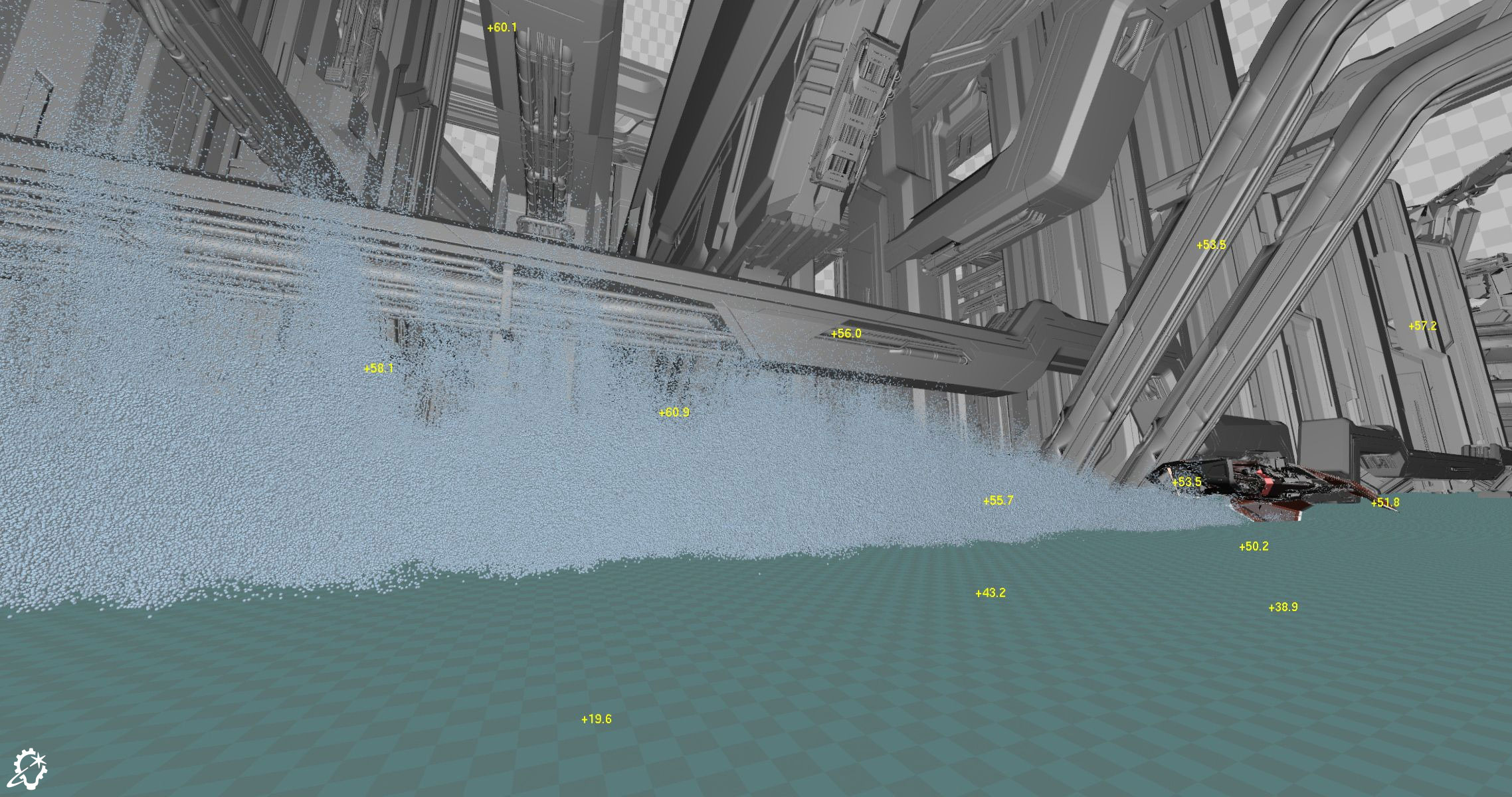
“I developed several vehicle animations, as well,” Alvarado continues. “For the light skimmer chase sequence, I partnered with our ILM animators to figure out the style and movement of how these vehicles skim through the water. We examined speedboat references so we could get the water spray right.” Alvarado’s mission extended to the laser printers that enabled Grid-based vehicles to be constructed in the real world. “We designed how the laser moved and collaborated with the rigging and effects departments to choreograph the printing. We had rigs which let us play with how the laser looked, its size, and where it was pointing.”

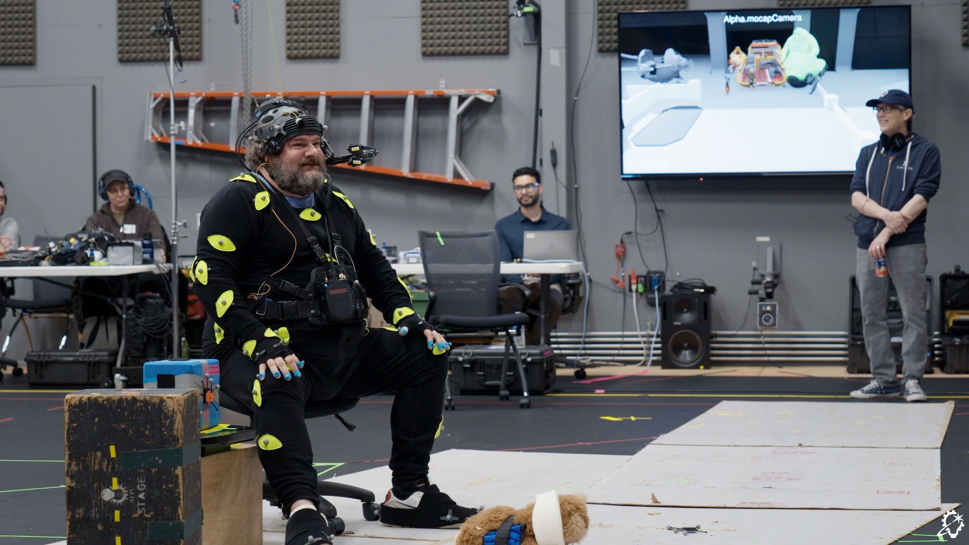
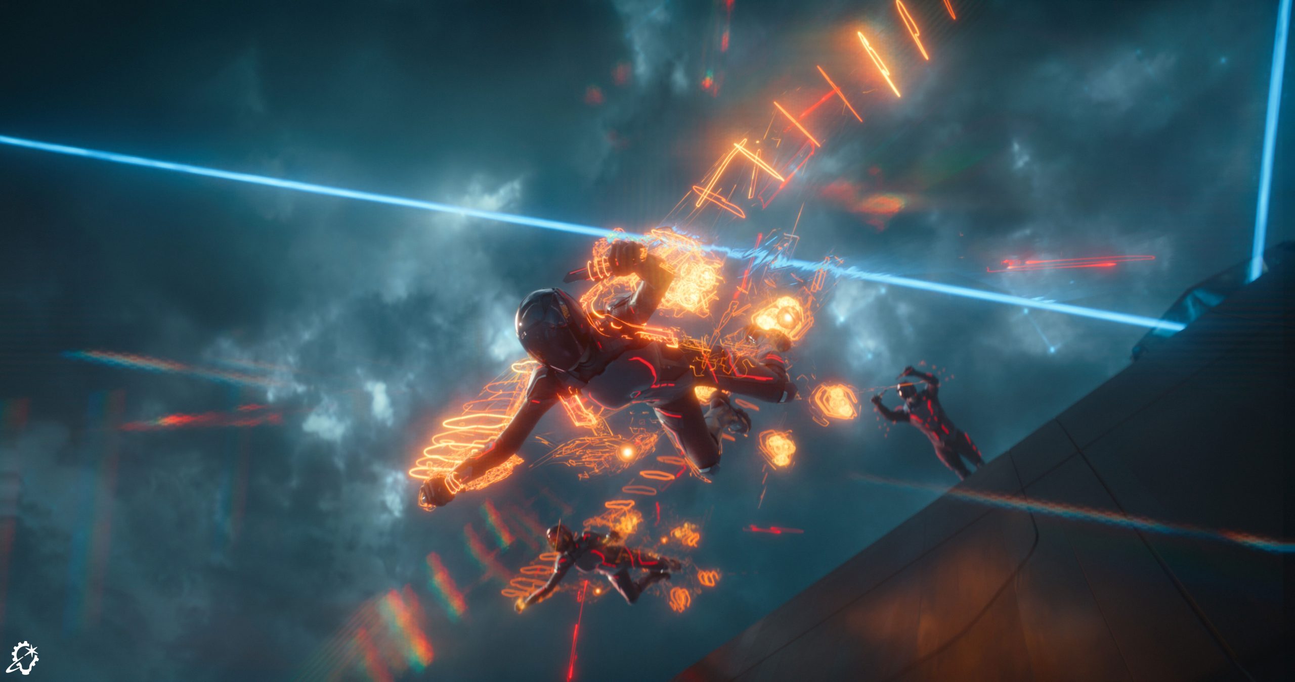
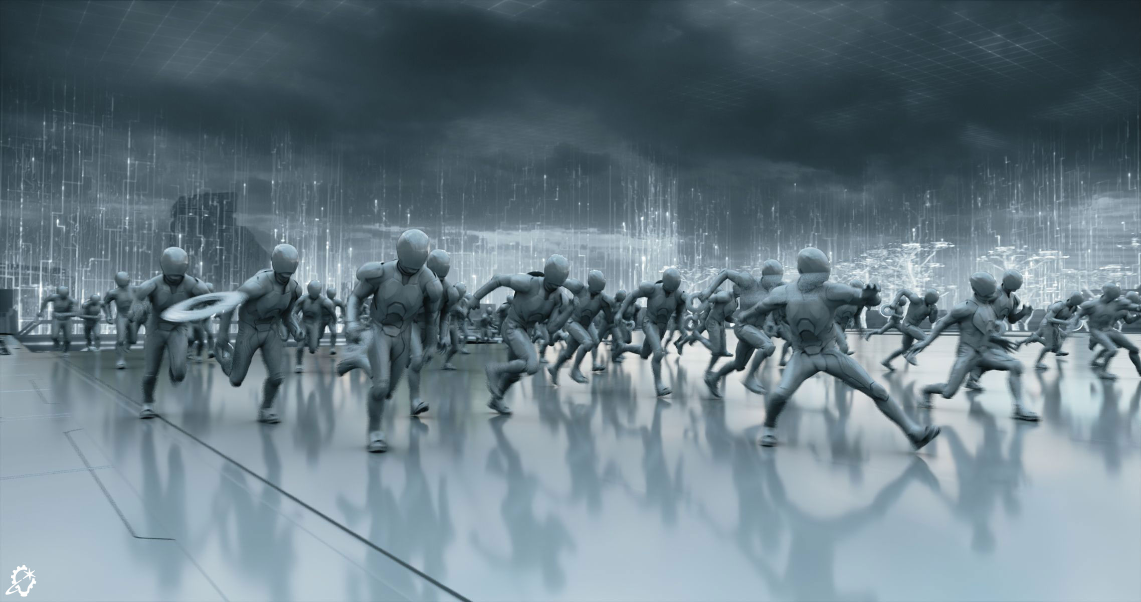
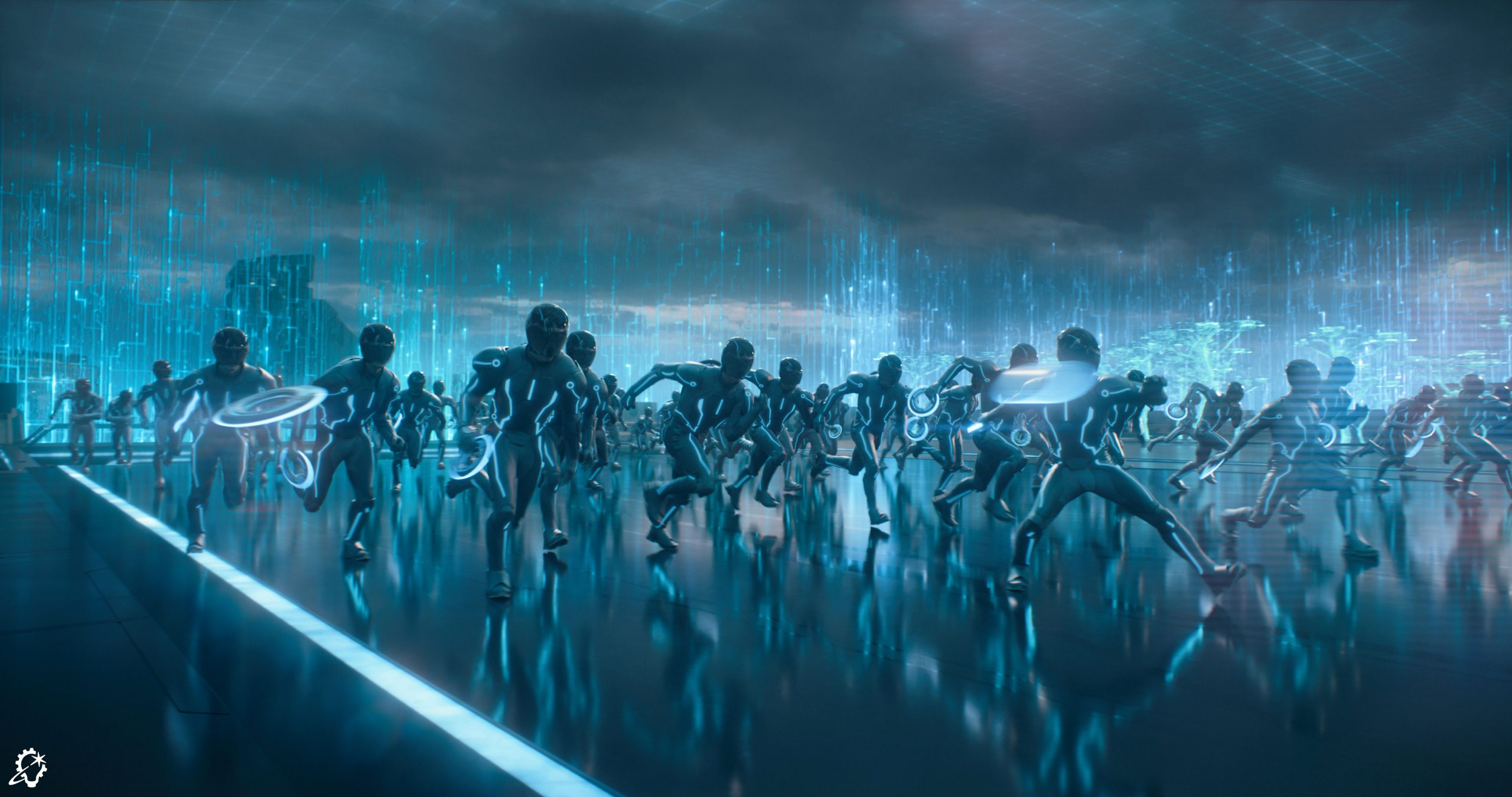
Alvarado selects a brawl between Ares and an army of Encom’s own Programs as another pivotal scene for his animation team. “We created digital doubles during the fight sequence where you see Ares being attacked by soldiers. At ILM, we have tools that permit us to get motion capture data integrated quickly, so we choreographed the movement alongside our animators and internal mo-cap team. I believe the filmmakers originally had a stunt performer do it, but he was only fighting maybe two or three guys, and the rest was air-fighting.” Along with adding in flying discs that caused the deresolution of Ares’s opponents, Alvarado’s team had a hand in mapping out the timing of each character’s ‘derez.’“

Scene management was important on Tron: Ares, especially for the light walls,” Alvarado notes. “In terms of animation, my role varied. People often associate animation with characters and creatures, but we’re also figuring out the timing, the choreography, and the cinematography so that we deliver a nice flow of the sequence to the director. Once that’s established, we pass it on to Jeff and all the other departments to use as a base to build upon.”

(Credit: ILM & Disney).

Going Into the Grid

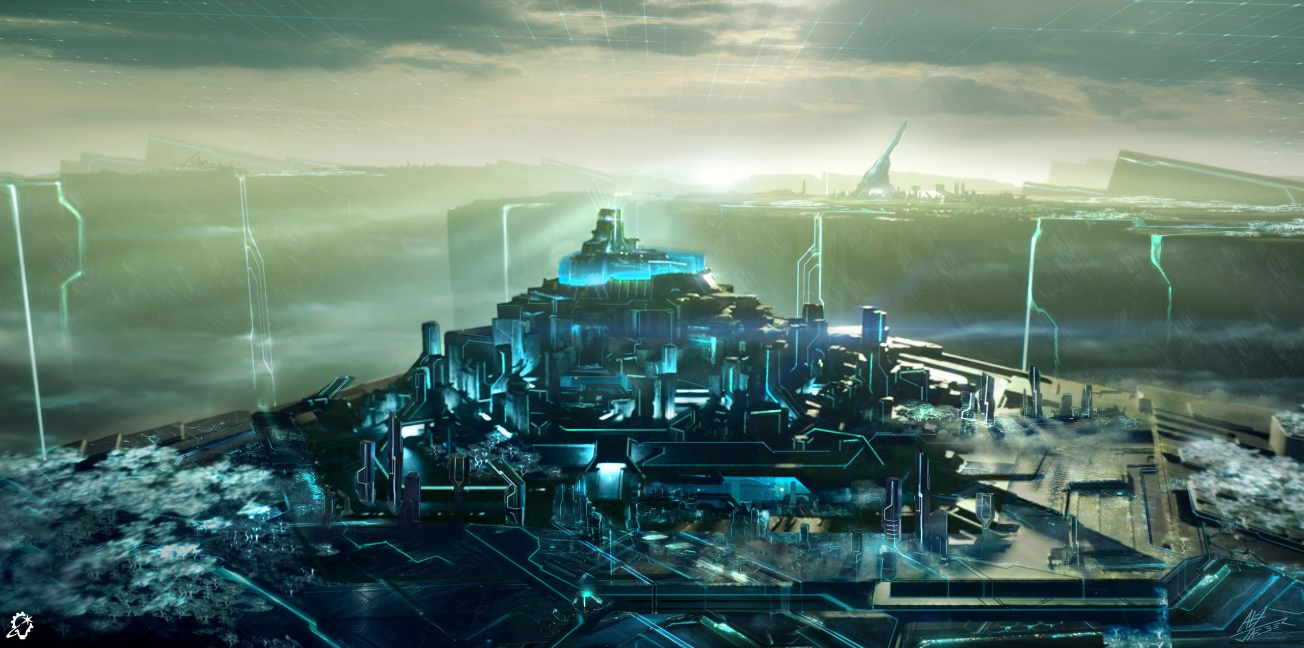
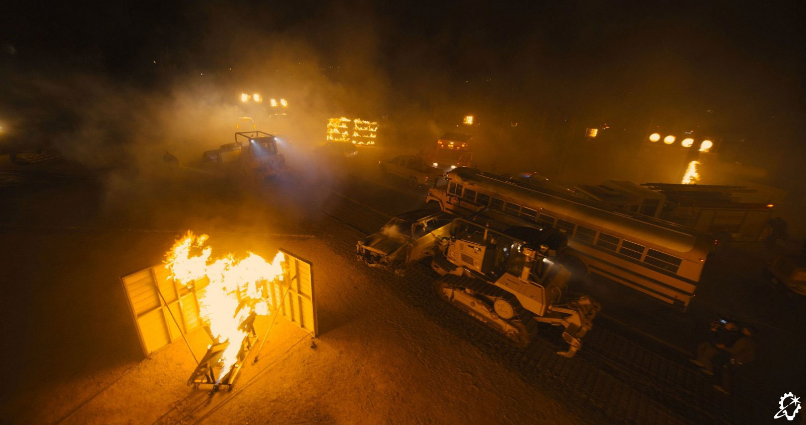
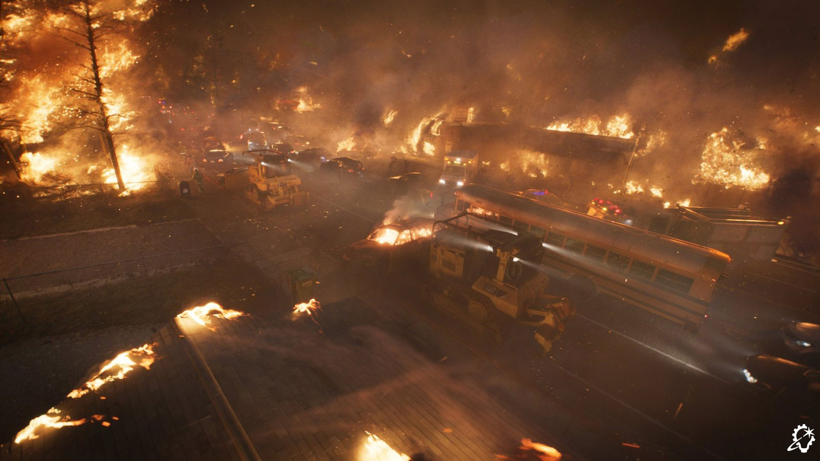
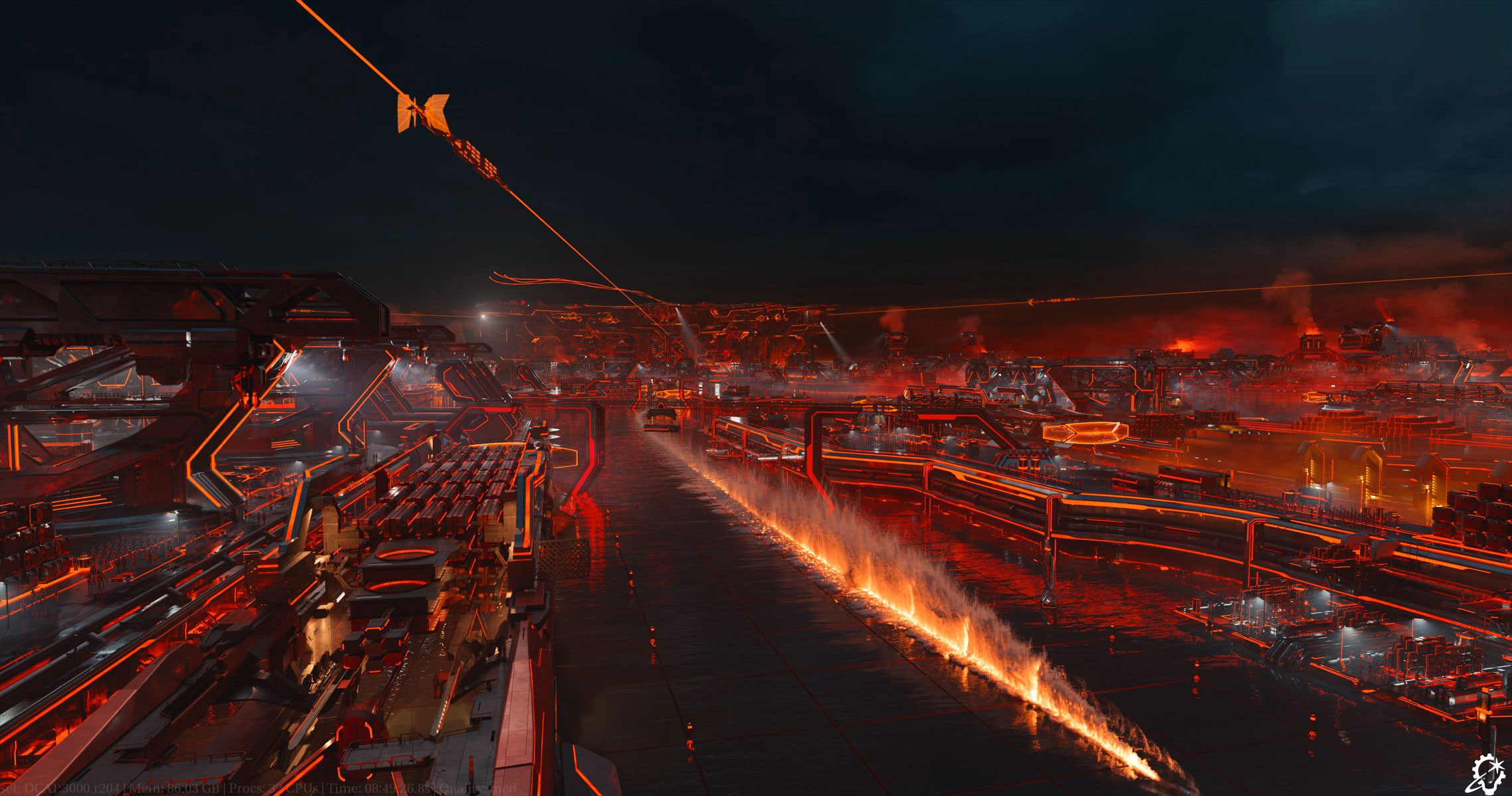
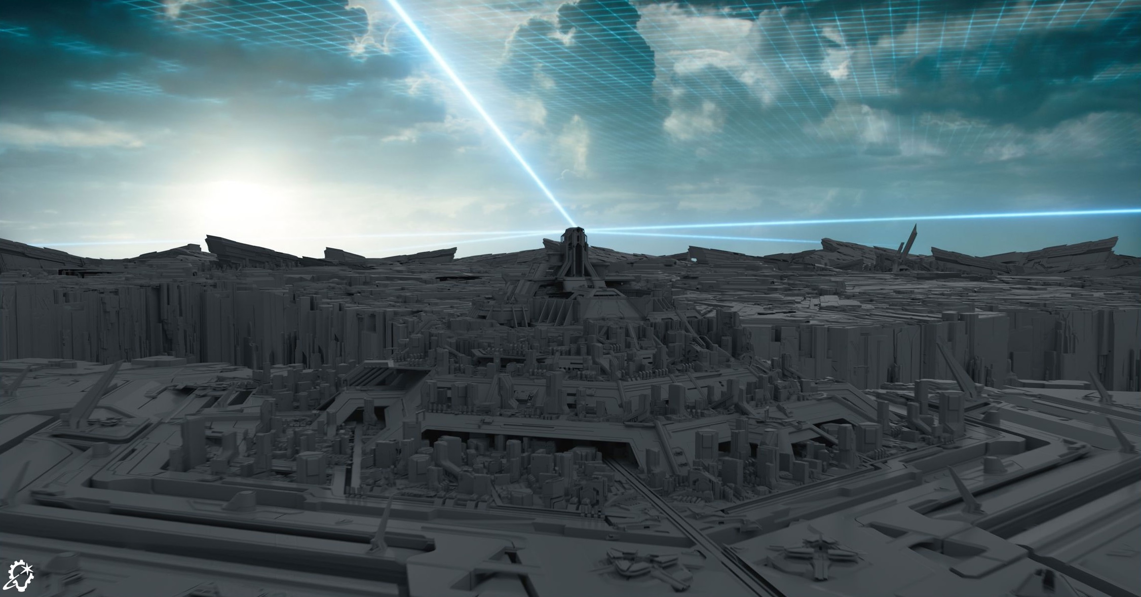
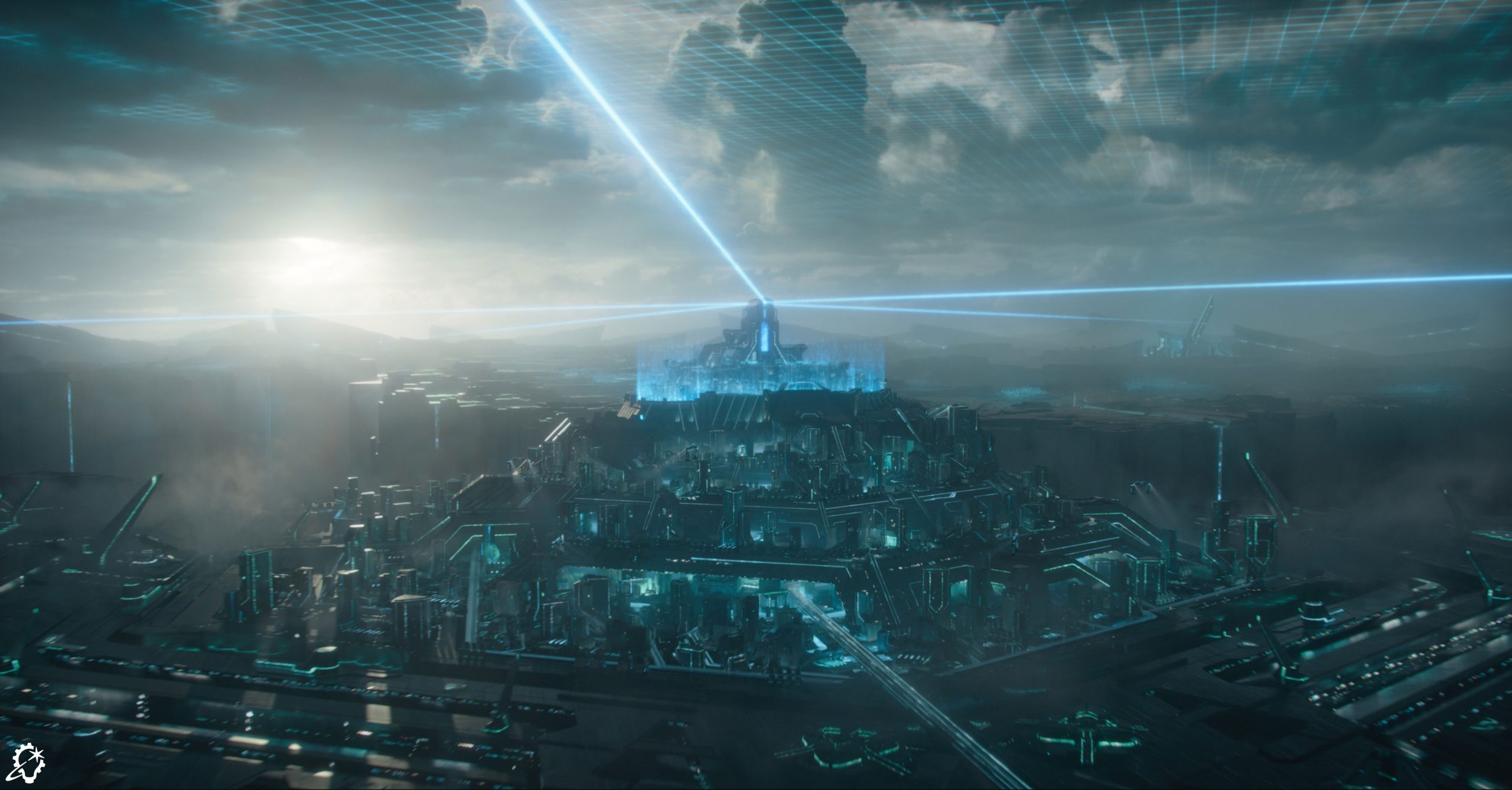
Designing the Dillinger Systems Grid proved to be a monumental task for ILM’s Sydney studio. “We had a fantastic production model given to us from the client side that was visualized in real time with a neat flythrough,” Capogreco states. “That provided the basis of what we called the Motherboard, or the main facility that overlooked the whole Dillinger Grid. Once we started getting the Grid into shots, we realized it wasn’t nearly big enough for what Joachim wanted. We did a test where our layout folks put the characters on a light skimmer and drove them from one end of the Grid to the next. It turned out to be about four times too small, because they’re moving so fast. We ended up increasing the original size by a factor of two-and-a-half. It’s massive!”

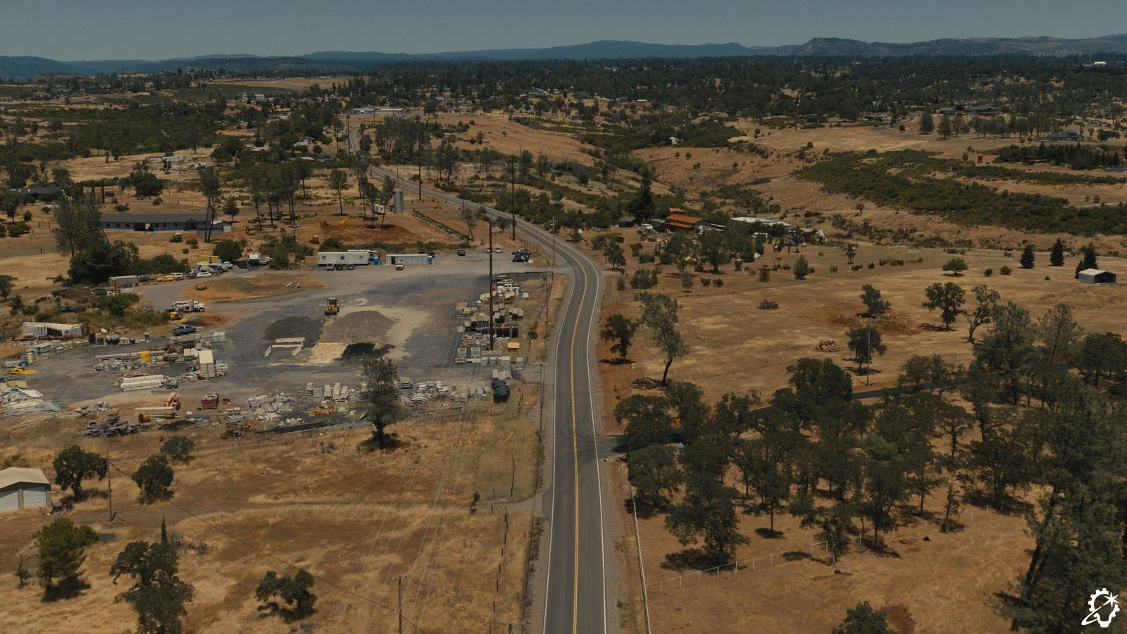
Seeking to furnish the Grid with “scale and purpose,” Capogreco researched ports and military facilities as a way to subtly infuse features that would cause audiences to recognize distinct areas, such as factories and military zones, within the Dillinger Grid.

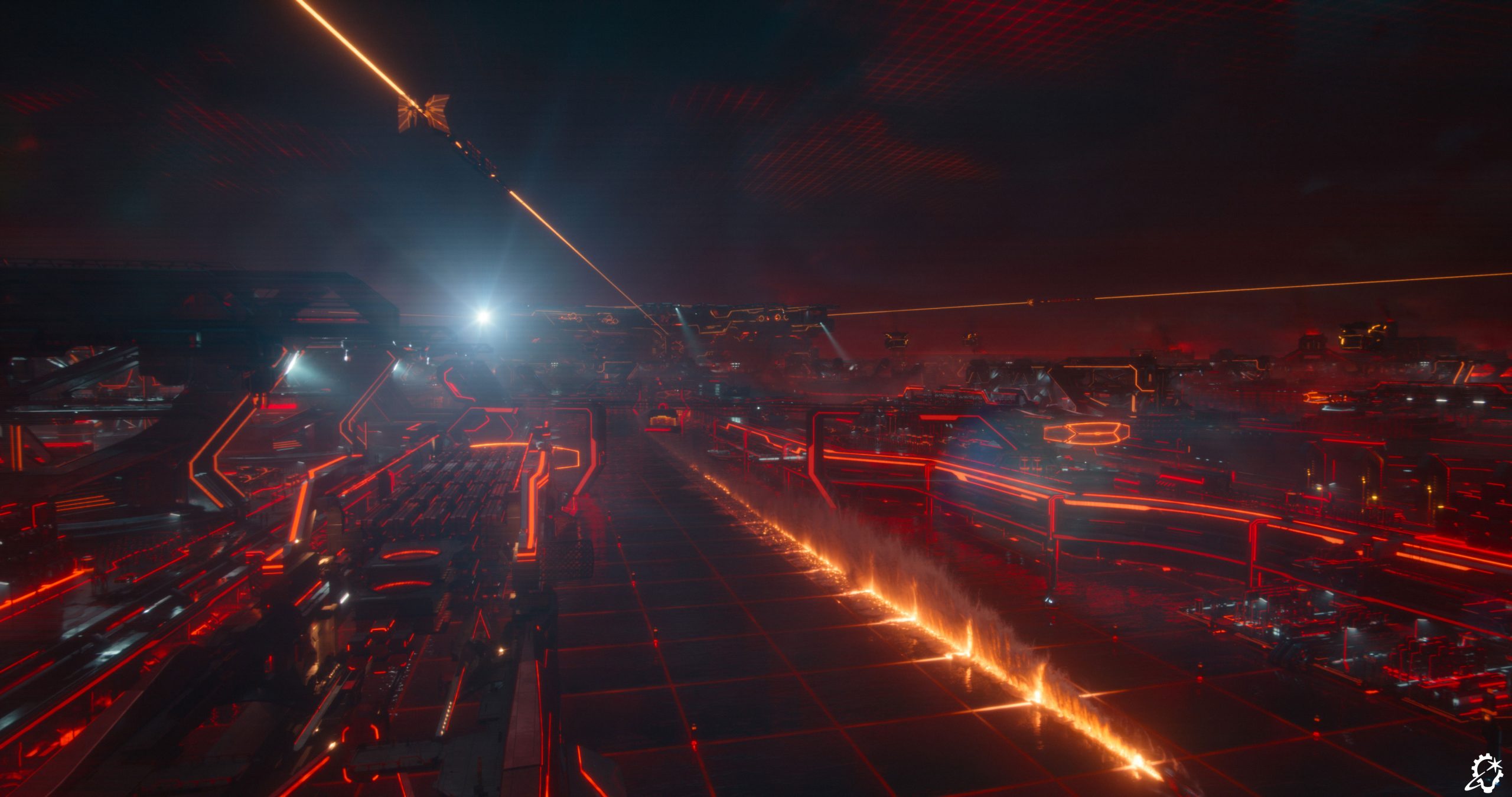
ILM relied on its expertise to know when it had to dial back the intricacy to fit the film’s setting. “Tron has a design language that’s all about shape and form – it’s not about being very busy. What I mean by that is, when you’re down at the water level, there’s an incredible amount of complexity that’s put into each shot. Every shot, to a degree, had to be designed,” Capogreco outlines. “We needed to translate what people see in the real world into Tron-like assets. What does a buoy look like in Tron? What about a crane or a shipping container?”

While the appropriate level of detail was required for scale at the surface perspective, Capogreco relays that “when we were up high, it became too busy and noisy, with many moving dots. So, we actually built two Grids. One sufficed for the wider views and was a more simplified version. Our team went in and hid much of the noise, guaranteeing the audience would at least see the shapes and silhouettes. When you’re down at water level, the geometric resolution needs to increase. Every section of the environment was fairly unique and required a huge design process to support the narrative.”
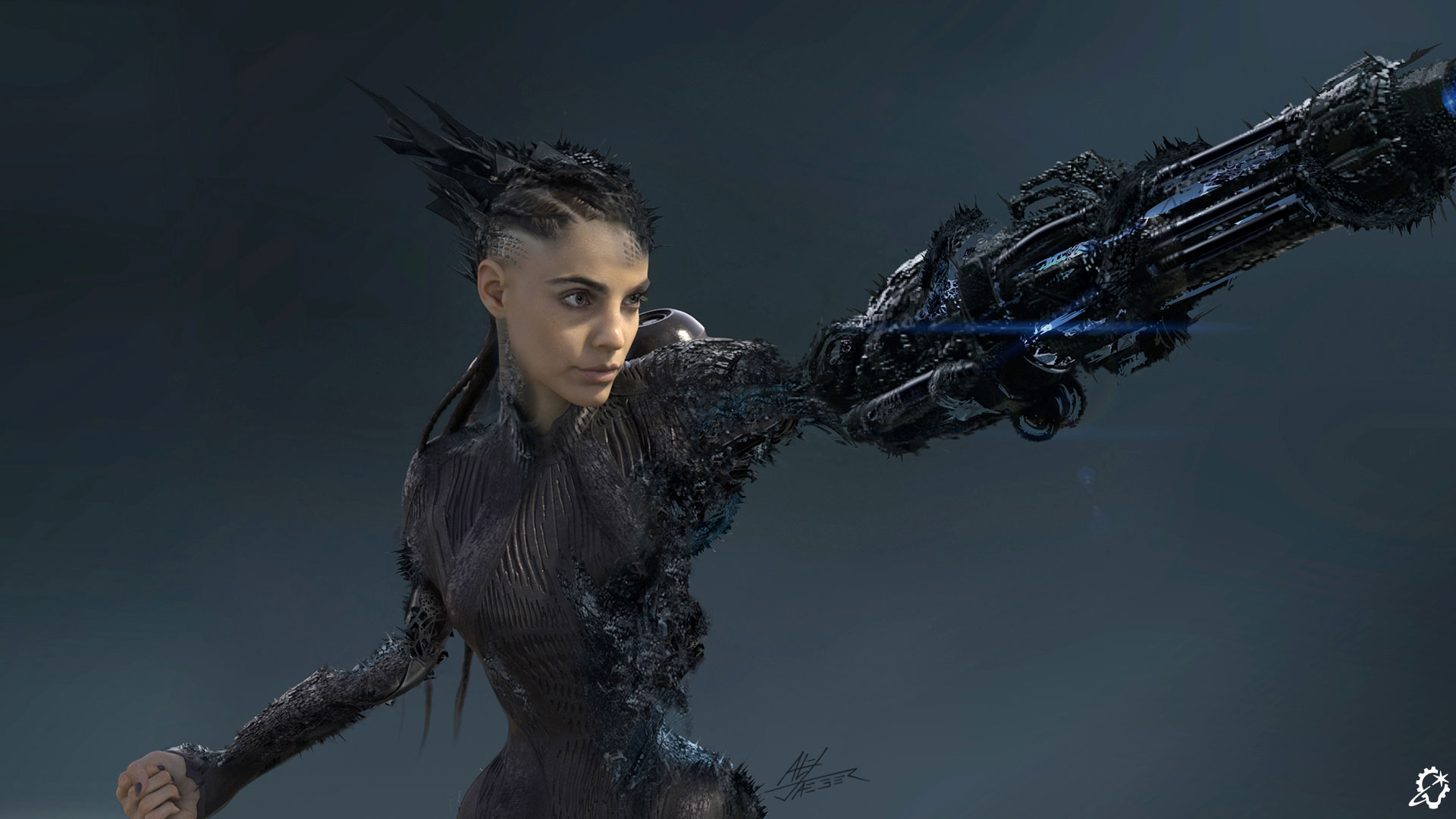
(Credit: ILM & Disney).

The Face of a Foe

Another key Grid-related component deals with the holographic avatar that Julian Dillinger projects to communicate with Ares within the Dillinger Grid. “They filmed Evan Peters saying Julian’s lines, and then we used ILM’s MEDUSA tool to generate a perfect match of Evan’s performance to incorporate into our asset,” Alvarado remembers. “Joachim and Dave asked us to experiment,” adds Capogreco, “so we tried making the eyes brighter, having no eyes at all, playing with the wireframe, and evaluating how much we wanted to see of Evan versus seeing the avatar of Evan.”

After numerous creative back-and-forths, ILM opted to stick closer to the original concept art that inspired the face’s depiction. Speaking to the experimental process, Capogreco notes, “We eventually did a cross-blend between a human skull and Evan’s face, which was important to the director. We wanted the mouth, nose, and brows to be genuinely Evan, but we also wanted to bring the creepy, evil avatar side out.” Alvarado adds, “I analyzed Evan’s eyebrows so the avatar would resemble him. Evan has a very specific and strong brow shape, but because the hologram didn’t have any eyebrows, we had to manipulate the model to make the shape of the brow a little more like Evan’s.”

(Credit: ILM & Disney).

The Vaunted Vehicles

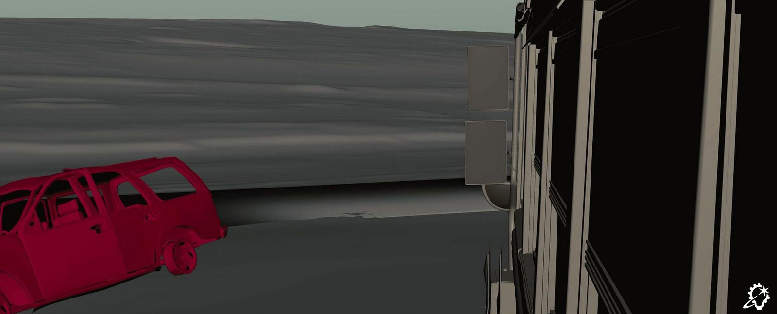
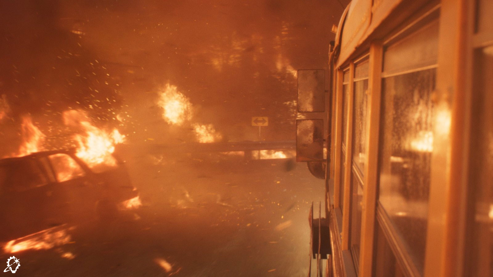
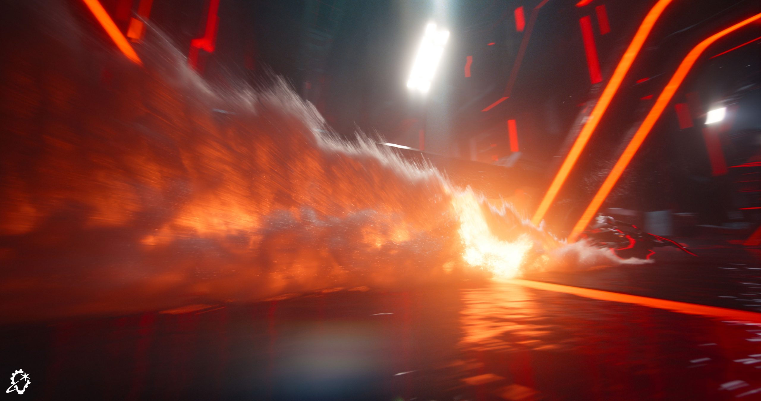
The production built a life-sized light cycle that helped define that particular vehicle’s mechanics, but other assets – such as the light skimmer, jump jet, and drones – left room for ILM artists to rely upon their imaginations. “We studied speedboat footage for the light skimmer in an effort to get its rooster tail to match the reference,” Capogreco explains. “Finding something you can anchor to is a terrific starting point for visual effects, and then it evolves. What can we do to make this weird? I welcomed ‘weird’ in dailies. The weirder the comments, the better. It was fun to experiment in that playground. If you pause on frames in the movie, you’ll see that the flares actually have texture – they have Grid patterns. Usually, when water is on a lens they’re circular, but one of our ideas played with the notion that – when the splash hits the lens – we actually refracted cubes onto the lens.”

“The light skimmer scene was heavily influenced by older Star Wars cinematography, especially the speeder bike sequence and the Millennium Falcon exiting the Death Star as it exploded,” Alvarado notes, in reference to Star Wars: Return of the Jedi (1983). “We used ILM’s work on Return of the Jedi as a reference and evaluated what made those scenes so special. You may notice that Skywalker Sound even added some of the speeder bikesque sound effects to the light skimmer in some of the shots [laughs]. There’s a lot of ILM’s DNA in Tron.” 

Although director Joachim Rønning wished to ground the drones that pursued the light skimmer in realism, he enjoyed Alvarado’s suggestion to have them rotate. “In the real world, the drones wouldn’t spin, but when Joachim saw them in the chase, he thought it looked great. It’s all about making everything fun for the audience.”The jump jet flown by Athena (Jodie Turner-Smith) opened another creative door for the team. “

The jump jet design was never a practical build so it wasn’t as defined as the light cycle, so we were left to figure out how it would take off and fly. At first, the pieces didn’t move in an aesthetically pleasing way – it was too mechanical and simple. The director wanted the movement to be realistic, but he trusted us to make it look cool. So, we utilized tools we had originally developed for the Transformers films that let us dynamically move pieces around. When Athena gets in the jump jet, she presses a button and the pieces are sort of Transformer-y,” Alvarado professes. “Joachim loved it. If you analyze it, the movement of the pieces doesn’t necessarily make sense, but there is an element of believability to it.”

(Credit: ILM & Disney).

Assisting Ares

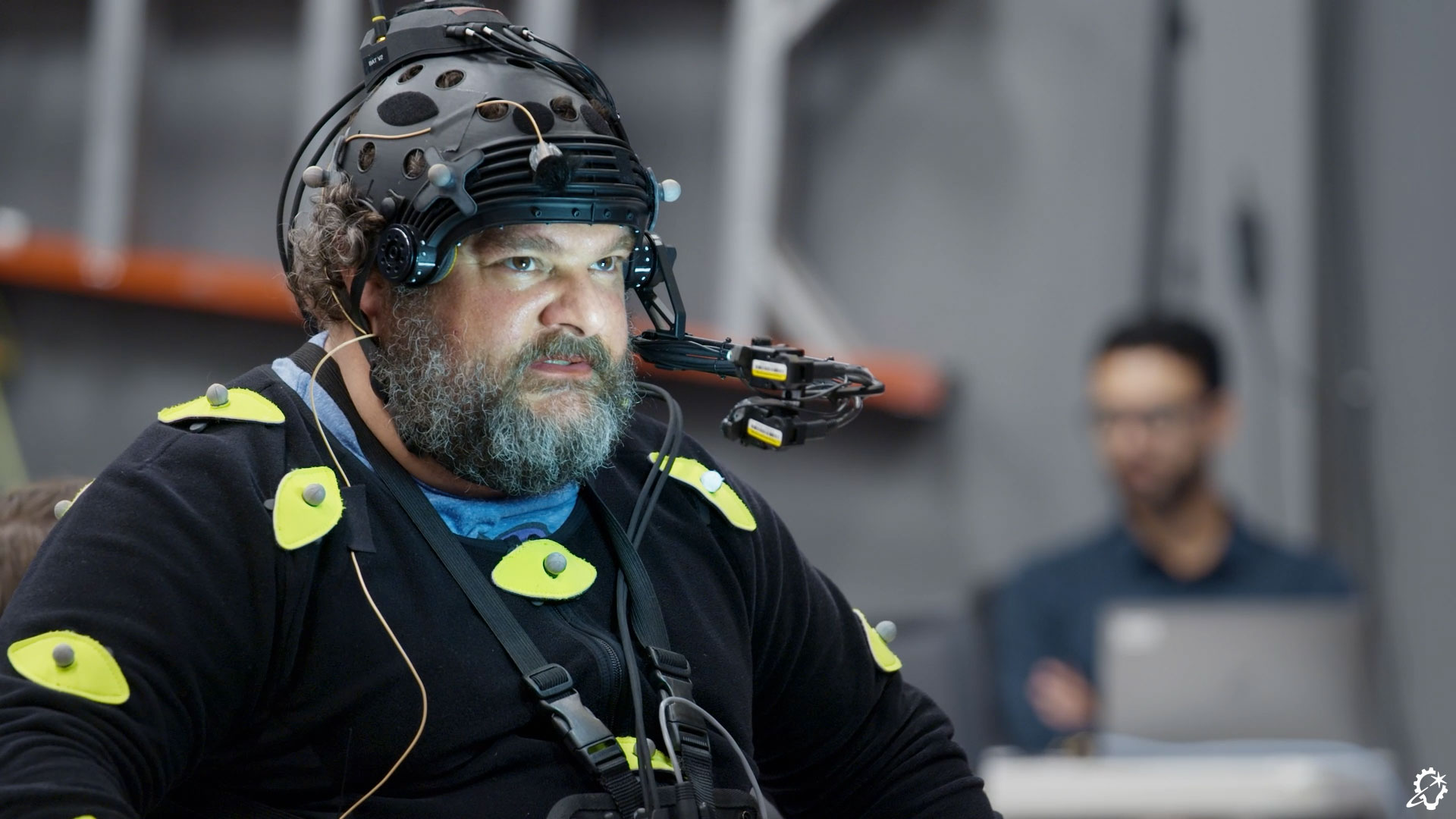
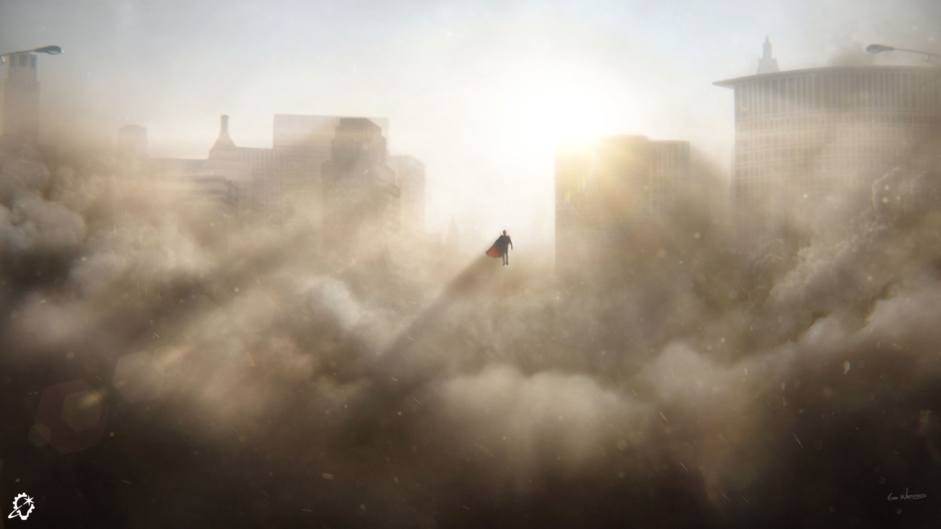
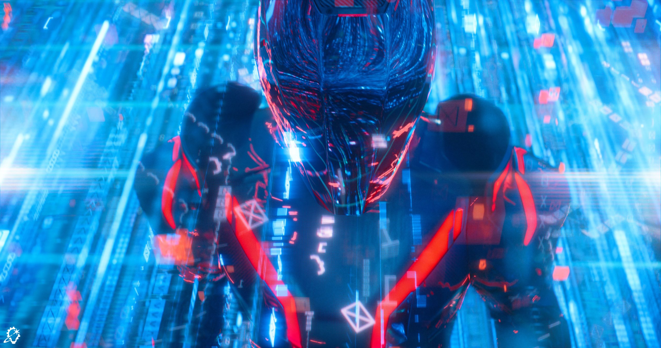
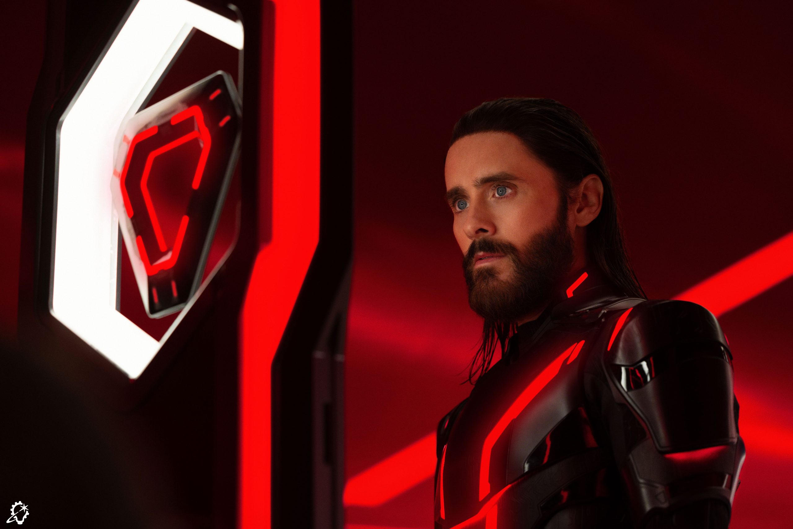
From the Grid to the jump jets and beyond, ILM delivered a visual effects extravaganza to Tron: Ares. However, while the vehicle assets and other prominent action sequences tend to receive the bulk of the audience’s praise, a significant portion of ILM’s assignment revolved around visual effects that are virtually invisible in the final cut. One example of this centers on Ares’s appearance throughout the beginning of the film. “For the entire Dillinger board presentation, Jared Leto was filmed without a helmet on. We were tasked with creating the visor that went over top of him. The decision to add a helmet onto Ares served the story and led to his big reveal moment,” Capogreco conveys.

The actor’s hair turned out to be a slight obstacle for ILM’s Sydney studio, as the team sought ways to cover up the parts that would have stuck out from under a helmet. “Jared had long hair that came over his costume, so we augmented parts of his collar and costume to tuck that hair back in,” Capogreco asserts. Alvarado concurs, recounting, “It also aided us in the early battle sequence, because that too was meant to be Jared Leto with no helmet. When the choice was made to use a helmet, we were able to go full CG with the character. When Ares stands up and walks over is Jared’s performance, but I don’t think people are able to tell that the other parts are full CG. Hopefully, they believe it’s a photographed suit!”

As with Julian Dillinger’s avatar, the filmmakers ensured that the Ares actor’s performance remained. “We wanted to keep Jared’s nuances in the close-up shots, but the digital double freed up Jhon for the wide and action shots,” Capogreco affirms.

(Credit: Disney).

A World of Work

As a global studio with multiple sites around the world, ILM spread its Tron: Ares responsibilities across its Sydney and Vancouver locations. “[ILM visual effects supervisor] Vincent Papaix and [ILM associate visual effects supervisor] Falk Boje at ILM’s Vancouver studio were wonderful collaborators, and Jhon often touched base with [ILM animation supervisor] Mike Beaulieu,” Capogreco underscores. “The wonderful thing about Tron: Ares is that the workflow was intended to be fairly autonomous, where we could do our own thing but still share our vehicle assets and digital doubles. Each studio took on different aspects of the film. It was nicely split out in a way that we could complement each other’s work.

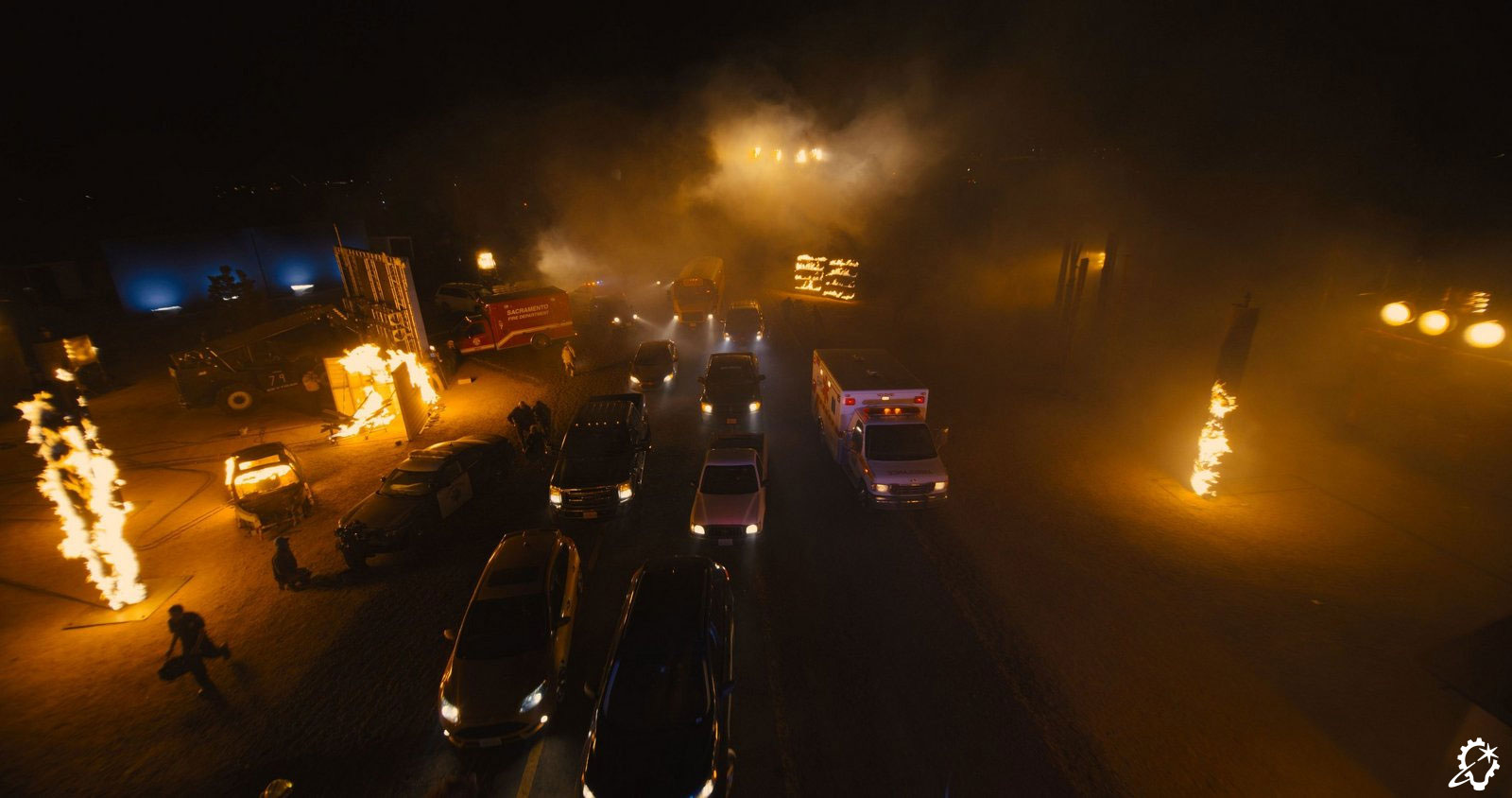
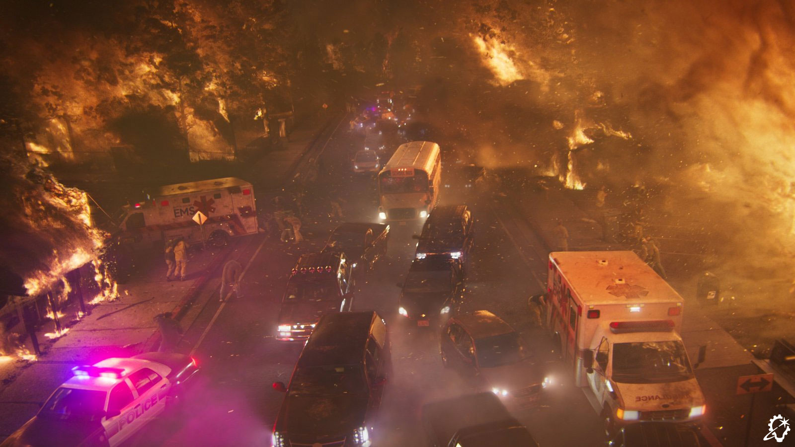
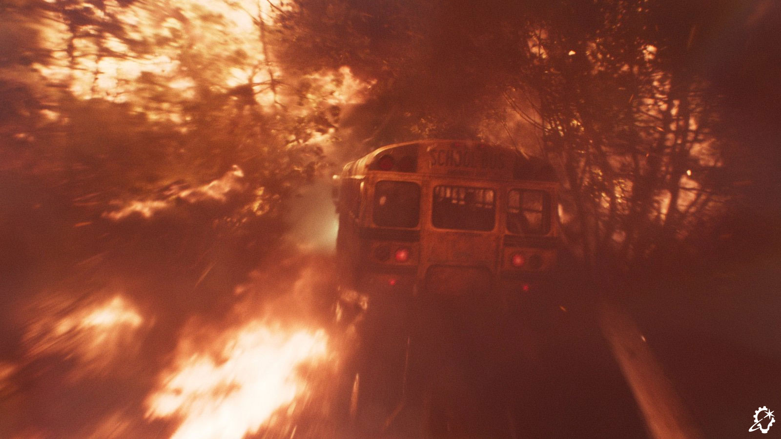
“The deresolution – or the black sand effect – in the real world was an excellent example of that,” Capogreco continues. “Vancouver handled most of the end battle sequences, and they pioneered Ares’s time-out effect inside the Dillinger facility when we first see a Program turn to ash after 29 minutes. Subsequently, we handled the shots that were closer to Athena’s face by using the Vancouver team’s shot setups and adapting them to what they needed to be for the close-up.” The same held true for assets, which Vancouver required, that had been designed by ILM’s Sydney studio, such as the jump jet used for a shot where two guards land just before Athena and Ares square off towards the end of the film.

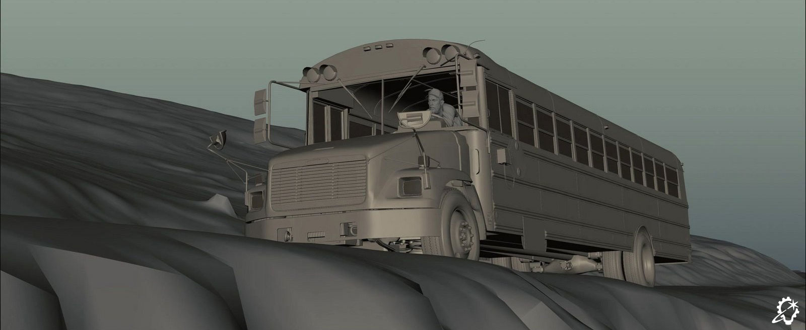
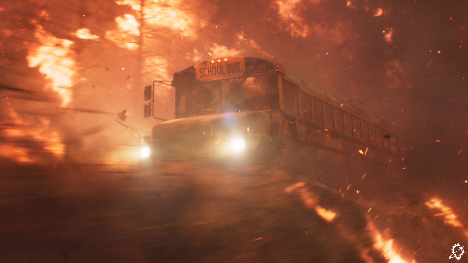
Capogreco broadly summarizes the delegation between sites, stating, “Vancouver covered the bluer and sleeker Encom Grid, and they owned the light cycle chase and the majority of the city work. On the other hand, in terms of the real world, Sydney had the mountain test site and the printing of the orange tree, as well as a substantial number of shots coming and going from the Grids. ILM’s Sydney studio was also involved with everything around the Dillinger Grid, even the on-set segment where partial sets were built. To film, they had to poke lights into the set, so we’d go in to top up the shots by augmenting roofs, set extensions, and other small cosmetic fixes here and there.”

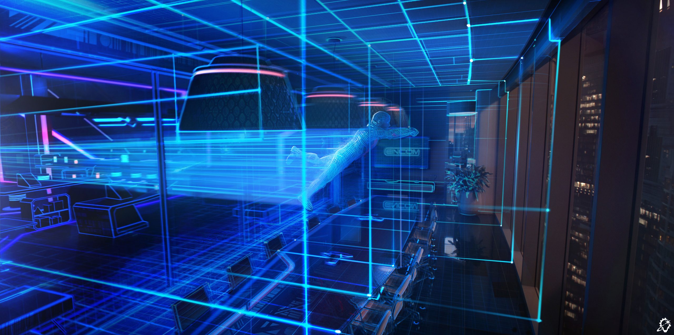
“The biggest elements that the two studios collaborated on directly were the light walls and the tools to generate them,” Alvarado adds. “Even when we were dealing with different assets, we all needed to have light walls for the vehicles, drones, and staff weapons.” Capogreco delivers an additional shout-out to ILM StageCraft, saying, “ILM StageCraft was used for shots where you’re up in Dillinger’s office peering out. Sections of the office were built and filmed, so that’s all in-camera work. That and the mountain test site, which they shot on an ILM StageCraft volume before we went in and did extensions on top of that.”

(Credit: ILM & Disney).

Taking Pride in the Project

Reflecting on the project as a whole, Capogreco notes, “Without hesitation, I would say that Tron: Ares was one of the hardest shows I’ve done. Not just because it is such a crazy technical achievement, but because it pushed our creativity to the limit. Joachim Rønning and Dave Seager weren’t necessarily aiming for formulated shots. They were open to ideas from Jhon, Alex, and I. That’s what made Tron: Ares extra special – we went on a journey together to find the best possible shots. Joachim had a good eye for motion, and he challenged the ILM teams in Sydney and Vancouver. He kept us honest about having designs be as realistic as possible without sacrificing the ‘weird.’ He emphasized that, when you’re in the Grid, it’s okay to allow some stuff that’s strange.”

When asked for his thoughts on the film, Alvarado replies, “Although Tron: Ares looks real and we were going for realism, there is a large amount of it that is computer graphics. For example, the city that Vancouver built for the light-cycle chase and the fighter-jet flight seems so realistic that I don’t think people realize a ton of it is computer graphics. It demonstrates the artistry at ILM, and the love and care we put into the details to make Ares as believable as possible. Every pixel, every camera, and every full-CG shot had to live in that world. Everyone gave it their best, and it looks fantastic. There were so many full-CG shots, and they are as good as the live-action photography. It’s a testament to the team.”

In a year where visual effects-heavy releases have been plentiful, Capogreco considers Tron: Ares to be a standout, concluding, “Tron: Ares is so different and out there. It’s not something you can say you’ve seen much of before, and I think that’s a feat for ILM to be proud of as a studio. I’ve been catching up on movies, and they all seem to have similar themes. That’s what’s quite cool about this one – it’s bananas. Celebrate it!”

Read more about the ILM Art Department’s work on Tron: Ares here on ILM.com.

Jay Stobie (he/him) is a writer, author, and consultant who has contributed articles to ILM.com, Skysound.com, Star Wars Insider, StarWars.com, Star Trek Explorer, Star Trek Magazine, and StarTrek.com. Jay loves sci-fi, fantasy, and film, and you can learn more about him by visiting JayStobie.com or finding him on Twitter, Instagram, and other social media platforms at @StobiesGalaxy.

ILM.com is showcasing artwork specially chosen by members of the ILM Art Department. In this installment of a continuing series, four artists from the San Francisco, Vancouver, London, and Sydney studios share insights about their work on the 2025 Disney production, Tron: Ares.

Senior Visual Effects Art Director Alex Jaeger

(Credit: Disney).

For this piece the goal was to portray the Encom data hub fortress, but also give it a brighter almost daytime look. The challenge was to figure out what the sky looked like and the overall details and forms in both the surroinding fortress and the distant background and “waterfalls,” etc.

I looked at some of the landscapes created for Tron: Legacy [2010], combined with some looks developed for Tron: Uprising [2012-13] and combined them with more complex details for the foreground structures and more simplified forms for the distant structures. One main goal was to develop a brighter look to the Encom Grid, so there was a bit of a nicer and brighter difference between this and the Dillinger Grid. 

One specific detail that had not been worked out yet was how to portray the sky and clouds in this brighter world. I came up with several looks, including this one, where there is a grid in the sky that the clouds intersect and mingle around, giving it some sense of depth, and providing a cool lighting effect where the grid lines light up the clouds where they touched, and they also aided in showing some movement into the sky.

Supervising Art Director Jason Horley

(Credit: Disney).

The idea for this piece was to show a virtual vehicle being physically printed in the real world. When I was creating different versions of this image there were several that came before this final concept, all balancing how dense the 3D printing support structures were, and how not to reveal too much of the tank that was being printed. Because the tank is a large heavy vehicle, I also had to make sure the support structures looked strong enough to hold such a heavy vehicle. Earlier concepts were much lighter and you could see the tank through the supports, but it didn’t look like they would physically work. 

Once I received the brief, I researched current 3D printing technology to see what the physical process is like, and then scaled it up and added the printing lasers to include an interesting light source that would help add an extra layer of visual interest. 

I found it interesting that when looking at 3D printing, normally the 3D print is the actual point of interest, but in this case, the interest was actually the 3D-printed supports that normally get thrown away. That informed the design decisions. So there is a beauty in those formations that usually get overlooked.

Art Director Igor Staritsin

(Credit: Disney).

This was a design exploration for a ship in the style of classic Tron world from the 1980s. My task was to keep it fairly simple and in the language of the rest of the environment. I did multiple versions of the ship design, exploring ideas and shapes that would best fit the brief. Besides the development of the overall shape, I needed to design it in a positive and negative look in its color, as it would change shape while responding.

I am a firm believer that, more often than not, “less is more.” There is a term in traditional art that I like to use “complex simplicity”, meaning you don’t really want to make it so simple that it looks boring, but you also don’t want to make it too complex so that it looks chaotic. It is a balancing act to find the sweet spot. In this case, it was relatively easy to follow it.

It was certainly interesting to try to play, and mix different low polygon shapes, and sometimes come up with unexpected results. Nowadays, sometimes there is a tendency to give too much control to “play aspect,” with all the modern tech available. I believe whether you come up with a good idea by accident or intentionally, a good artistic judgement is necessary either way.

Art Director Cody Gramstad

(Credit: Disney).

This image was designed to illustrate the process of transformation from the past’s aesthetic to the modern world’s. This was achieved using a gradient across the scene, transitioning from screen left to right, which defines layers of change between the original Tron aesthetic and its contemporary counterpart.  

The process involved taking a modern office space available on location and simplifying all its assets to align with the technical limitations of the 1980s. Subsequently, those key assets were replaced and blended using Tron lines until they evolved into the high-fidelity assets of the real world. High-frequency cubes and digital detail were used to help smooth the transition in complexity between the two states.

The image’s development involved a two-stage iteration process. The initial stage focused on integrating 1980s Tron world design details. The challenge was to clearly introduce these features without compromising the overall compositional goals. For the Tron design, we concentrated on achieving a level of detail that felt appropriately simple yet visually distinct for the space. The second stage addressed the compositional design, which was initially too complex. The combined visual information from both visible worlds and the particle laser effects created an overly complicated scene. We resolved this by employing several techniques: gradating all secondary information out of the Grid space, reducing reflection clarity, and ensuring the lines retained sufficient value contrast for clear reading. Finally, we used this same gradation effect to soften the right side of the frame, allowing Ares to be seen as clearly as possible.

The most rewarding part of designing this image was managing the sheer chaos. With such a busy scene, the challenge lay in simplifying and ordering the elements, essentially solving a complex visual puzzle to bring structure to the multitude of details.

See the complete gallery of concept art from Tron: Ares here on ILM.com.

Learn more about the ILM Art Department.

Take an extensive deep dive into ILM’s creation of the original X-wing fighter miniatures for Star Wars: A New Hope.

By Jason Eaton

(Credit: ILM & Lucasfilm ©).

50 years ago, in an industrial park far, far away, an unassuming team of young artists and craftspeople created something that would capture the hearts and imaginations of an entire generation, becoming an icon for decades to come: the X-wing fighter. 

Seemingly against all odds, these men and women would work in what was initially a bare-bones environment. It was a warehouse with no air conditioning in a lackluster part of town. It would bake in the summer with little shade. There were hardly any trees, just taco stands and aviation supply shops. Cinderblock buildings with no labs, institutes, or studios nearby. And yet, with no fanfare, and against all odds, magic was made. 

A roughly two-foot miniature made of acrylic, styrene, metal, and resin, the X-wing was the on-screen vessel that carried heroes to triumph. It moved impossibly before our eyes against surreal pinwheeling star fields, giving a sense of desperate energy. For myself, a child at the time, it would become a totem for my imagination, never really leaving my brain, to one day push my curiosity as an adult: What exactly were the models made from, and how did they come to be?

I collected various die-cast and plastic toys and built the model kit of the X-wing. I was captured by a design that was both rugged and sleek. Building that first model of the X-wing was not only an enjoyable pastime, but it also began the building of skill sets, and it was a way to imagine myself as an ILM modelmaker. I found incredible joy in building impossibly realistic-looking ships that inadvertently created our modern Star Wars mythology and redefined a multigenerational, visual science fiction “style guide.”

The onset of the internet facilitated a fan community with a shared curiosity about ILM and its creations. I found my tribe through gatherings, parties, and, eventually, ILM artisans’ living rooms. My curiosity transformed into a personal mission to preserve and record the nuanced details behind these Star Wars miniatures – specifically the processes, dimensions, and stories that inspired me as an artist. The X-wing was not just a focus, but an artistic and intellectual obsession.

ILM modelmakers with a number of their creations. L to R: Joe Johnston, Paul Huston, Jon Erland, David Jones, Steve Gawley, Dave Beasley, Lorne Peterson (Credit: ILM & Lucasfilm ©).

Origins: Colin Cantwell

Memory alone is understandably an unreliable narrator, and over the last 50 years, the storied history of the X-wing has been both apocryphal and often contradictory. Focusing on period photographs, paired with the recollections from people who were there for production, we can establish a more comprehensive understanding of the X-wing’s history. I always value the time and generosity of those helping me on my journey. Sadly, many of the artists and incredible people who were part of the production’s journey are no longer with us, and my sense of urgency about this “mission” has only grown stronger. The photographic record is a window into this incredible time, when no one realized how they were changing the world of entertainment. Each photo contains little glimpses of magic being made in an extraordinarily unassuming environment.

Colin Cantwell was the first to put glue to model kit, creating a series of prototype designs very early in 1975 from George Lucas’s thumbnails and descriptions. It was fascinating to talk with Colin about the X-wing, as his mind saw objects and concepts in uniquely creative ways. His model was built from the body of a Jeb Allen’s “Praying Mantis” top fuel dragster model kit, with wings hinged at the center rear of the fuselage that would spring open in an “X” shape. He said he imagined it as a fast craft and as a Wild West gunslinger. The “X” was analogous to the quick draw of a pistol at high noon.

The Cantwell concept models were unsuitable for filming, however, as internal armatures were not included for support or mounting to production equipment, and the details were too fine for the blue screen compositing system being developed by ILM at the time.

Colin Cantwell’s prototype X-wing fighter model, built in 1975 (Credit: ILM & Lucasfilm ©).

Refining the X-wing Design

What was the launch point for the iconic ILM X-wing fighter design that we know today? Enter art director Joe Johnston, who worked with the modelmakers and technicians to bring what was internally dubbed “Project 504” to life, with the first unfinished “hero” example being completed in December 1975. “Hero” meaning a filming miniature that would have the best fit, finish, and all of the adornments needed for specific shots, as opposed to a “pyro,” which was a simpler construction built for pyrotechnic detonation. But before we talk about blowing up models, let’s back up a little to the early fall in that industrial park in Van Nuys.

From a series of photographs and an internal document tracking the progress of each project with names assigned to tasks, David Beasley carved the X-wing fuselage as a “buck” from wood. This first prototype fuselage appears to be made from a top and bottom shell, both in vacuum-formed styrene. There was an internal armature made from machined aluminum by Grant McCune, with David Grell assisting, with the wings being made from a combination of machined acrylic and sheet styrene. Motors and some, if not all, of the electrical wiring are in place.

Steve Gawley with the ILM-built X-wing prototype (Credit: ILM & Lucasfilm ©).

Notable landmarks of this prototype include the half-circle engine intakes we see in Ralph McQuarrie’s paintings from the time, as well as a much sleeker underside rear fuselage. The nose was a different shape, as this build followed the idea that the midline of the body would contour slightly upwards to meet the nose, as depicted in the McQuarrie painting. Most importantly for the design process, this initial series of parts shows that the back half of the lower fuselage is cut away, as the internal armature and motors would need more room to inhabit the shells. David Jones recalled this being a running design change. A careful examination of any hero X-wing will show that quite a bit of material needed to be cut from the sides of the fuselage as well, with long slots to allow the wing brackets to travel. This is very apparent when the wings are closed, but nearly invisible when these models have their wings open. It is a quirk of the hero design that is rarely noted or seen. 

The next series of photographs shows a “proper” hero build in progress, now with a resin top shell, fully enlarged vacuum-formed lower shell, full-circle-shaped engine intakes, and the various details and engines being glued in place.

The hero build in progress, with Lorne Peterson (left) and Joe Johnston. Johnston holds a model part against the fuselage, which will be trimmed down to make a side mount cover (Credit: ILM & Lucasfilm ©).

The Original Model: Blue 1

In December 1975, Lorne Peterson, Jon Erland, and Steve Gawley were working on wings and detailing three days before Christmas. Joe Johnston painted the model with Gawley. The model is Blue 1, the first X-wing ILM would build. It features a blue paint scheme instead of red, no cockpit or pilot figure, no droid, and no working electronics. But it is photographed in this state and shipped to production designer John Barry at Elstree Studios in England on December 26, to be used as reference for blueprinting and constructing the full-sized X-wing fighter set piece on a sound stage.

The first Hero X-wing built, Blue 1 (Credit: ILM & Lucasfilm ©).
Credit: (ILM & Lucasfilm ©).

The images above appear to show Blue 1 and the Red Y-wing (also sent, in an incomplete state to England), along with a clay mock-up of a pilot and canopy/cockpit. This sequence of shots seems to show possible angles and focal lengths to inform the eventual build of the 1:1 cockpit sets that actors would be filmed in.

This model will be returned to ILM in the new year, and Grant McCune will finish the electrical plumbing. The model will be completed by breaking the canopy framing to allow a cockpit and a pilot to be inserted. The frame is somewhat restored with a styrene strip, and the model is redressed as the Red 2 Hero. This will go on to be the miniature that is photographed by Richard Edlund and composited with a TIE fighter behind it, featured on thousands of lunchboxes and promotional materials.

The 1977 Star Wars lunch box features the “Red 2 Hero” X-wing model, originally Blue 1, the first to be completed (Courtesy of Pete Vilmur).

The “Hero” X-wing

So what makes a Hero X-wing a “hero”? And what is a pyro? For the sake of clarity, let’s start by focusing on miniatures made for the first film. There were four Hero X-wings made, with a fifth unfinished example that appears to have stayed with the model shop through the production of the original trilogy. The four X-wings are painted to represent Red 1, Red 2 (formerly Blue 1), Red 3, and Red 5. Each fighter model is bespoke. Detail elements were patterned using styrene, acrylic, and various pieces from model kits, which were all then molded and cast, such as the rear butt plate, top “droid strip,” nose, droid, the two-piece cockpit, pilot, and elements of the laser cannons.

A Hero X-wing with armature, plumbing, and wings in progress (Credit: ILM & Lucasfilm ©) .

The armature was round metal stock, threaded at either end. This rod ran from nose to tail with the threaded holes providing the front and back mounts. Situated underneath the astromech droid is an octagonal-shaped block with threads on the top, sides, and bottom. Set screws are always present in one of these mounts, serving to anchor the octagonal block to the main armature rod. Behind this block sits the “scissor” mechanism for the wings, which consists of brackets that hold two motors in place along the underside, with the brackets ending with “L” shaped metal that serves as the main surface to affix the wings. 

The motors each have a toothed gear that sits against a larger brass central gear parallel to the octagonal mount, and it appears that the motors, when engaged, would “crawl” along the surface of the central gear (which did not move) and this would open or close the scissor mechanism. At some point, someone added screws to the wing mounts with a rubber band stretched between them, which aided in the wings’ opening. It appears that the motors may have been underpowered to pull the wings open reliably or smoothly. Dennis Muren recalls that the motors worked smoothly when he filmed the models on stage, and agreed that the rubber band would have provided tension in the mechanism.

A look at the inner mechanisms of the Hero Red 5 X-wing, with a stripe greyed over to appear as Red 4 (Credit: ILM & Lucasfilm ©).

Plumbing made from surgical tubing was used to distribute cool air to the hot lights used at the time, and an electrical wiring loom was also created. Four sets of six wires were positioned at mount points – front, back, port, and starboard. These wires were capped with brass female pin plugs, and are very visible along the sides of the miniatures just aft of the canopy, and on the underside of the Sherman tank detail on the butt plate. These wires would provide power to the motors and the lighting to the four bulbs inside the engines at the exhaust. 

GE aircraft indicator bulbs were utilized for the engine lighting and were most likely sourced from Kasper Sales across the street on Valjean Avenue, according to Paul Huston. The bulbs are seated behind Aavid heatsinks (remember, the lights used at the time would be incandescent and would become hot), and in the center of the heatsink, a circle of hand-cut red lighting gel is glued to give the color to the engines that you see on screen. Curiously, the same bulbs are found inside the laser cannons, torpedo tubes, and, from an examination of Red 5, the cockpit. Muren doesn’t think that these lights were ultimately utilized, and the supposition for some is that they would be keys for the rotoscope artists to follow when animating things like the laser fire.

Pin plugs on the side of the Hero Red 3 X-wing (Credit: ILM & Lucasfilm ©).

The wings on the Hero builds were constructed from machined acrylic and styrene. The outer face of the wing starts with an acrylic “box” that mounts to the armature’s “scissor” mechanism with two bolts. This box sits atop the main wing itself, which is made from 1/16th acrylic on the top and sides, and .040 styrene for the inner facing wing. This creates a hollow along the length of the wing. The wing box is dressed with a large Holgate and Reynolds HO Scale brick sheet panel, which is long out of production and prized by contemporary Star Wars model makers as it also appears in small rectangle chips elsewhere on X-wings and other filming miniatures. 

The acrylic box at the base of the wing also serves as the main mount for the engines, which are made from half of a 1/144 Saturn V rocket’s third stage and half of an engine bell (large and small sizes), 1/32nd Phantom turkey feathers and engine halves (cut up, reassembled, dressed with kit parts and in some cases molded and cast), Aurora Sealab pieces, styrene, and acrylic. The back half of this assembly has a machined metal tube with those aforementioned Aavid heatsinks inside. This metal tube is encased by the Phantom engine halves, which were patterned and cast (and curiously, in the case of Blue 1/Red 2, are uniquely patterned). This top wing ends with a mount for the laser cannons, which is a cast resin plate. 

As it turns out, no two Hero X-wings were built exactly the same, so plating details and even the Saturn V pieces will vary from wing to wing and miniature to miniature. Even the small engine bell halves inside the engine’s “intakes” will have different pieces on the same model.

Some of the unique details on the Hero X-wing builds (Credit: ILM & Lucasfilm ©).

Laser cannons are made from a cylindrical assembly (cast resin in at least two heros) that features unique chip/panel detailing, back caps that are recessed to varying degrees on each build, and a cannon made from telescoping brass tubing (and in one instance, machined acrylic). The tips have a small resin-and-styrene “emitter” assembly, with the smallest-diameter brass tube creating the tip. On Red 1, there is solid red acrylic inside the laser cannons. On Red 3, a length of fiber optic material pokes out slightly. Both, we assume, would be lit by the bulbs inside the laser cannons, which sit inside the two stacked Aavid heatsinks on each cannon. These cannons are mounted on the wings with 3/16th brass tubing, with the wiring from their bulbs traveling down the tube mount, and through the wing plate hollow described below.

A look inside Hero Blue 1’s inner wing box’s hollow (Credit: ILM & Lucasfilm ©).

The inner wing plate features two cutouts. Plastruct “C” channel, styrene, and model kit parts were added to suggest the idea of mechanical detail. While the wing is oriented in this position, it would be easier to see the rest of this mechanical detail sitting in the wing boxes’ hollow. There are two detail plates from the Sealab inside this box, and they seem to sit opposite each other in each wing, top to bottom. The majority of the box’s space is filled with another Phantom engine half, either a patterned casting or a section of the styrene base part that was not used elsewhere. 

Surgical tubing is visible here. It starts at the end of the metal tube inside the engine assembly up top, travels through the Saturn V’s third stage half, and emerges below into the wing box hollow, punching out of the Phantom half to become visible, and then directly into the body. Hero birds have one or two “cages” from the Sealab, adding to the idea that this is a functional engine area. Half of a Sealab’s air tank piece caps it all off and hides much of the surgical tubing and bolt heads.

Reflective tape applied to Hero Red 5’s lower right wing (Credit: ILM & Lucasfilm ©).

Interesting, lesser-known wing features include a chamfered edge on the top of each wing’s leading edge. This has been somewhat obscured on Hero Red 1 by the reflective tape applied to these models on the leading and trailing edges of the wings. This tape shows hand-drawn pencil lines suggesting panel lines, a technique seen in some areas on these models, including the rear portions of the engines and the rear of the angled box that the engine assemblies rest on. 

In speaking with Dennis Muren and Richard Edlund about the challenges in the revolutionary blue screen and compositing process they were refining at the time, both explained that when a model moves in certain ways and creates motion blur, thinner areas are prone to disappearing as the lighting drops off. So for the X-wing, this reflective tape was an attempt to ensure enough light would define the wings to keep them from disappearing during the compositing process. Muren also recalls experiments in which they would intensify the front lighting on a model, as a more dynamic movement would be programmed into it. He said they tried many things, and then analyzed the next day during dailies. If it didn’t work, they would abandon the idea.

Red circles denote the areas where puttied-over screw heads hold the top fuselage shell to the armature beneath (Credit: ILM & Lucasfilm ©).

The top shell, as stated before, is a cast resin. An examination of a surviving unused casting features faint panel-line engravings, an indentation for the “Droid Strip” to be placed behind the cockpit, and a solid back wall. The reverse shows two thicker rectangular stand-offs on the inside-facing surface that aided in affixing the top shell to the armature, with two screws puttied over. Over time, these puttied circles have, in some cases, fallen away, revealing screw heads along the top of the fuselage. 

The wall thickness of this casting would be seen when the back wall was cut away to create a lip around the inset butt plate resin casting, as well as the wall thickness of the canopy bracing, which was made by cutting and filing material to the etched lines that described them – essentially what would be canopy glass, but in this instance, negative space. This explains why the back window on each of these models was uniquely shaped, as there was no surface etch to follow. 

The cockpit was two cast resin pieces, with a pilot made from a figure from a 1/24th Harrier model kit, modified to feature a futuristic helmet. Then arms from other 1/24th kits were used, which again makes identifying the source kits a bit of a scavenger hunt for a researcher. The pilot castings were used in both hero builds (painted in multiple colors) and Pyro builds (painted a solid dark primer grey), with the cockpits being solid dark primer grey in both versions. Neither reflected the designs of the 1:1 sets and props seen in the live-action footage.

The lower fuselage’s rear wall thickness tapering, due to its vacuum-formed nature. Also note more pin plug access holes at the rear mount area (Credit: ILM & Lucasfilm ©).

The lower shell is a vacuum-formed piece of styrene that was hand-scribed, with the side torpedo tube openings hand-cut and located by cutting brass tubes at angles and grafting them into place. Curiously, at the ends of these tubes, you will find those small incandescent bulbs. The handmade nature of these landmarks means that every one of the hero X-wings has unique panel lines, as well as unique “chip detailing,” which are small rectangular pieces of .010 styrene placed along wing and fuselage surfaces to help catch the light on set. 

The vacuum-forming process creates a thinner-walled piece the deeper the draw is, meaning that for these lower shells, the wall thickness tapers to a very thin edge at the bottom rear of the fuselage. This is a signature look unique to the Hero X-wings. A nose cone finishes off the fuselage, which was cast in one piece and grafted into place in the front, with the gaps puttied and contoured over. Each nose was sliced in two at a slightly different spot, creating a permanently attached mount area on the body, with the separated front cone acting as the front armature mount cover. The nose cone has a proud cylinder and two brass locating pins that fit into corresponding holes on the front of the fuselage. When removed, the six power port female pin plugs can be seen encircling the hole to access the armature threads, three on each side.

These models could initially appear very bright (Credit: ILM & Lucasfilm ©).

Adding Detail

These models were all painted using automotive paints, Floquil enamel railroad paints, and primers from companies such as Nu Finish. Much has been said about the process over the past fifty years, and a fair amount of it can be contradictory. It wasn’t until a conversation I had with Dave Jones in the late 2010s that the proverbial light bulb clicked on, when he made an off-hand comment about how (paraphrasing) “everyone was experimenting and doing their own thing with the painting.” 

That one observation neatly explained why some were painted with black primer and some with grey primer. Some were base-coated with Hot Rod White, which is a creamy warm white, and some were base-coated with Reefer White, a brighter white comparatively. This also neatly explains why Red 1 is so bright overall, and why Red 3 was warmer, even “muddier” in places. 

Floquil made two very similar red colors, and it appears that both were used to make the stripe details. Lorne Peterson and others have described using Scotch-Brite and/or sandpaper for processes such as sanding back finishes to reveal the dark primer underneath, masking fluid applications for “chipping” detail, and varying the color on wing and body panels. Other processes included masking areas with tape and painting diluted washes; adding decals from Micromark (and other kits the shop used for miniature construction); applying dry transfers of small rectangles in black and dark grey with hand-cut frisket masks; and airbrushing misted coats and streaks.

Everything was used to varying degrees to create these unique models akin to the WWI Flying Circus. Each X-wing had recognizable painted landmarks, which deepened the “used universe” look and feel that made Star Wars as a whole feel so “real” to the viewer.

Canopy glass is present on these Hero X-wings on the filming stage (Credit: ILM & Lucasfilm ©).

There was even an attempt to include “canopy glass” in some shots of the models on stage. Peterson remembers using slide glass, and it appears there are remnants of a tinted gel material on the surviving Hero Red 1. Some stage photos show this canopy glass, and if you look closely at any surviving X-wing, you will see remnants of adhesive or missing paint from where these panels were removed. It is usually mistaken for weathering, as it indeed looks the part.

Lorne Peterson building a Pyro X-wing, with Jon Erland to the left (Credit: ILM & Lucasfilm ©).

The “Pyro” Models

With the complexities of the X-wing Hero fighters, how did ILM then simplify the process for the Pyro models? In an interview after the film’s release, McCune stated there were nine Pyros made. These would have to be easier and quicker to make, given financial and time considerations. In speaking at length over the course of multiple years with Dave Jones, he explained about the master pattern he helped make for these Pyro versions of the X-wing. 

Returning to the photographic sequence of events, the Pyros were an all-hands affair, with Lorne Peterson, Paul Huston, and Dave Jones constructing and assembling the Pyro builds and a “first wave” of Pyro X-wings painted by Joe Johnston, featuring a level of care and sophistication that was given to the hero builds. These well-painted Pyros were photographed by Richard Edlund and serve as a wonderful preservation of some of the work that was quite literally destroyed to get the pyrotechnic shots. 

Many have described that the initial Pyros did not result in the explosions they wanted for the shots. Later Pyros would have to be made and would be more hastily constructed. Infamously, at least one, had “sticks” as stand-ins for the laser cannons, which made it into a final shot. It can still be seen in the current version of the film (look for Red 10’s demise for the shot).

A set of almost complete pyro pieces, with Steve Gawley’s sunglasses (Credit: ILM & Lucasfilm ©).

The Pyro master pattern was created by taking a Hero top and bottom shell, mating them with the torpedo tubes, and grafting in a nose cone. The wing root area was fitted with a fixed wing mount, constructed in the open “X” mode, and then panel lines and chips were applied. This assembly was then cut vertically, so that the body was now a left and right shell. Dave Jones then poured liquid resin into the inside of this pattern to strengthen everything from behind. The thinking being that the weight of the wings would help to quite literally pull the body apart when they exploded. 

Wings were constructed similarly to the Hero wings, but any undercuts were filled in on the underside, and the wings overall were slightly shorter (in the area where they ultimately attach to the hull). Laser cannons and engine assemblies were in brass, but also constructed and cast as simpler, more complete assemblies, and then everything was molded and cast.

A pyro X-wing featuring brass cannons (Credit: ILM & Lucasfilm ©).

This meant that every Pyro X-wing would lock in the locations of the nose, the torpedo tubes, the angle of the “X” wing deployment (they are noticeably a wider splay on the Pyros), the panel lines, and the chip detail. The body is overall shorter than a Hero and surprisingly skinnier as well, as there was width lost to the kerf of the physical saw blade used to cut the body in two, and then again but to a lesser degree when assembled, as the cast halves would have had their mating surfaces sanded slightly once cast, to remove any irregularities/flashing, or to ensure a flat plane. Some seem to have been constructed without a butt plate casting, and seemingly backfilled with foam so they could slide onto a C-Stand. On stage, they found that there would be better results if the bodies were pre-scored to break apart into smaller pieces, and surviving fragments will sometimes show these odd zigzag shapes carved into the castings.

Keen eyes will observe some of the same ships represented in their Hero and Pyro forms on this table, with John Dykstra (Credit: ILM & Lucasfilm ©).

Over the years, photographs have helped identify these pyros. Red 1, Red 3, Red 4, Red 6, Red 10, and Red 12 have been identified. Red 1 closely followed the Hero’s paint job, but at some point was partially detonated, and then was repaired and partially repainted. Curiously, two more stripes were added to it and the Hero, to make it appear as Red 3. Red 3 bears little resemblance to the Hero Red 3, and Red 6 seems to have been detonated and then donated some of its parts, becoming Red 10. The stripes top out at 6 on the wings, and for 10 and 12, ILM simply took a thin length of additional tape when masking for paint, and cut the 6 bars in two, so that when painted, they became shorter stacked markings. 

Many pieces of Pyro X-Wings have surfaced over the years. Some have been positively identified as one of those mentioned above. But many pieces have no photographic reference, which perhaps speaks to the speed at which the later Pyro builds were created. 

These Pyro molds (and castings pulled after the film, which were themselves used to mold and cast again) are where all “lineage” post-production castings originate, including the first licensed replica created by Icons in the 1990s. When compared to a production pyro casting from 1976, dimensional shrinkage will be noticeable, making the Heros look massive in comparison! 

These kinds of details and observations are what drive people like me to learn as much as possible about the filming miniatures of Star Wars. Every new piece of information about the construction of these filming miniatures would encourage me and others to refine recreations of the X-wing miniatures, and there is no greater satisfaction as a modelmaker than to see how close the builder community has gotten as we have continuously improved the builds over the last twenty-five years. Part archaeology, part artistry, and part friendship, the journey to get to the center of these models has been illuminating and gratifying. 

Grant McCune at work on an X-wing (Credit: ILM & Lucasfilm ©).

The amount of heartfelt thanks to individuals is massive, but I would be remiss in not specifically mentioning Lorne Peterson, Dave Jones, Bill George, Dennis Muren, Paul Huston, Jon Erland, Gene Kozicki, Richard Edlund, John Goodson, Sean House, Hiroshi Sumi, Ed Minto, Craig Underwood, Bryan Babich, Mike Salzo, Dave Mandel, and my supernaturally-cool-with-this-stuff wife, Lisa Eaton. You can find a few X-wing replicas I have made here: www.jasoneatonstudio.com.

Releasing January 13, 2026, the landmark book is now available for pre-order.

By Lucas O. Seastrom

Although Ian Failes was surprised when offered the chance to write Industrial Light & Magic: 50 Years of Innovation, he’d seemingly been preparing for it much of his life. 

Growing up just south of Sydney, Australia, Failes was an avid fan of ILM productions, including the Star Wars and Indiana Jones series, the Back to the Future trilogy (1985-90), and Jurassic Park (1993). But it was 1994’s Forrest Gump that piqued his curiosity about the visual effects craft. Watching a behind-the-scenes documentary included with the film’s VHS release, Failes became enraptured with the process of how these visual effects marvels were created by the ILM team.

“I saw plenty of films growing up, but I didn’t really understand that visual effects was an industry,” he tells ILM.com. “As you see this behind-the-scenes material, you realize that people actually work on this stuff. It was towards the end of high school that I started to be obsessed with visual effects, and ILM in particular.”

Failes admits “I don’t think I’ve reread a book as much as I have Into the Digital Realm,” in reference to the 1996 publication about ILM by Mark Cotta Vaz and Patricia Rose Duignan. That book was the second in an ongoing series showcasing ILM’s story, which has also included Thomas G. Smith’s The Art of Special Effects (1986) and Pamela Glintenkamp’s The Art of Innovation (2011). Failes’s own 50 Years of Innovation from Lucasfilm Publishing and Abrams Books carries the tradition forward with its release in January 2026.

A Self-Taught Storyteller

“Those early ILM books were huge parts of my formation as a visual effects journalist, but also just to spur on my interest in visual effects before that,” says Failes. His current vocation as founder and editor of the visual effects publication, befores & afters, was inspired by his passion for reading about the art form in magazines like the iconic Cinefex. Studying law and information technology, he began his career as a lawyer while blogging about visual effects on the side. 

“In some ways, I was more obsessed with the journalism of visual effects than visual effects itself,” Failes notes. “But I am in Australia, and back then, I didn’t think it was possible to cover the visual effects industry from here. I would go to work as a lawyer, come home, and blog more about visual effects, conversing with people on the internet. Then I started doing interviews, usually at five or six a.m. from Australia, and transcribing them from a tape. Over time, it was clear to others, and then eventually to me, that that’s what I was passionate about. It wasn’t clear how I could have an income and a career from this. But then I started to find ways to do it.”

Initially working for the publication fxguide, Failes is largely self-taught both as a journalist and in his knowledge of filmmaking craft. He authored the book Masters of FX in 2015, which included interviews with a number of ILM visual effects supervisors like Dennis Muren, Scott Farrar, and John Knoll. He soon founded befores & afters as his own independent outlet. “Celebrating the artists” is his chief priority.

“Personally, I think visual effects is an art form that doesn’t always get its due,” explains Failes. “My mandate with befores & afters is simply to report how a movie, a sequence, or a shot was created. I’ve found that it’s a really good antidote to some of the discourse online, which can include misinformation about how things were made. If I can report it accurately, then my goal is to be the source for accuracy in the visual effects community, not that anyone else isn’t doing that. But I really want to try and rally against the misinformation. The artists do such incredible work. They’re a big part of these huge films that we get to watch.”

A sample spread from Industrial Light & Magic: 50 Years of Innovation (Credit: Lucasfilm & Abrams).

Crafting ILM’s Narrative

“I don’t think I’ve ever said ‘yes’ faster than when I was asked to write this book,” Failes recalls with a laugh. ILM’s 50th anniversary “crept up on me,” as he says. “Visual effects companies don’t normally last that long. This isn’t a common thing.”

In discussing the book’s story with ILM’s leadership and publicity team, Failes worked to identify the company’s many eras, each full of creativity and transformation. ILM didn’t reach its 50th anniversary without constantly embracing changes in technology, filmmaking trends, and an expanding, global industry. The company itself has played a significant role in shaping that industry, making ILM’s story a 50-year history of the visual effects art form in itself. In the end, Failes is pleased with the resulting book in which readers “can see the progression of work and changes over the years,” as he explains.

“There are great stories about people embracing change,” Failes says. “There were artists who were practical modelers or painters, and they realized that they needed to move into the digital realm to keep their jobs. As those individuals had to adapt, ILM as a whole has had to as well. The good thing is that ILM has jumped on big changes all the time. Digital was one of those, but virtual production is another one, with ILM StageCraft and how that’s been used on The Mandalorian [2019-23] and elsewhere.

“What interests me is that these changes were not brand new inventions,” Failes continues. “There are all these nice threads in ILM’s history linking a past development to what they’re currently doing. The virtual production work has its roots in older rear projection methods, and ILM has dabbled with this kind of thing a lot over the years. So many different tools and techniques come together. Because ILM is a place full of innovation, they can put the best and brightest onto these projects and make them happen. So I hope that when people read the book, they can see that we’ve connected some of those threads together.”

A sample spread from Industrial Light & Magic: 50 Years of Innovation (Credit: Lucasfilm & Abrams).

It’s All in the Details

Conducting a number of original interviews for 50 Years of Innovation, Failes was able to go deep into some long-held questions, such as the origins of digital compositing in the late 1980s and early ’90s. “Many of us know about these three huge films – The Abyss [1989], Terminator 2 [1991], and Jurassic Park [1993] – and the incredible innovations achieved in CG modeling, animation, and rendering of different creatures,” the author says. “But an enormous part of why they worked was because of digital compositing. 

“I got to chat with [visual effects supervisor] Dennis Muren about this topic,” Failes continues, “things I haven’t read much about before, including the methods created for ingesting film and outputting digital images back out onto film, plus the actual compositing approach. The book has allowed me to fill in some of these details that I didn’t know.”

Throughout the book, many sidebars expand on various details from specific tools and methods to characters and films. “Members of the ILM Publicity team contributed to these sidebars,” notes Failes. “They’re incredible gems of information that haven’t really been talked about elsewhere.”  

Pulling it all together are upwards of 1,000 images from the ILM archives, something Failes considers to be the book’s marquee feature. “The images involved a team of people at ILM spending countless hours poring through image libraries, scanning 35mm slides and negatives, and then captioning all of them. The images really make this book what it is, a coffee table book that you can flip through a thousand times because you’ll see so many cool things.”

A sample spread from Industrial Light & Magic: 50 Years of Innovation (Credit: Lucasfilm & Abrams).

Supporting Voices

ILM’s founder, George Lucas, contributed a brand new foreword to 50 Years of Innovation that captures the spirit of the intrepid company in its earliest years. Filmmaker Bryce Dallas Howard also penned an introduction, bringing not only her lifelong admiration of ILM’s work, but her direct experience collaborating with the team as a director on The Mandalorian and other Lucasfilm series. “She’s really familiar with ILM’s process, in particular StageCraft,” adds Failes, “so we have a filmmaker’s perspective.”

ILM’s current senior vice president and general manager, Janet Lewin, penned the book’s afterword. Lewin helped to craft the book’s story and perspective. “Janet herself has a long history with ILM,” notes Failes. “She is a champion for artists and many of the changes ILM has had to go through over the years. It’s important for her to be a big part of the book.

“Janet really cares about how artists feel inside the company,” Failes adds. “That’s a bit of a secret weapon of this book. It’s not just about the films and shows that the company has worked on, but it’s also about what it’s like inside ILM. What’s the culture? Why has this studio persevered for so long? It’s there in the book, and that comes in part from Janet’s influence.”

A sample spread from Industrial Light & Magic: 50 Years of Innovation (Credit: Lucasfilm & Abrams).

Capturing the ILM Spirit

Over five decades and some 500 productions across film, television, theme parks, and interactive and immersive experiences, ILM’s story leaves a lot to cover, perhaps even too much for any one volume. It’s something Failes laments on behalf of his fellow visual effects fans. “That will always be in the back of my mind,” he explains, “and I apologize to those who were looking for a major discussion about a film that isn’t in there. We can’t cover everything, so maybe we’ll just have to do another [laughs].”

The number of ILM shows has particularly swelled in recent decades with the company’s global expansion that began some 20 years ago in Singapore, and now extends to studios in Vancouver, London, Sydney, and Mumbai. Having visited a number of ILM’s locations, Failes is impressed by the company’s ability to maintain its culture between each studio. “You feel like you’re at ILM at each one. That’s not always easy to do. The book showcases ILMers from these different parts of the world.”

As the industry’s oldest visual effects studio, ILM is also arguably its best known, in part as a result of its part within Lucasfilm and association with Star Wars and George Lucas. But that’s not the whole story, according to Failes. 

“ILM’s notoriety comes from constantly proving their skill and innovation,” the author says, “as well as their collaboration with filmmakers. Visual effects is a service industry, but it’s also an art form. Film and TV are amazing ways of combining lots of different art forms, and ILM has a seat at the table, and that comes through in all of their amazing projects.”

A sample spread from Industrial Light & Magic: 50 Years of Innovation (Credit: Lucasfilm & Abrams).

From Pirates to Matte Paintings

Whether they’re experienced artists working in the visual effects industry, or brand new to the craft, readers of 50 Years of Innovation will encounter a menagerie of iconic characters and spellbinding visuals, from Yoda and E.T. to the Hulk and Davy Jones. The latter pirate captain has always been a favorite of Failes. “There’s something about the combination of Bill Nighy’s performance and ILM’s digital character work led by John Knoll and Hal Hickel. It’s so watchable, and it stands out in the book.”

Another personal highlight for Failes is the chance to write more about the infant Sunny Baudelaire from A Series of Unfortunate Events (2004). “When that film came out, so many people didn’t realize that in certain scenes she’s completely digital,” says Failes. “Who knows how ILM pulled that off [laughs], though we do cover it in the book, of course. The integration of that character is so effective. The big films are in the book, but people might be surprised at some of the smaller projects in there that are big moments in their own right, and that includes Sunny Baudelaire.”

One of the most “magical” elements for Failes is the traditional matte paintings created by ILM artists in the photochemical era. “A lot of people who’ve just come to visual effects cannot quite believe that it was actually painted on glass or some other surface. Sometimes it’s a full painting in the final film, sometimes it’s a painting integrated with live action, and sometimes it’s a moving shot. The fact that that kind of work could be done pre-digital still just blows my mind.”

All of this and much, much more is to be found in Industrial Light & Magic: 50 Years of Innovation, from Lucasfilm Publishing and Abrams Books, and written by Ian Failes. The book is available everywhere January 13, 2026.

Pre-order the book now from Abrams, Bookshop.org, Amazon, and Barnes & Noble

Read more from Ian Failes at befores & afters.

Lucas O. Seastrom is the editor of ILM.com and Skysound.com, as well as a contributing writer and historian for Lucasfilm.

The actor who voiced and supplied the motion capture performance for Grakkus the Hutt opens up about his work on the mixed reality playset.

By Jay Stobie

Bobby Moynihan on the motion capture set (Credit: ILM).

Star Wars: Beyond Victory – A Mixed Reality Playset immerses users in the Star Wars galaxy, crafting an interactive experience that can be explored through three distinct game modes – Adventure, Arcade, and Playset. Beyond Victory is currently on sale on Meta Quest 3 and 3S headsets, and ILM.com had a chance to catch up with actor Bobby Moynihan, who voiced and provided the motion capture performance for Grakkus the Hutt. From brushing up on Grakkus’ origins in Star Wars comics to describing his collaboration with Industrial Light & Magic, Moynihan shares his insights on creating the mixed reality playset.

Grakkus the Hutt, a crime lord whose muscular frame sits perched atop cybernetic legs, made his debut in 2015’s Star Wars #9. An avid Star Wars fan, Moynihan was aware of the character prior to taking on the role in Beyond Victory, telling ILM.com, “I knew of the character from the comics. I knew he had robot spider legs. I knew he had a lightsaber necklace.” Once he discovered he’d be bringing Grakkus to life, Moynihan dove deeper into the lore surrounding the Hutt. “I bought the comics and read them,” Moynihan states before jovially reflecting on his early impressions of Grakkus by quipping, “I thought I was not nearly as jacked as I needed to be.”

Concept art of Grakkus the Hutt by Stephen Zavala (Credit: ILM).

When it came time for his motion capture collaboration with ILM, Moynihan describes the process in a way only he can, explaining, “I got to do motion capture sitting in an office chair on wheels being pushed by a man with a mask on. I highly recommend it if you get the chance. It was very cool to see it in real time. It felt very Star Wars. I was in heaven. The most challenging part was not peeing for a long time because of the jump suit. And even that wasn’t that bad.”

Asked how he determined the manner in which Grakkus would move, Moynihan declares, “That’s the best part. I don’t have any legs so the extremely talented animators helped me a great deal. But the upper body… that’s all Moynihan.” The actor’s praise for the ILMers doesn’t stop there, as he reveals what made working with ILM and Beyond Victory director Jose Perez III so special, relaying, “I love working with people who adore what they do. Who really truly love the universe they are working and creating in. Jose is the best!”

Grakkus the Hutt (Credit: ILM).

On a lighter note, Moynihan jests about the traits he feels he infused into his Grakkus performance, teasing that his contributions include, “Lumbering movement. Slight back pain and male pattern baldness.” When it comes to Moynihan’s favorite Grakkus attribute that had already been established in the comics, the actor focuses on the collection of Jedi lightsaber hilts the Hutt wears around his neck. “That saber necklace is a STATEMENT PIECE,” Moynihan proclaims.

As much as he delighted in voicing and supplying the motion capture performance for Grakkus the Hutt, Moynihan’s enthusiasm for Beyond Victory now takes the form of enjoying the mixed reality playset from a player’s perspective. “I have been having an absolute blast playing this game. It’s so fun to be fully immersed in a universe you love,” Moynihan asserts. Summarizing his reaction to seeing Grakkus in the final release, Moynihan emphatically concludes, “Grakkus. Is. Huge.”

(Credit: ILM).

Star Wars: Beyond Victory – A Mixed Reality Playset is currently on sale on Meta Quest 3 and 3S headsets.

Read more about Beyond Victory on ILM.com.

Jay Stobie (he/him) is a writer, author, and consultant who has contributed articles to ILM.com, Skysound.com, Star Wars Insider, StarWars.com, Star Trek Explorer, Star Trek Magazine, and StarTrek.com. Jay loves sci-fi, fantasy, and film, and you can learn more about him by visiting JayStobie.com or finding him on Twitter, Instagram, and other social media platforms at @StobiesGalaxy.

Avatar: Fire and Ash, Jurassic World: Rebirth, and Sinners are among the selected films.

The Academy of Motion Picture Arts and Sciences has announced the shortlists for productions in 12 categories at the upcoming 98th Academy Awards, including Best Visual Effects. Industrial Light & Magic contributed to all 10 films shortlisted for the category. The films include:

Avatar: Fire and Ash

The Electric State

F1: The Movie

Frankenstein

Jurassic World: Rebirth

The Lost Bus

Sinners

Superman

Tron: Ares

Wicked: For Good

Voting for nominations will take place between January 12 and 16, and subsequently announced on January 22, 2026. The 98th Oscars will be held on March 15, 2026 in Hollywood. A huge congratulations to our ILM teams from around the world!

Our colleagues at Skywalker Sound have also contributed to 5 out of 10 films shortlisted for Best Sound, including Avatar: Fire and Ash, F1: The Movie, One Battle After Another, Sinners, and Superman.

Read more about the Oscars announcement here.

And discover more about ILM’s work on The Electric State, Jurassic World: Rebirth, The Lost Bus, and Superman right here on ILM.com.

ILM.com is showcasing artwork specially chosen by members of the ILM Art Department. In this installment of a continuing series, three artists from the San Francisco and Vancouver studios share insights about their work on the 2025 Warner Bros. production, Superman.

Art Director Chris Voy

The premise for the Luthcorp escape shuttle was that it would first be seen by the audience as a command center/observation deck at the center of the skybridge between the towers of the Luthcorp building. During the escape it is revealed that the room doubles as an aircraft detaching from the structure and takes flight.

When we started on it, the overall design of the building and shuttle had been established. My task was primarily to work out the details and mechanics of how the two structures would fit together and work in a convincing way. I provided a range of iterations and options to the client but always tried to maintain the elements of the design they liked. It was a challenge to make the shuttle first believable as architecture and then as an aircraft without the former spoiling the later! 

The client provided concise tasks and great feedback with reference that made it a fun sequence for us. At one point they asked to see how the shuttle would detach, clear the tower and the engines would deploy in time without everyone inside falling hundreds of feet. I mocked up a few rough animations where we played around with timing and different ideas of how it might detach from explosive hard points like a fighter jet canopy or something. We experimented with a few variations on the idea until they were happy and could see how all the elements would work together.

Senior Art Director Alex Jaeger

I jumped into this project late to help out with some designs, one of which was the look of the Engineer’s “nanite tech,” and how it took from one part of her body to form another part. The challenge was to come up with believable solutions for where to take away, and how much, and what would the resulting areas look like. 

My goal was to create a balance of removing enough material from her silhouette to create the weapons, while leaving enough in the right places so she still felt strong and capable of holding up the new weapons. I had also played with whether or not to reveal some sort of understructure or skeleton in areas.

While researching various looks, I came across some great minerals in nature that exuded a great level of design within chaos. They show how, even in the depths of the Earth, there is a design presence in the smallest of details.

Senior Concept Artist Evan Whitefield

The concept captures a defining moment that shows who Superman truly is, someone who puts saving lives above everything. In the story, he holds up a collapsing building until every last person is out of harm’s way, letting it fall on him to keep them safe. Then, through the rubble and dust, he rises. It’s the moment we see the cost of his sacrifice and the unstoppable strength of his compassion.

The composition and scale were established with a wide, low-angle shot, placing Superman small against the vast, ruined building to emphasize the enormity of his sacrifice and the weight of what he had endured. Clouds and smoke were added, carefully scaled to match the figure, reinforcing the sense of vastness. Light and atmosphere were refined, shifting from dull gray smoke to a warm, golden palette of dust and heat, tones that conveyed both the chaos of the collapse and the radiance of hope breaking through it. Finally, subtle rays of light were added, with one more pronounced, elevating the iconography as it pierced the haze and cast a long shadow framing his upward, determined stance. The effect felt almost celestial, transforming the small, central figure into a symbol of resilience and hope rising from the ruin.

Inspiration for this piece merges classic comic book iconography with modern film cinematography. It draws on the emotional power of Superman’s emergence from overwhelming danger and the idea of his strength being renewed by sunlight.

See the complete gallery of concept art from Superman here on ILM.com.

Learn more about the ILM Art Department.

The ILM visual effects supervisor reflects on ILM’s contributions to the riveting film inspired by a compelling real-life story.

By Jay Stobie

Inspired by the events of the 2018 Camp Fire in Paradise, California, and based on Lizzie Johnson’s 2021 book “Paradise: One Town’s Struggle to Survive an American Wildfire,” The Lost Bus (2025) follows Kevin McKay (Matthew McConaughey) and Mary Ludwig (America Ferrera) as they attempt to shepherd 22 children to safety aboard a school bus during a chaotic evacuation. Directed by Paul Greengrass (The Bourne Ultimatum [2007], Captain Phillips [2013]), who co-wrote the screenplay with Brad Ingelsby, the film puts the audience in the front seat on a harrowing ride through the awful inferno.

Industrial Light & Magic’s Dave Zaretti (WandaVision [2021], Willow [2022-2023], The Acolyte [2024]) generously took time to sit down with ILM.com and discuss his role as the project’s ILM visual effects supervisor. In a wide-ranging conversation, Zaretti touches on studying real-world references, crafting intricate assets and environments, paying respect to those who endured the tragic events depicted in The Lost Bus, and much more, detailing every level of ILM’s extensive contributions to the captivating film.

(Credit: Apple & ILM).

Real-world References

As the ILM visual effects supervisor, Zaretti operated out of the London studio and oversaw the company’s work on the project. “I think ILM had the lion’s share of the visual effects work for the second part of the film,” Zaretti tells ILM.com. “I supervised all of the London work, and we had work from ILM’s Mumbai studio that [ILM associate visual effects supervisor] Steve Hardy supervised. My daily role was to keep an eye on the overall vision of the show and check in with Charlie Noble, the client-side visual effects supervisor.”

Noble supplied ILM with what Zaretti describes as a nearly two-hour-long “megaclip” of reference material, which helped ILM ground their visual effects shots in realism. “I’ve never had so much reference on a show,” Zaretti emphasizes, “because this event occurred in 2018, and everyone had phones and cameras. It was a very filmed event. A pickup unit also went to Paradise and filmed loads of additional footage of the actual place itself. In terms of the environment and road layouts, we spent a long time on Google Maps ensuring we got all of the turns in the road correctly.”

ILM broke up the reference megaclip into separate asset types. “We had shots within the smoke cloud, shots outside of the smoke cloud, big fires, small fires, brush fires, trees burning, houses burning, and cars burning,” Zaretti recalls. “There were fire tornadoes; I didn’t even know that was a thing! We were spoiled with references to the point where the references began to contradict each other because there’d be wind blowing in two different directions in the same piece of footage. Those contradictions actually helped us in certain scenarios. For example, during the escape sequence when the bus is winding down this thin road, there are points where we had flames licking at it from both directions to portray the danger that they were in. So, having a real reference to back up your visual effects often helps.”

(Credit: Apple & ILM).

Assembling Assets

The abundant reference footage proved incredibly useful; although, its varied nature also meant ILM needed to build a wealth of digital assets to fully represent the range of material. “We had about seven types of fire assets,” Zaretti says of the meticulous process. “You’d think fire would count as one thing, but no, we had small, medium, and large fires. We had traveling fire that was needed to show the spread of fire through the grass. There were several types of smoke because vegetation has a lighter smoke, while houses and cars have a darker, roiling, inky smoke.” Surprisingly, minute embers seen amidst the chaos are burning or smouldering pine cones, reflecting the heavy debris encountered throughout the 2018 fire.

“We built a CG bus, as well as the digital cars we used on the multilane Skyway. We added to the cars they already had to create a sense of everything being jammed together, with people nudging and jostling.” Though a practical bulldozer was captured on location, the ILM team lobbied Paul Greengrass to supplement a fully digital version, which Zaretti notes “looked fantastic. Our team at ILM’s Sydney studio built that for us.”

ILM constructed large environments for the project, such as Roe Road and the Skyway. “We had to build all of that. There were other environments here and there, too. We had to augment Pearson Road’s falling power cables. Paul [Greengrass] did some practically, but we added more to get a chain reaction of the cables coming down and whipping around. We did nine or ten species of trees. We had variants of each species, and for each variant, we had different strength winds going through several levels of fire. We must’ve had hundreds of tree variants in total, as well as bushes and grass. One of the biggest technical challenges was the scale of the event,” Zaretti advises.

“When it came time to design the shots, we already had these component parts and could drop them in. Then, when we needed to do a hero simulation for something in the foreground, we could simulate that,” Zaretti continues. “Our effects team was amazing, and Billy A. Copley was our effects lead. [ILM digital artist] Matthieu Chardonnet devised a really cool fire setup where, once we had a look that we liked, we could essentially paint where we’d want the fire to be on the trees. Within a few hours, we’d have a first pass of how it’d look. Normally, doing that work would’ve required a couple of days turnaround.”

(Credit: Apple & ILM).

Dynamic Details

Zaretti and the ILM team considered their visual effects work as another tool the director could utilize to tell this immensely important story. “Despite the fact that some of the shots are perhaps 90% visual effects, they were always supporting what had been filmed. We viewed the fire, smoke, and embers as a character,” Zaretti explains, noting that Paul Greengrass felt the ember cam shot was the film’s “Jaws moment.” “The fire is coming for you, and there’s this impending doom. It is the protagonist in the film – it’s the baddie.”

The scene in question finds the camera weaving through the forest from the fire’s perspective, as the smoke and embers close in around the trapped bus. “That was a big operation. The nature of Paul Greengrass’s dynamic camera shots meant that you never focused on anything for too long. Suddenly, you come to this calm, slow, and long piece of track material through the woods. It was entirely digital because the filmmakers wanted to completely art direct where they went. We had an environments build for our forest, which we used for the rest of the show, but we increased the resolution for this particular shot and simulated all of the grass,” Zaretti declares.

Incorporating the original 2018 fire conditions increased the scene’s realism and sparked a somber thought for the ILM artists. “The reason the event was so devastating was because the extreme winds made the fire spread, so we always had to convey a sense of high-directional wind by simulating the grass being blown. The environment looked so good, and we wanted to show it off, but it needed to be dark. We had to bring it down and use the distant firelights to illuminate it. We wanted it to feel realistic, which was enough to make it terrifying. It’s difficult because I kept getting excited about our shots – but then I reminded myself that this actually happened and must have been absolutely horrifying,” Zaretti states.

(Credit: Apple & ILM).

Unexpected Undertakings

ILM’s contributions to The Lost Bus consist of numerous tasks that casual audiences might not typically associate with visual effects work. When McConaughey’s character exits the bus to survey the fiery landscape surrounding it, ILM trained its efforts on a surprising feature. “The scene needed to be windy, but they didn’t have the wind machine on set at that point,” Zaretti remembers. “So, we rotoscoped the beautiful curls in Matthew’s hair and did a comp shake on those to suggest the wind was stronger than it was.”

For the sequence where the bus embarks on its final escape down a narrow road, Zaretti’s ILM artists assessed key factors relating to the fire’s intensity. “If you have too much fire, you’re just going to have a big sheet of orange. As a viewer, you need to see identifiable objects in there to give it some composition. We took a little creative license to guarantee that the audience would know what they’re seeing. Where’s the bus? Where’s the danger? We also played with the density of the smoke to allow shots to be revealed as you go along,” Zaretti divulges.

Even the digital trees were painstakingly reviewed by Zaretti and his ILM colleagues. “At the end, we started on our ‘tree assassination’ rounds. Usually, the procedural winds we added in turned out spectacularly, but they’d occasionally cause a tree to appear a bit suspect,” Zaretti reports. The ILMers searched for and removed any trees that didn’t pass their quality control test, verifying that every tree that landed on-screen behaved naturally.

(Credit: Apple & ILM).

Detecting Daylight

The Lost Bus reaches its cathartic crescendo when the bus finally exits the fire, traversing the edge of the smoke cloud, and emerging into the safety of daylight. “That was a neat shot, and very big. It was driven purely by reference because we had footage of people driving through smoke as it goes from black to a slightly lighter shade. Then you get a hint of daylight coming through until suddenly it’s daytime and everything seems normal,” Zaretti remarks.

“That shot was an interesting one to put together, to transition from one environment to another, as we did end up needing to go all digital. The daytime section was the same environment we built previously, but because it’s bright out, we had to confirm all the details, like the tree simulations and so on, were there. We put in the CG bus windshield with the wipers, and we had a simulation for the embers. The bus was splatting into the embers, and due to the speed of the bus, the embers sort of floated to the side and got caught underneath the windscreen wiper. All of these details helped convey the sense of travel.”

(Credit: Apple & ILM).

Committed to Collaboration

As the ILM visual effects supervisor on The Lost Bus, Zaretti notes that he had the honor of overseeing every ILM shot and deciding whether they were up to the company’s high standards. However, Zaretti reserves the bulk of his praise for his artists, pronouncing, “When all the work is presented in our dailies, I’ll sit in a room and see a shot for 30 seconds, and I’ll already have people from production tapping their watch to say I have to move on and keep the pace up. [laughs] The people who really know the shots and contribute are the artists that are doing them. They’ve sat there for two or three days to make the shot beautiful, and then they present it to me.”

Of his review process, Zaretti affirms, “My artists know their shots better than I do, and I’m just looking at a snapshot in time. I have a gut instinct, and I’ll say what I see, but I enjoy it when other people have opinions because I’m but one person. I cannot see all of the things, all of the time. I value having such an excellent team around me that sometimes helps me spot obvious things that I’ve missed. I’m only human, so I encourage it to be a team effort. This is how we make great work, because we’ve got great people.”

Zaretti is also keen to point out the contributions of CG supervisor Jamie Haydock, a fellow member of the ILM London studio. Haydock, as Zaretti explains, was essential to creating all of ILM’s visual effects shots. “His technical knowhow and level headedness kept everything ticking along so well, and he technically enabled the FX artists to let loose and be creative with some very tricky manipulation of our still fresh USD [Universal Scene Description] pipeline.”

(Credit: Apple & ILM).

Remarkable Reactions

Eight months after completing his work on The Lost Bus, Zaretti and his wife had a chance to see the finished film at a premiere. “It was one of the most stressful things I’ve ever watched, and my wife felt the same way,” Zaretti reveals. “At no point was I inspecting the visual effects, because you’re just in the story. Paul Greengrass has a documentary style that doesn’t allow you to stop and pause and analyze. It’s not too much or over the top – it’s just storytelling. It’s a perfect example of supporting visual effects doing what needs to be done – and doing it well.

”Speaking of the film as a whole, Zaretti proclaims, “I am immensely proud of The Lost Bus. Firstly, because of the work that we did. Secondly, I do think we’ve respected the event itself and what happened that day. Thirdly, it’s a really good film. Visual effects aside, it’s a nice change to work on something that’s so grounded. When I’m working on a fantasy project, it doesn’t have the degree of gravitas that this one did. This was a terrible event. People lost their lives, and the people who survived will never forget what’s happened. It was important that we did it justice.”

(Credit: Apple & ILM).

Jay Stobie (he/him) is a writer, author, and consultant who has contributed articles to ILM.com, Skysound.com, Star Wars Insider, StarWars.com, Star Trek Explorer, Star Trek Magazine, and StarTrek.com. Jay loves sci-fi, fantasy, and film, and you can learn more about him by visiting JayStobie.com or finding him on Twitter, Instagram, and other social media platforms at @StobiesGalaxy.