ILM.com is showcasing artwork specially chosen by members of the ILM Art Department. In this installment of a continuing series, four artists from the San Francisco, Vancouver, London, and Sydney studios share insights about their work on the 2025 Disney production, Tron: Ares.
Senior Visual Effects Art Director Alex Jaeger
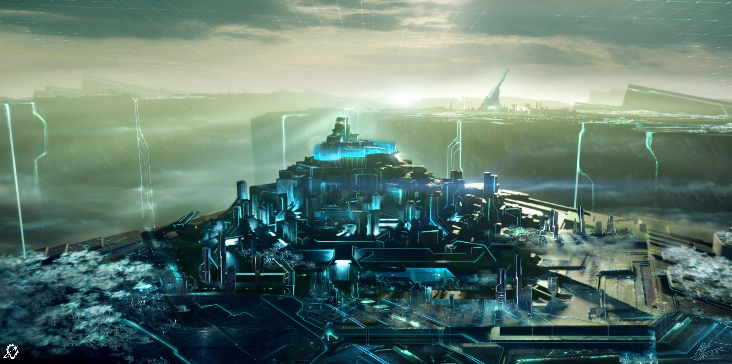
For this piece the goal was to portray the Encom data hub fortress, but also give it a brighter almost daytime look. The challenge was to figure out what the sky looked like and the overall details and forms in both the surroinding fortress and the distant background and “waterfalls,” etc.
I looked at some of the landscapes created for Tron: Legacy [2010], combined with some looks developed for Tron: Uprising [2012-13] and combined them with more complex details for the foreground structures and more simplified forms for the distant structures. One main goal was to develop a brighter look to the Encom Grid, so there was a bit of a nicer and brighter difference between this and the Dillinger Grid.
One specific detail that had not been worked out yet was how to portray the sky and clouds in this brighter world. I came up with several looks, including this one, where there is a grid in the sky that the clouds intersect and mingle around, giving it some sense of depth, and providing a cool lighting effect where the grid lines light up the clouds where they touched, and they also aided in showing some movement into the sky.
Supervising Art Director Jason Horley
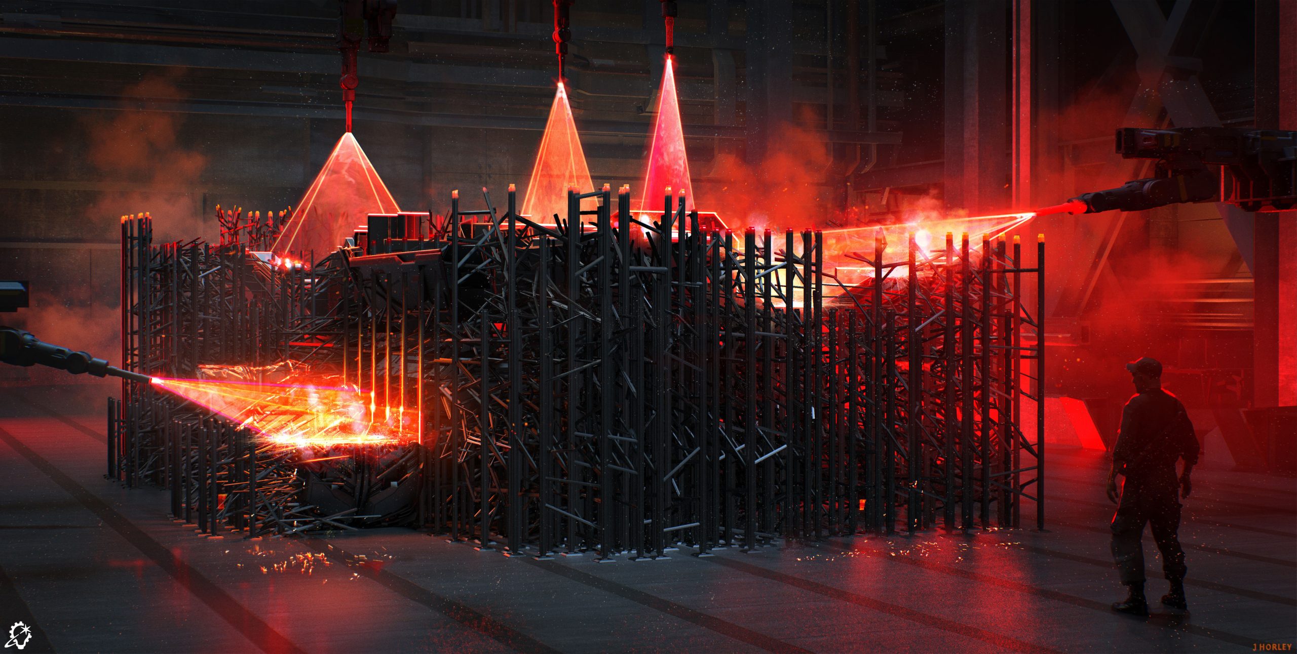
The idea for this piece was to show a virtual vehicle being physically printed in the real world. When I was creating different versions of this image there were several that came before this final concept, all balancing how dense the 3D printing support structures were, and how not to reveal too much of the tank that was being printed. Because the tank is a large heavy vehicle, I also had to make sure the support structures looked strong enough to hold such a heavy vehicle. Earlier concepts were much lighter and you could see the tank through the supports, but it didn’t look like they would physically work.
Once I received the brief, I researched current 3D printing technology to see what the physical process is like, and then scaled it up and added the printing lasers to include an interesting light source that would help add an extra layer of visual interest.
I found it interesting that when looking at 3D printing, normally the 3D print is the actual point of interest, but in this case, the interest was actually the 3D-printed supports that normally get thrown away. That informed the design decisions. So there is a beauty in those formations that usually get overlooked.
Art Director Igor Staritsin

This was a design exploration for a ship in the style of classic Tron world from the 1980s. My task was to keep it fairly simple and in the language of the rest of the environment. I did multiple versions of the ship design, exploring ideas and shapes that would best fit the brief. Besides the development of the overall shape, I needed to design it in a positive and negative look in its color, as it would change shape while responding.
I am a firm believer that, more often than not, “less is more.” There is a term in traditional art that I like to use “complex simplicity”, meaning you don’t really want to make it so simple that it looks boring, but you also don’t want to make it too complex so that it looks chaotic. It is a balancing act to find the sweet spot. In this case, it was relatively easy to follow it.
It was certainly interesting to try to play, and mix different low polygon shapes, and sometimes come up with unexpected results. Nowadays, sometimes there is a tendency to give too much control to “play aspect,” with all the modern tech available. I believe whether you come up with a good idea by accident or intentionally, a good artistic judgement is necessary either way.
Art Director Cody Gramstad
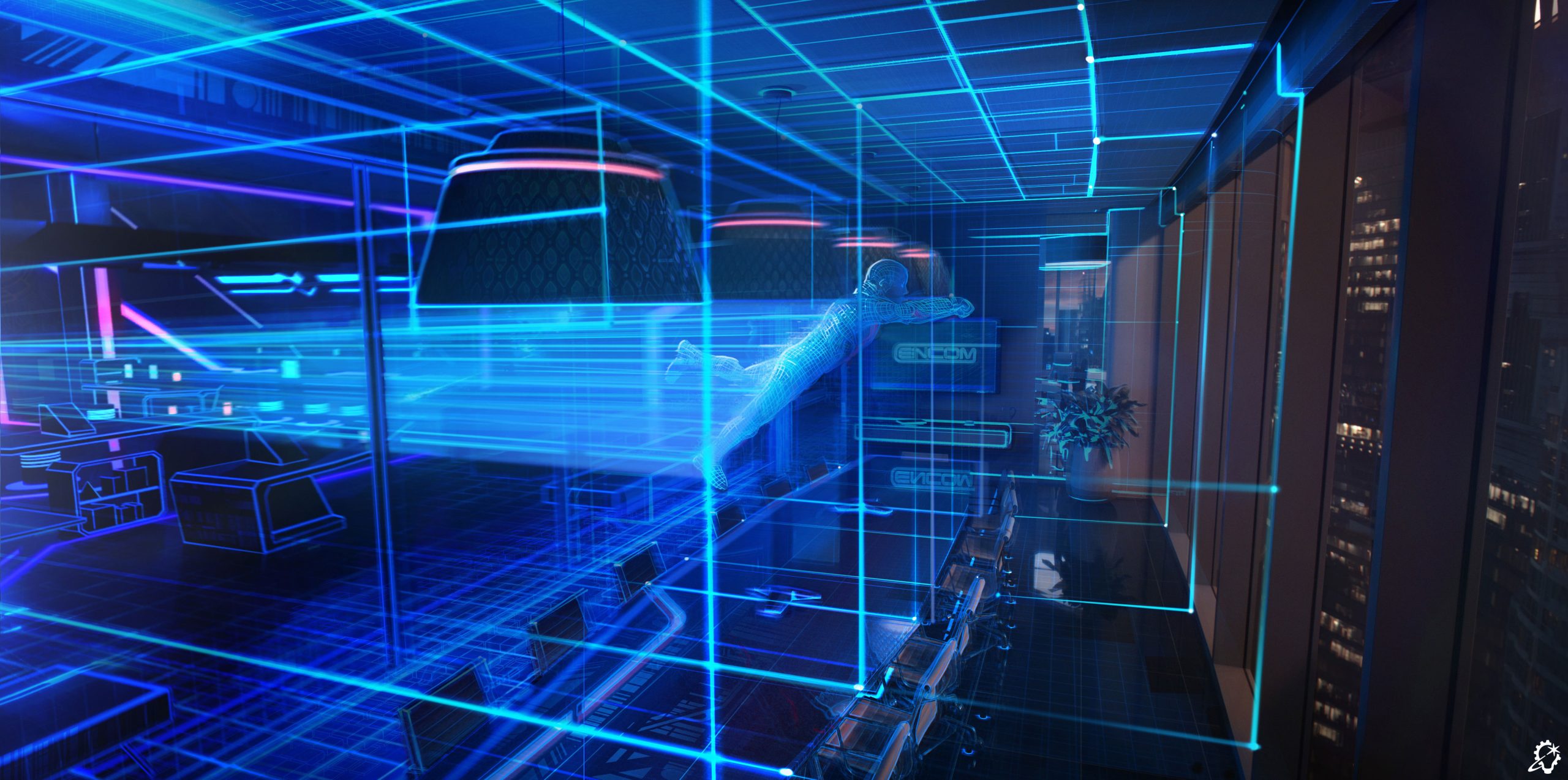
This image was designed to illustrate the process of transformation from the past’s aesthetic to the modern world’s. This was achieved using a gradient across the scene, transitioning from screen left to right, which defines layers of change between the original Tron aesthetic and its contemporary counterpart.
The process involved taking a modern office space available on location and simplifying all its assets to align with the technical limitations of the 1980s. Subsequently, those key assets were replaced and blended using Tron lines until they evolved into the high-fidelity assets of the real world. High-frequency cubes and digital detail were used to help smooth the transition in complexity between the two states.
The image’s development involved a two-stage iteration process. The initial stage focused on integrating 1980s Tron world design details. The challenge was to clearly introduce these features without compromising the overall compositional goals. For the Tron design, we concentrated on achieving a level of detail that felt appropriately simple yet visually distinct for the space. The second stage addressed the compositional design, which was initially too complex. The combined visual information from both visible worlds and the particle laser effects created an overly complicated scene. We resolved this by employing several techniques: gradating all secondary information out of the Grid space, reducing reflection clarity, and ensuring the lines retained sufficient value contrast for clear reading. Finally, we used this same gradation effect to soften the right side of the frame, allowing Ares to be seen as clearly as possible.
The most rewarding part of designing this image was managing the sheer chaos. With such a busy scene, the challenge lay in simplifying and ordering the elements, essentially solving a complex visual puzzle to bring structure to the multitude of details.
—
See the complete gallery of concept art from Tron: Ares here on ILM.com.


