ILM.com is showcasing artwork specially chosen by members of the ILM Art Department. In this installment of a continuing series, four artists from the London and Sydney studios share insights about their work on season five of the Netflix production, Stranger Things.
Art Director Amy Beth Christenson
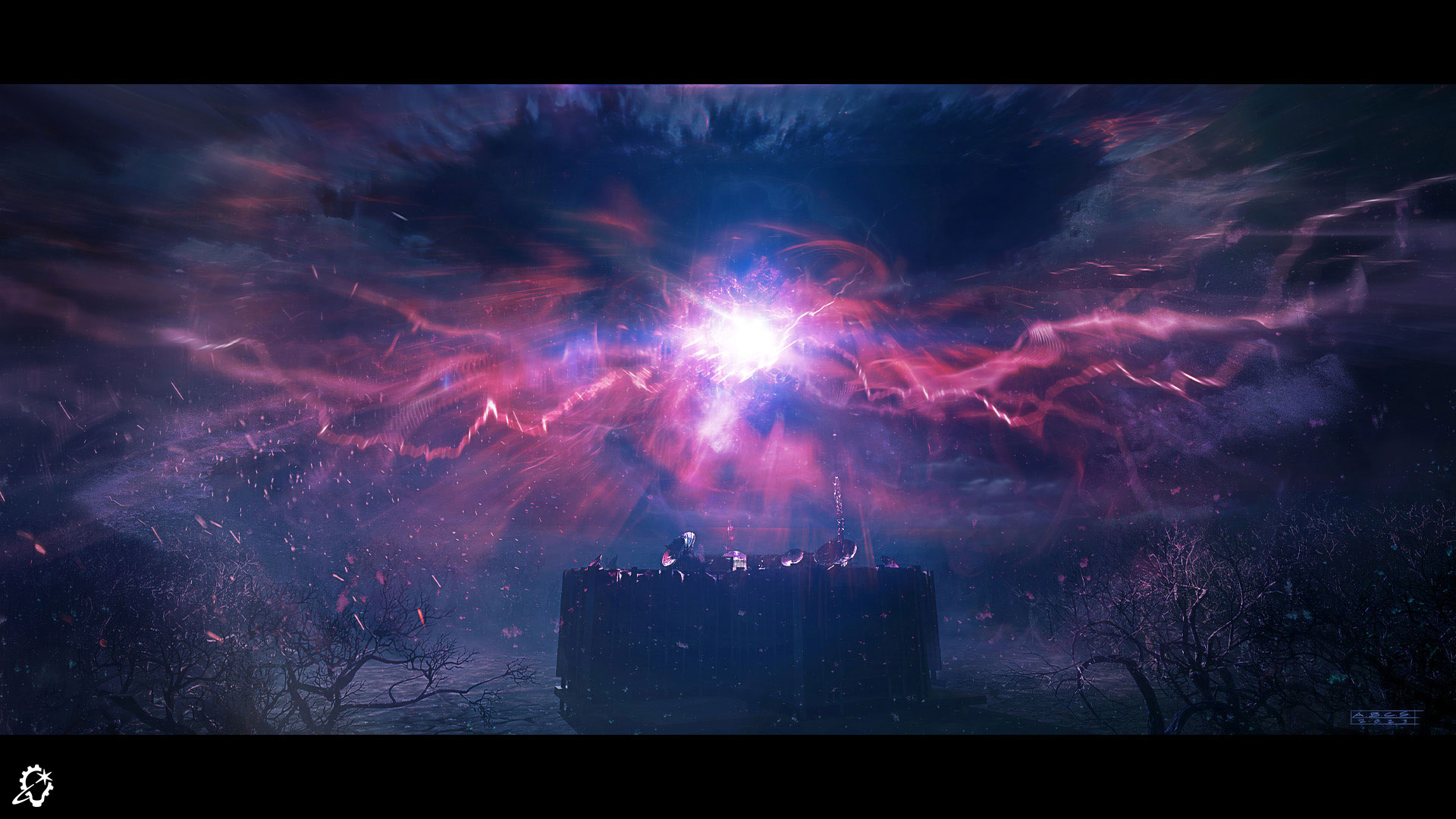
One of the biggest design challenges that I had for Stranger Things season five was coming up with the look for the exotic matter sphere – the shield generator above Hawkins Lab in the Upside Down. This matter sphere takes on a lot of different forms over the course of the series, so there were a lot of different ideas and evolutions to cover with this task.
The first stage of the sphere was the most difficult in some ways, since it’s actually invisible in its most stable state. With no way to see the sphere itself, I concentrated on how that sphere is affecting everything around it. There was already a plan to have the melted roof and lab, but I tried to think of anything else that would be visibly affected by a transparent orb. I threw every visual solution I could think of at it. I had the air spores/motes sticking to the sphere shape, clouds missing in the sky above the sphere, vines dying off around the sphere, and a flashlight beam terminating in thin air.
I tried several iterations of what that might look like once the matter was in a visible state. We ended up going with a look more inspired by scientific sources, such as neurons, firing synapses, plasma, sound waves, and ferrofluid. To help make it feel even more integrated, the elements mimic some of the other Upside Down elements, such as energy bolts mirroring the vine growth, and the center of the sphere feeling almost like a solid organic material.
Throughout all of its states, the sphere needed to be ever-evolving and have a feeling of instability, but also have some ties back to the rest of the established Upside Down/Abyss visual language, so there were a lot of conversations and explorations around that. I got a lot of great direction from them, and from ILM visual effects supervisor Bill Georgiou, to help narrow down the final sphere looks.
I’ve always been a huge fan of Stranger Things (being a 1980s kid myself), so my favorite part of this was just getting to work on season five (my entire family and I even went as Eddie Munson for Halloween a few years ago!). I was able to work on multiple designs, but the matter sphere was the biggest task that I had to tackle, and I had a great time working with everyone throughout the process.
Art Director Cody Gramstad
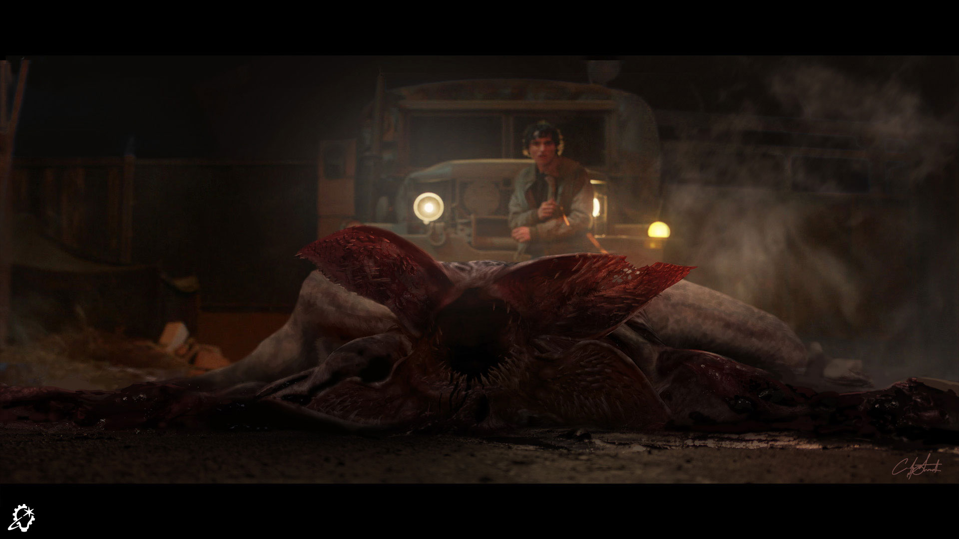
This image serves as the final frame in a longer sequence revealing Will’s transformation. By this point, the Demogorgon has already been violently killed, its body collapsed into a lifeless heap in front of a vulnerable Mike Wheeler. The goal of this frame was to communicate two things clearly: that the Demogorgon is no longer a threat, and that Mike is now safe.
The creation of these images involved several stages. First, I analyzed the pre-shot plates of the actor’s performance, which established key constraints such as lighting direction, value range, and indications of the likely composition. From there, I produced a loose sketch to map out the placement of the main elements, including the environment and the Demogorgon, ensuring the composition and storytelling were clear.
Once that was approved, I developed the lighting to match the original plate while enhancing it to emphasize the destructive moment. In the final stage, I refined the image by drawing attention to key narrative details, such as the severity of the broken neck and subtle expressions of pain on the Demogorgon’s face.
A key priority for the client was striking the right balance between the two narrative beats. With both Mike and the Demogorgon acting as focal points, I relied on core visual principles to maintain clarity without competition. The Demogorgon is emphasized through sharper camera focus, increasing its visual presence, while Mike is defined through value contrast. This approach keeps both elements readable and distinct, without pulling attention away from one another.
My favorite aspect of the design is the subtle framing of the two focal points. Images like this can easily become cluttered and visually overwhelming, but I aimed to create a balance that guides the viewer’s eye and allows the story to be read in the intended sequence.
See the complete gallery of concept art from Stranger Things season five here on ILM.com.
—
Read more about Stranger Things:
ILM Journeys Into the Upside Down: The Visual Effects of ‘Stranger Things’ Season 5


