ILM.com is showcasing artwork specially chosen by members of the ILM Art Department. In this installment of a continuing series, eight artists from the San Francisco, Vancouver, London, and Sydney studios share insights about their work on the 2025 Disney production, Lilo & Stitch.
Art Director Cody Gramstad
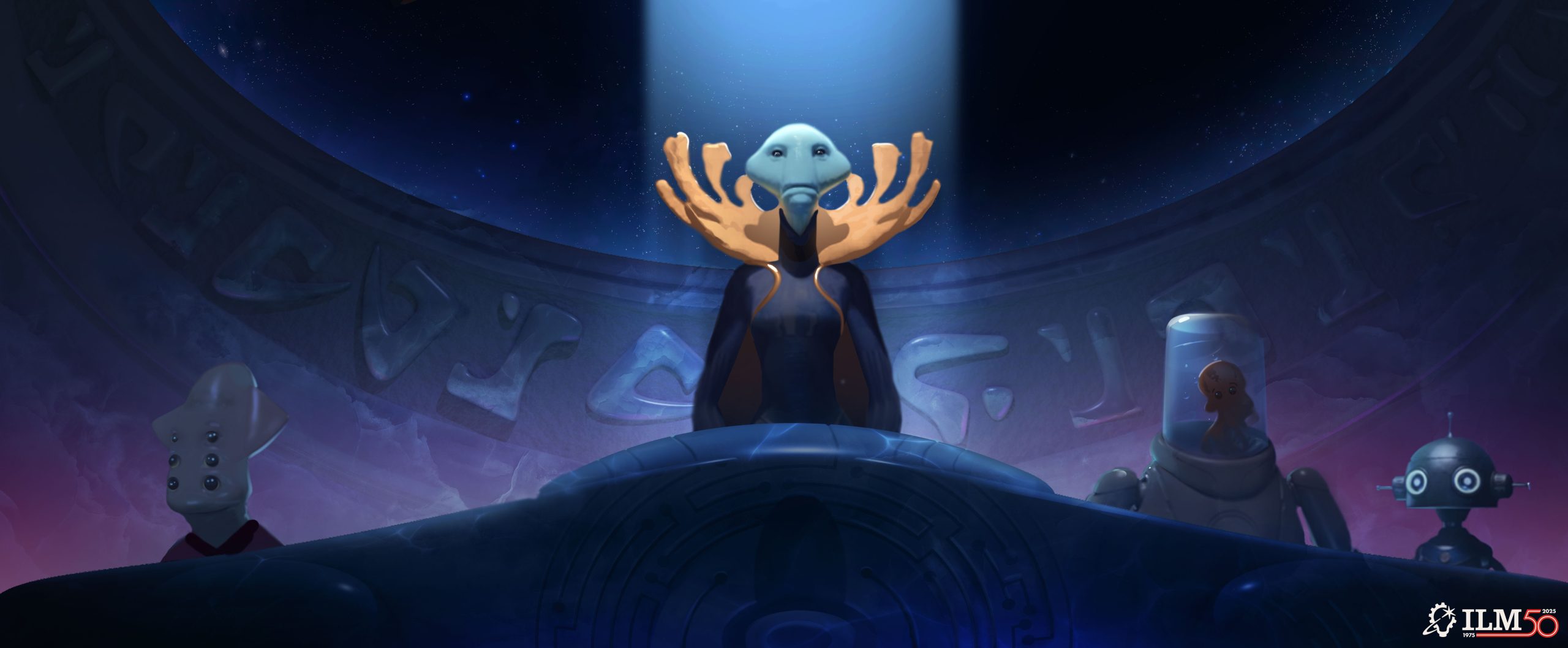
Gramstad: This concept was tackling two key problems for this scene. What should our balance be between Chris Sanders’s soriginal visual style and the limitations of live action expectations? At the same time, we could use this image to give practical design guidance for the environment team on how to stage the podium space so that the window both frames and provides value contrast to the Grand Councilwoman’s head for our primary focal point.
The iteration process for this concept was an evolution of a pre-existing previs set. From the original film we knew key staging, camera placement, and expected lighting direction. The iterations came in adjusting the environmental elements around the figures, exploring different shape languages and materials, and experiments in color and saturation to find a balance that maintains the personality of the original animated film but could exist in the lighting and material context of a more dimensional rendering approach.
My favorite part of this piece is the simplified value shape language. When this composition is refined down to its most basic fundamental art skills, it creates a graphic shape language that feels in character to the original film, while at the same time allows for a clear read of the primary focal point.
Senior Visual Effects Art Director Alex Jaeger
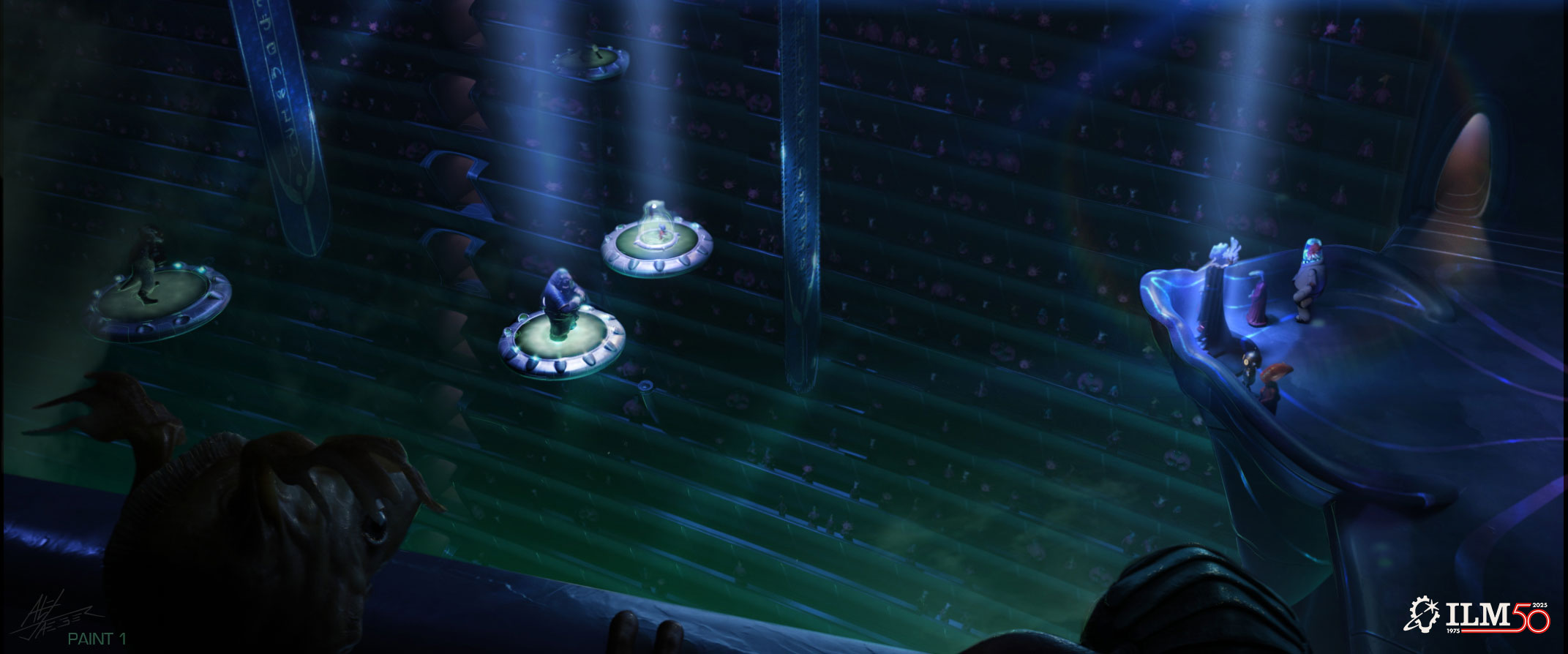
Jaeger: The main brief for Lilo & Stitch was to try out some ideas to pull it away from looking like an animated feature and make it feel more realistic while keeping all the main structures from the original film the same.
The work on this piece was done as part of a push to complete a set of shots early for the trailer. As part of the process it was also done in an effort to gain a bit more realism in this sequence and offer up some new suggestions and options for detail and lighting. So, after looking at the existing sequence, I found that the textures overall were soft and that a few indications of hard reflections might help.
One of the challenges was to not alter any of the models, but rather keep my alterations to lighting and texture. So I added more fall-off and texture to the spot lights, added a metallic line element to the platform railing and floor. I also added a more metallic glint to the threads in the banners. The hardest part was finding spots to add metallic elements that would be most effective for the added realism that the client requested, without altering major elements.
Concept Artist Mathilde Marion
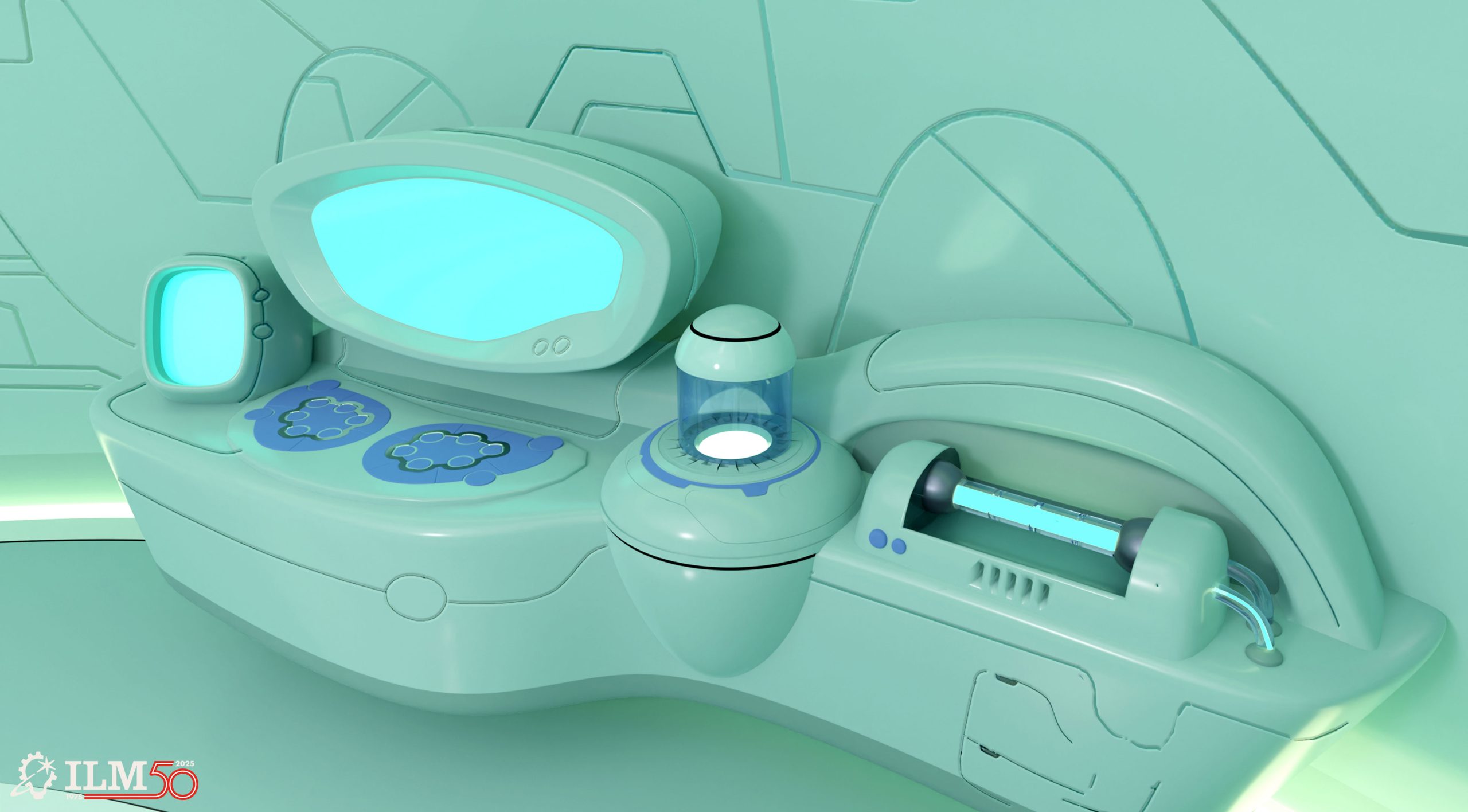
Marion: After his trial, Stitch is sent to a lab room where he is being tested upon, and from where he escapes. We needed to start from the client’s design of the room, and in the same spirit, expand a workstation into a DNA reading machine. We came up with a few variations of designs and how it would work, based on the client’s storyboards. This one is, in my opinion, the most successful.
This is a frame of the overall design, but it was actually designed and sent to the client as a series of close-up shots where we can see Stitch’s hair being processed and tested by the machine. There were primarily two challenges: designing a machine in the spirit of the original animated feature, all the while showing a sequence of mechanical events that are somewhat logical. Because the movie isn’t meant to be realistic, we had a bit of leeway, but it still needed to work within the chosen design and make sense story-wise.
I took inspiration from Chris Sanders’s original designs, and the original movie’s assets and weapons. I made a goal to try and match another artist’s style, which is not the easiest thing to do. My style is usually not as cartoony, and it was important for the story that everything was sitting in the right visual universe. A stylized-type of drawing is really tough, as it requires a perfect understanding of the basic shapes, values, and color relationship. You can’t hide behind details or processing in your image. I found that very interesting and had to challenge myself.
Senior Concept Artist Brett Northcutt
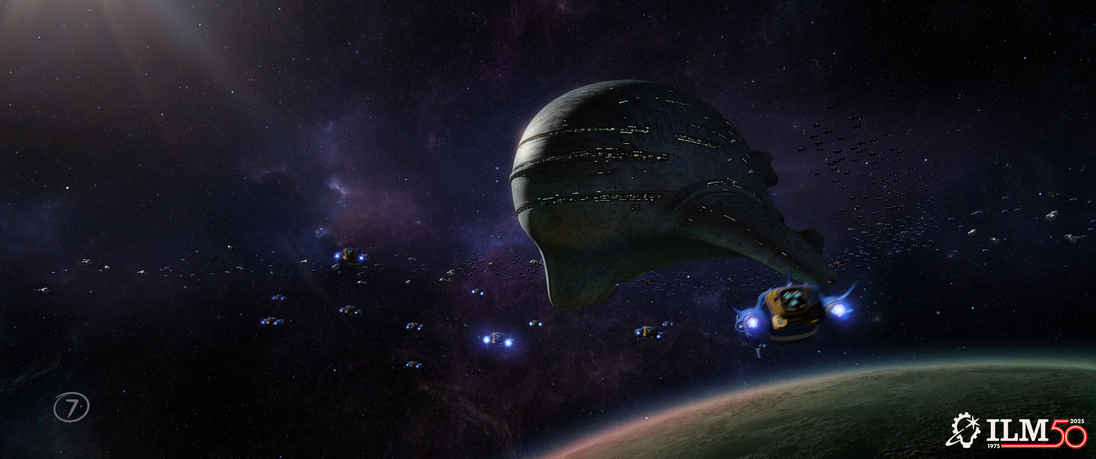
Northcutt: I worked on this piece late in the schedule trying to help with lighting and reality cues to improve the look of the shot.
This shot was originally front lit against space and I thought it looked a bit flat. I reversed the lighting to make it back lit, which really helped the mother ship look more imposing. With the ship now pretty dark, adding a nebulous background really helped to make it pop and also added visual interest. Finally, adding a planet to the lower right justified adding some unusual light reflection to the dark side.
Supervising Art Director Fred Palacio
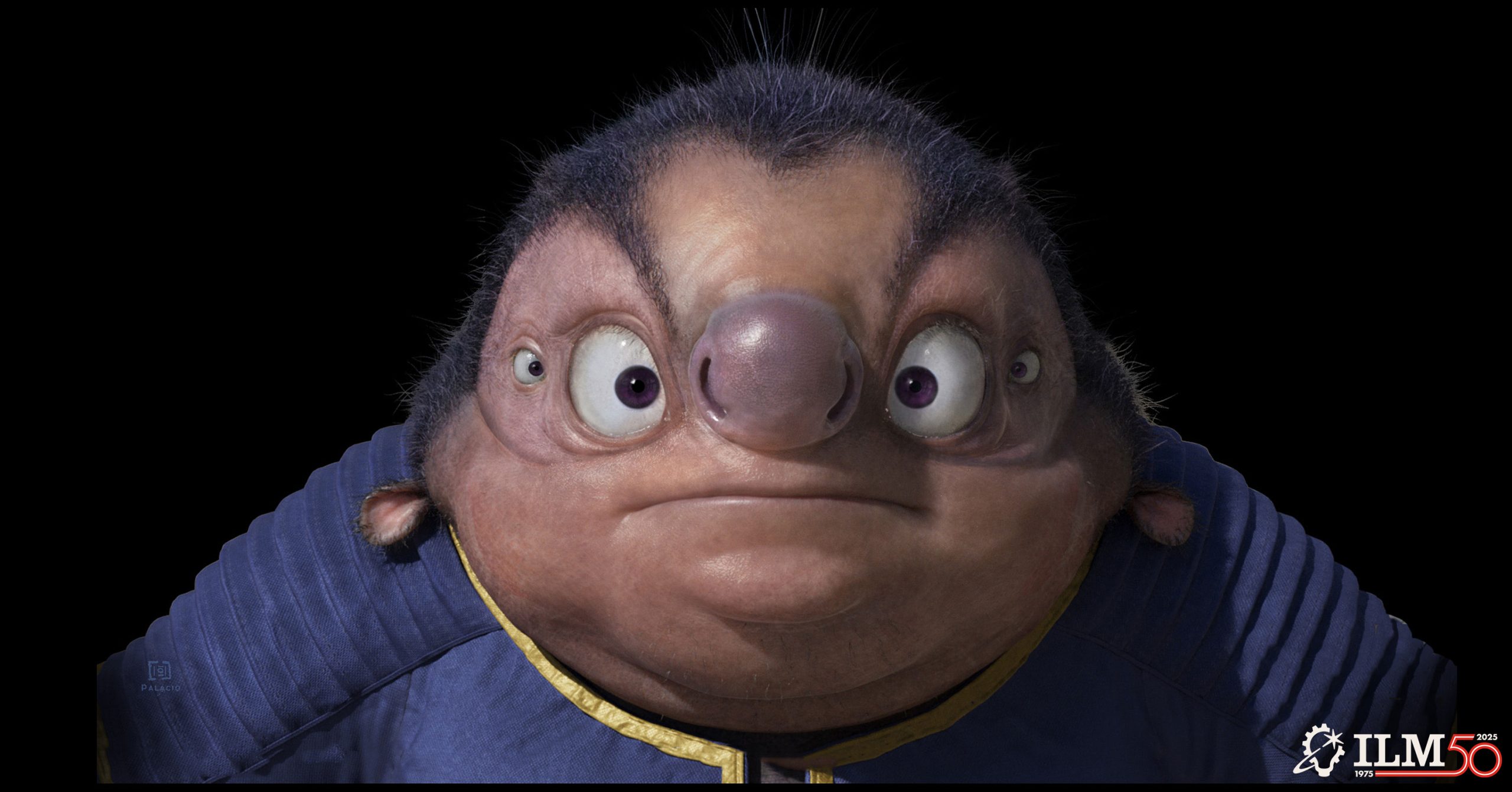
Palacio: The task was to make the character more appealing to a broader audience, while avoiding a design that may appear too frightening for some. The main challenge was the time constraint, as the character had already been modeled, textured, animated, and rendered, so any changes had to be made on the spot.
In situations like this, my approach is to assess where we are and iterate step by step through paintovers, gradually exploring the visual possibilities. For example, we might ask: what if we changed the shape of the pupil? Its size? Its color? What if the skin appeared softer, the color more uniform, or the hair density had more contrast?
Each adjustment was aimed at subtly shifting the character toward a more stylized, graphical direction, while still preserving the realistic quality the team had already achieved. It felt almost like sending Jumba to our makeup and hairstyling department. We also explored enhancing the clothing by injecting more saturation and slightly shifting the hues to evoke the distinctive palette of the 2002 film.
Art Director Amy Beth Christenson Smith
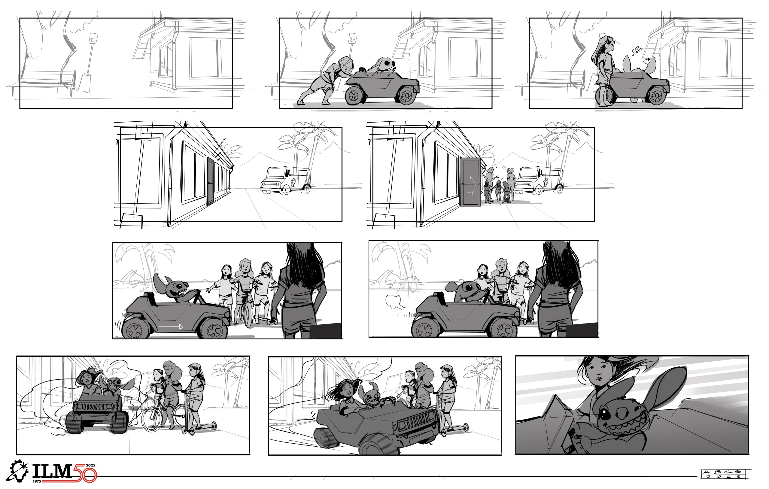
I worked closely with senior animation supervisor Hal Hickel under a fast deadline to get final boards ready for these sequences. The location had been scouted, so I had to make sure to match the scale and layout of it all. The most challenging part was also the best part: making sure Stitch had a lot of over-the-top personality and that the comedy would shine through.
The client shared reference for the scouted location, as well as some rough sketches for a few frames. The biggest inspiration came from the characters in the original animated movie, trying to match their body language and personality. I also took inspiration from my pet rabbit – having Stitch turn only his ears in the direction of the sound when the shop doors are opening came from how my rabbit’s ears twitch and turn when she hears any sound.
Art Director Igor Staritsin
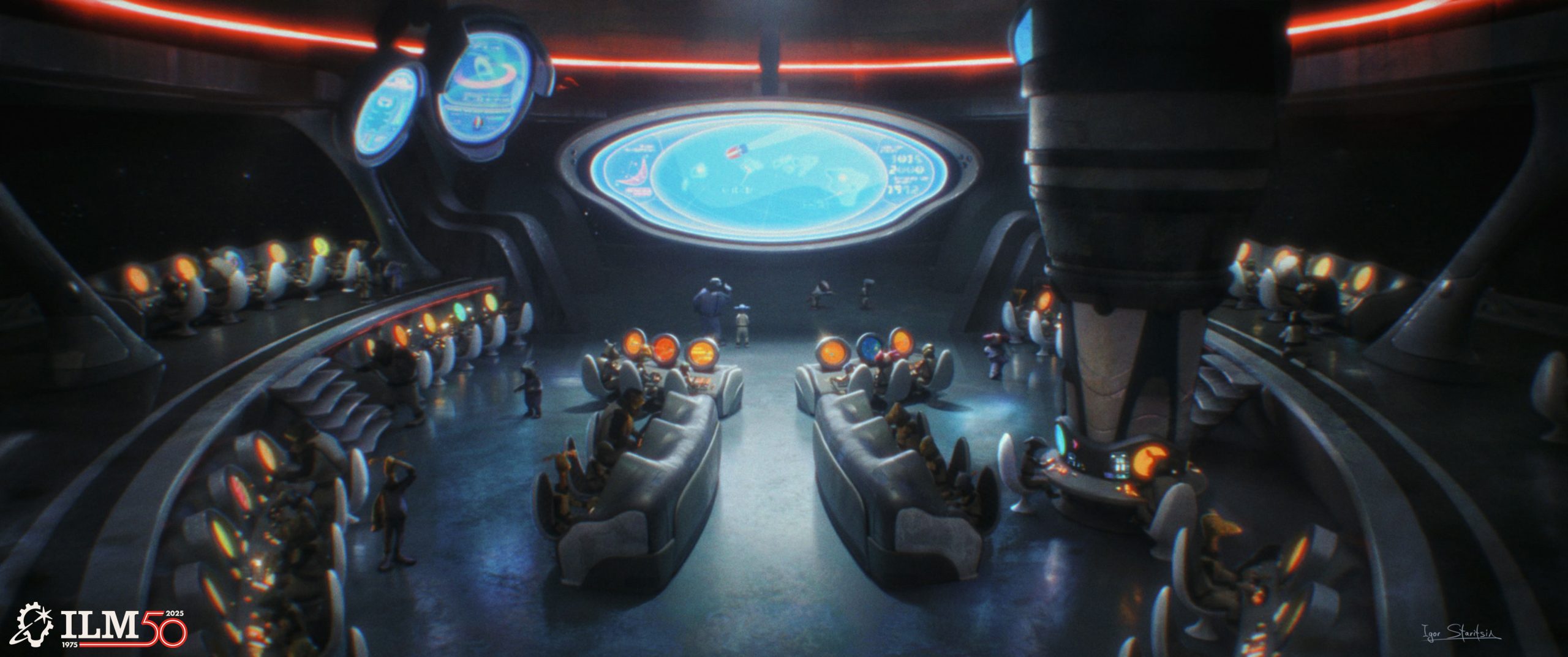
This was an art direction shot paintover that was meant to help the visual effects team establish the look of the final shot. The main challenge for this sort of task is to make the concept as close as possible to the final quality of the shot, as if it was seen in the movie. It usually requires quite a bit of research on the subject matter, as we want to make sure that the decisions made are based on reality. For example, a good design is usually achieved not only by establishing a pleasing aesthetic look, but also a logical function. The same goes for shot paintovers. We want to play up the most important elements in the frame that help to tell the story and play down the rest.
For this shot I knew what I was going to do after gathering enough information from my prior research on the task. However, there are certainly moments when one might experience a bit of struggle when trying to find a solution. I think it is best to assess your design in the simplest way possible, meaning one shouldn’t try to go into details too soon and get lost there. It is important to make sure that big shapes read well. Proportions and distribution of shapes make for a pleasing arrangement. When the basics are in place then mindful distribution of details on top will bring the design home.
I really enjoyed adding small details, a variety of materials, and break-ups that made it all look more realistic in the end. Tiny things like halation, bloom, vignetting, and suppressing details in secondary areas, as well as increasing the attention around the focal point really helps to bring it all to life while telling the story in the shot.
Concept Artist Evan Whitefield
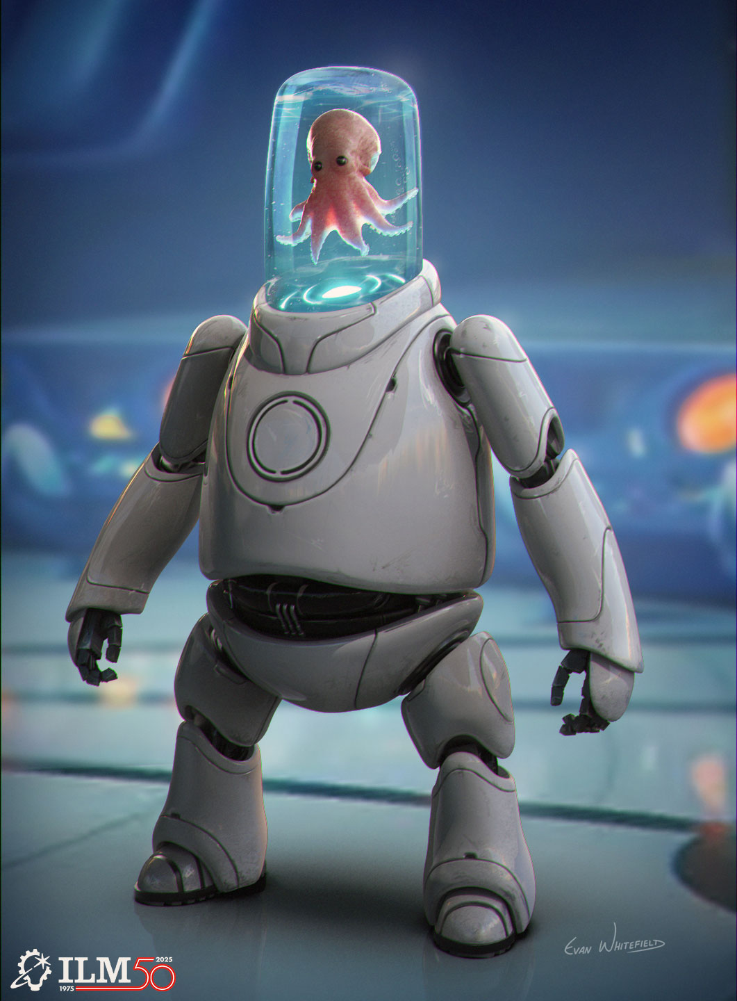
The squid-piloted robot was designed as a supporting but visually memorable background character in the Grand Council chamber. While not a primary character, it helped reinforce the sci-fi tone, scale, and advanced tech of the Galactic Federation. The design retained the creature-in-a-tank-helmet concept, evolving through multiple iterations to balance the charm of the original animated version with a more grounded, high-tech look for the live-action world.
When I first started exploring the design, my goal was to go all out with the initial concepts to really push the creativity and explore extreme ideas without limits. This helped uncover unique shapes and personalities for the squid-piloted robot. Once I had a strong range of options, I focused on pulling things back to create a more grounded, believable design that would fit seamlessly into the live-action world. That balance between bold exploration and practical refinement was key.
One of my favorite details is how the tank-like helmet functions as both a life-support system and a clear window into the squid’s personality, letting its expressiveness come alive. I also love the contrast between the squid’s relatively small size and its massive, bear-like robotic frame. The functional, mechanical design of the robot pairs beautifully with the organic shape of the squid, creating a compelling balance between technology and creature.
—
See the complete gallery of concept art from Lilo & Stitch here on ILM.com.


